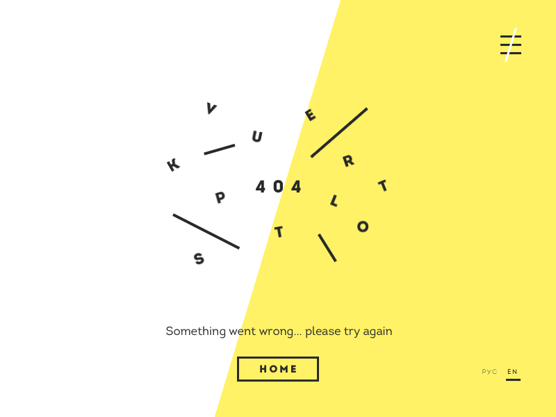
Micro interactions are the latest (possible biggest) UX trend to be recorded so far, thus critical for modern design which can’t go without them anymore.
By micro interaction, we refer to every task-like engagement of users with their devices, smooth enough to pass unnoticed as the user is performing his usual activities. That’s, of course, when the micro interaction is properly executed.
There are several things micro interactions serve for:
- Communicating statuses or feedback
- Revealing results from particular actions
- Helping manipulation
It is easy to overlook micro interactions in the general design scheme, and that’s because designers happen to miss the fact it is micro interactions that hold the scheme and the experience together. From this perspective, micro interactions are the small bits of communication that help users navigate the interface, and perform basic functions:
- To communicate feedback or results for their actions
- To accomplish personal and isolated tasks (connecting devices, liking posts, and so on).
- To manipulate the setting
- To prevent errors
In modern web design, even the tiniest details need to be considered carefully. Micro interactions, for instance, will help users understand the process they’re about to participate in, and approach the interface easily as complicated as its logic may be.
That’s why micro interactions appear in many different forms – they can be extremely formal, but also cartoony and fun, usually placed straight against the website’s backdrop to reinforce brand awareness. What is most impressive about them is that they make the experience more entertaining, with slightly more fun than usual to help us learn new things, or simply know we’ve handled the digital world challenges correctly.
MICRO INTERACTIONS: HOW DO THEY WORK?
Every micro interaction has four essential elements: trigger, rules, feedback, and modes/loops. The purpose of these elements is to organize the operational cycle, which is why they’re not ‘visible’ for the user, and he doesn’t even think of them until something is missing or goes wrong. It is only in the best of micro interactions that all of these concepts are present:
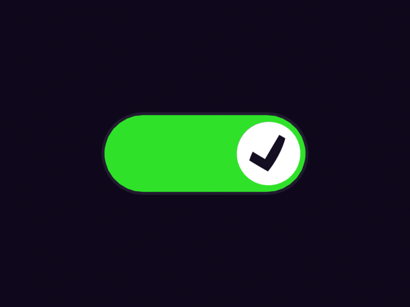
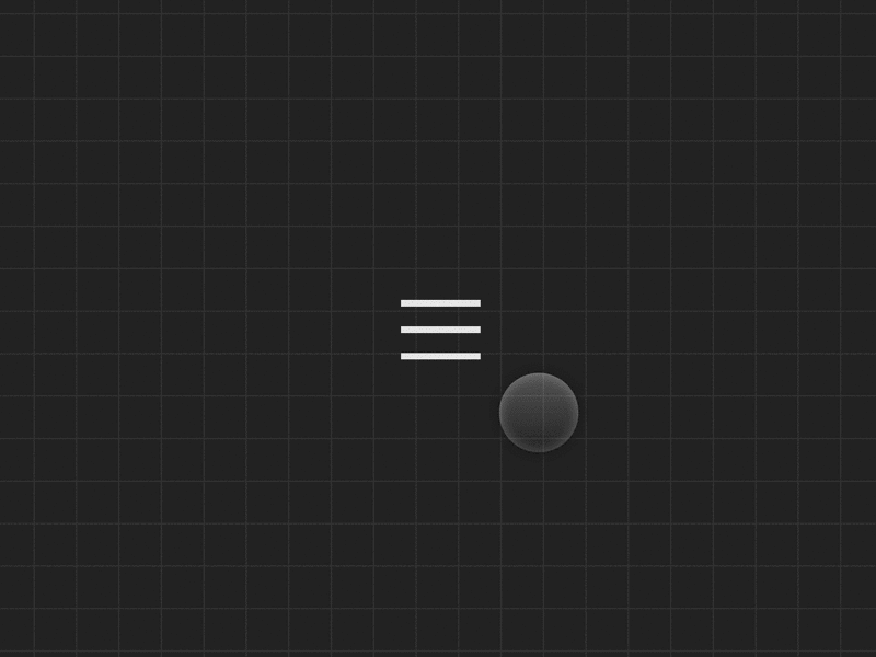
Triggers: Initiating actions
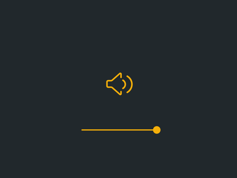
The entire micro interaction process is initiated with the trigger, which represents a manual action as for instance clicking, taping, or flipping an icon. The trigger can also be built inside the system, meaning that the action will occur upon the accomplishment of another one. For instance, a trigger is applied for the system to provide sound notifications when we receive a message or publish a post.
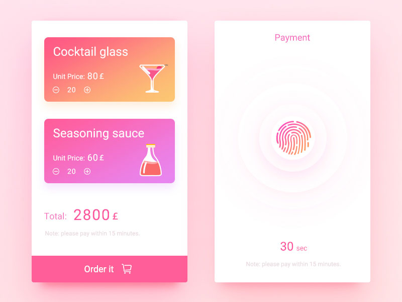
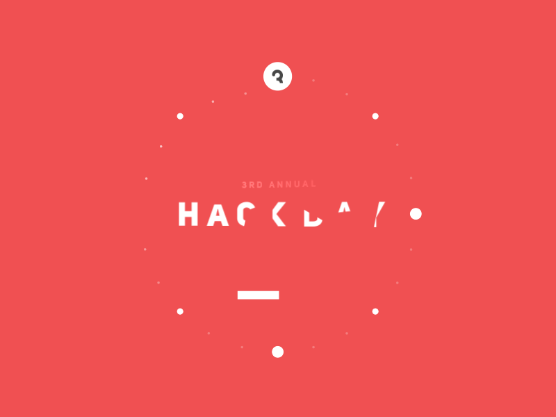
 Image source: Alex Pronsky
These triggers work with a set of established action rules which prescribe what can and what can’t be done. They are programmed within the micro interaction, and the user can’t see them until he receives feedback.
Rules: Prescribed interaction guidelines
Rules prescribe the conditions for a micro interaction to happen. Think of WordPress bootstrap themes for instance – while the user is altering sections there, the site uses an inbuilt drag-and-drop editor to help him accomplish that. set the conditions for a micro-interaction to happen. If we take any WordPress bootstrap theme as an example, whenever a user wants to alter any website section, they will have to use an inbuilt drag-and-drop editor to get the result.
Feedback: Letting the user know how he is doing
Feedback helps users understand that the necessary rules were engaged by the trigger, and that the micro interaction is successful. The vibration option on our phones is a very good example, because we know we activated the silent regime successfully, according to the rules. If there was no such feedback, we wouldn’t know whether we accomplished something as we should.
Loops and Modes: Building user expectations
Loops and modes appear in the last stage of micro interactions. The purpose of loops is to determine the duration of the micro interaction, while modes take care of less common actions that can help users continue with the process, as for instance inserting geographical data to check the weather.
THE IMMENSE SUCCESS OF MICRO INTERACTIONS IS DUE TO MANY REASONS:
Micro interactions allow you to control instant feedback: As the micro interaction takes place, the user understands the results of his action, and feels motivated to continue working.
Micro interactions streamline guidance: most of the time, they are completely invisible, but contain intuitive elements and hints that show users how to operate.
Micro interactions are rewarded with visual means: thanks to micro interactions, user experience is rewarded with visual effects which enhance habit loops and create specific behavioral patterns.
Micro interactions give users what they need: users often expect the website to follow an actual web trend, and wouldn’t settle for one that doesn’t have it.
Micro interactions have a role in all digital design projects: Design nowadays is far more human-centric than before, requiring several paths of interaction to make devices function in a human-like way, and to be adopted easily. That’s where micro interactions are the handiest – thanks to them; every important moment and element of the interaction will be included in the final design.
The extreme orientation towards better user experience prevents designers from affording the luxury to create less user-centric websites, or skipping whatever essential micro interactions revealing hues for users to perform actions or make changes to the website. The user journey has to be smooth and well-designed, as everything less than it can make your website uncompetitive on the market.
MICRO INTERACTIONS IN THE FOCUS OF USER-CENTERED AND HUMAN-CENTERED DESIGN
Human-centered design is no longer a requirement on modern websites, but a fact. It goes beyond solid user experience, and examines the purpose of its existence, performance, and objectives. Once all this information is gathered, designers come up with the ideal patterns that can meet the needs of their users, and make even the most complex website run seamlessly.
User-centered design, on the other hand, doesn’t pay that much attention to the needs and requirements of users. Its main purpose is to examine market needs, and to make the website functional.
Human-centric and user-centric design are a couple of seriously interchangeable terms, perceived to be the same even by some experienced developers and designers. The main focus for most of them is to make design user-friendly; reflecting end-user needs in each of their priorities, but it is human-centered design that will take this concept out of the box.
Users’ needs will remain the priority, but designers will foremost think of a specific problem to be solved in the most straightforward way. They will consider readability, usability, and confusing elements that need to be removed, analyzing the whole picture of the website’s online presence, and the reason why the user actually landed on it.
Design in its current form has more to offer than pure functionality, and aims to deliver dynamic user experiences. People will remain in the center of these experiences, as each element will be designed to cater their needs in a dynamic way (including clicks, shares, multimedia, navigation pattern, mobile access, or whatever other feature you can think of). The ideal interaction has to include all of these elements in order to accomplish the website’s goals.
As it is probably clear, human-centered design is not exactly a breeze, and it takes to overcome few serious challenges to make it work. To start with, it takes more than a single designer to wrap the final package, and a lot of participants that would test the product or assist the process.
In order to make the process smoother, share work while it is in progress and you will be able to stay unbiased and avoid serious mistakes just because you thought something was perfect when it was not. The ‘polishing’ is easy to make and correct, and it won’t take as much time as a complete correction would.
At the same time, the chance to familiarize with your product will make users trust you more, and will improve the overall impression they have about your website.
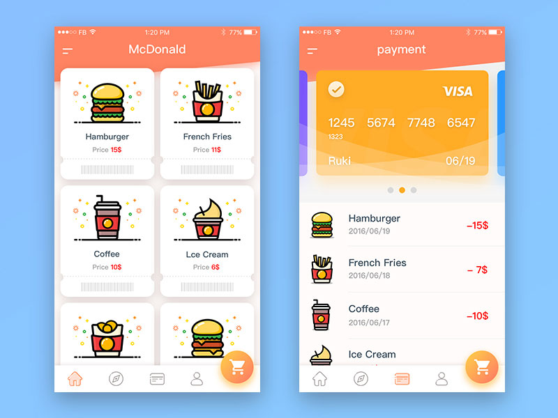
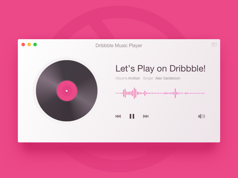
 Image source: Srikant Shetty
Don’t be persistent, however, and let users determine whether your choices are good or not. Present things as they really are, and accept negative feedback without bad feelings. After all, that’s the best way for you to reveal flaws and to correct them, and to build a lasting user relationships many of your colleagues don’t have.
Feedback
You can cooperate with people and involve them in your work in many ways other than basic feedback, and that’s exactly what you should do when designing in a human-centered way. In order to detect a problem to be solved by your website’s services, you need to interact you’re your audience, understand them and compromise with them, and base your product exclusively on their needs.
Another thing human-centered design requires you to do is to interact closely with your industry, and keep an eye on problems your design might solve there in order to become more competitive. Many designers with dead simple pages imposed themselves right because they knew what their industry was missing.
Finally, blend the human and the technical aspect of your design in order to make the product work.
Try to discover what users like or want, and detect their preferences even for the lightest elements to be included (colors, patterns), and consult them for every function you’re thinking to include. For any web design to be truly successful, it must work on both technical and human levels.
BEST MICRO INTERACTION PRACTICES
We are surrounded by micro interactions, as they are present on every website, app, or program we’re using. As we explained previously, they represent tiny functionality triggers that are neglected by many designers, and have just recently come to the focus of their attention as a way to make design more human centered.
Still, micro interactions made and broke many designs on the web, as they were basic means of functionality in some cases and an entertaining practice that helps the brand be recognized in others. For what is worth, micro interactions have to be executed properly from the beginning until the end, as without them even the best feature won’t be attractive to users. Your users are not only supposed to use your product – if you want to succeed with it, you have to make them love it!
Both the details and the big picture have to be spotless, and micro interactions can make that happen.
The main benefit you’ll obtain as a designer is to save time, as you will communicate information instantly, and keep users undistracted. It will be extremely easy for them to obtain any information they want, and they will never be bored.
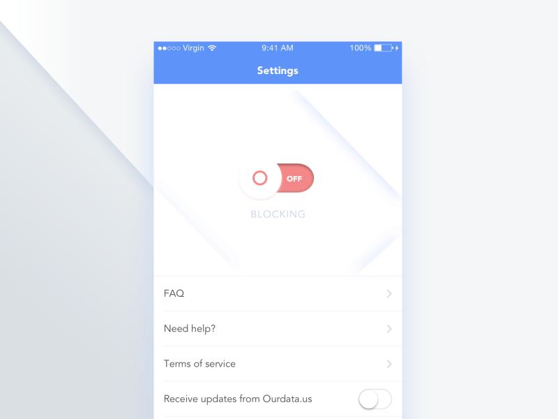
1) Displaying the system status
Jakob Nielsen established one of the most important usability heuristic principles: according to him, users should always know what is going on, and receive immediate responses upon the accomplishment of their actions.
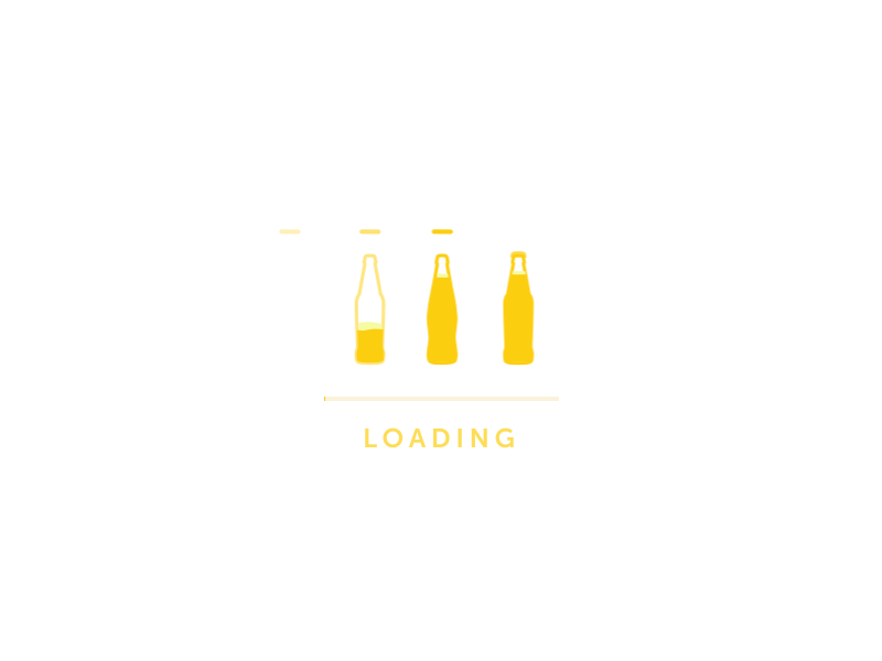
Feedback should come from the interface, and be displayed in an interesting background graphic, either with bitrates or a sound. The same applies for file transfer: users should not be bored while their files are being sent, but receive pleasant notification with entertaining messages. So, the interface should keep the user enlightened about what is happening by displaying
2) Highlighting changes
Many designers believe it is a good practice to make action buttons smaller and to save space, but that’s not how you invite users to perform the action. They must be able to see the button, or be entertained with an animation that will direct them where they should go.
3) Keeping the context
Designers of our time need to design foremost for mobile purposes, and find a way to display information in a visible way and not to miss anything important. It is of vital importance for mobile design to keep the navigation pattern clean, so that users will understand the process as a whole, instead of getting lost in the middle of it.
4) Using uncommon layouts
As we explained in the previous paragraph, micro interactions make it possible for users to understand design as a whole, and to adopt even an unfamiliar and uncommon layout without confusion. There are many means that can make this happen: scrolling graphs, flipping photos, rotating letters, and so on.
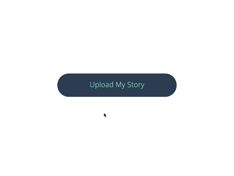
5) Calls to action
Calls to action are designers’ favorite tool to work with, as they ensure effective interaction with any app or system. Using micro interactions, the designer can motivate users to click on these buttons, or interact in a similar way by sharing the content or reading more about it.
6) Visualizing the input
Those of you who have designed a mobile app before can appreciate the importance of data input, being the most critical element to determine the quality of their work. Another thing you can probably confirm is that data input is a boring process, and wouldn’t reject a couple of micro interactions to make it more entertaining.
7) Introducing live tutorials
Users love animations, which is why those make for the perfect educational mean. Instead of long guides and explanatory papers, try to engage users with videos that highlight the essential features of your product, and teach them the controls they need to use it.
MOBILE MICRO INTERACTIONS
The key force of user interface is to keep users updated with feedback, instead of letting them guess what is happening. That’s why interface is almost completely dependent on micro interactions which make that feedback visible.
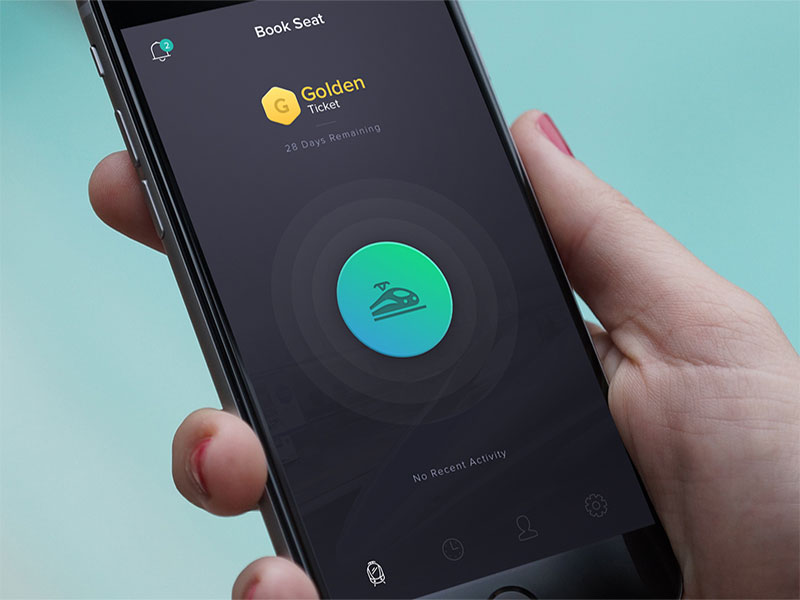
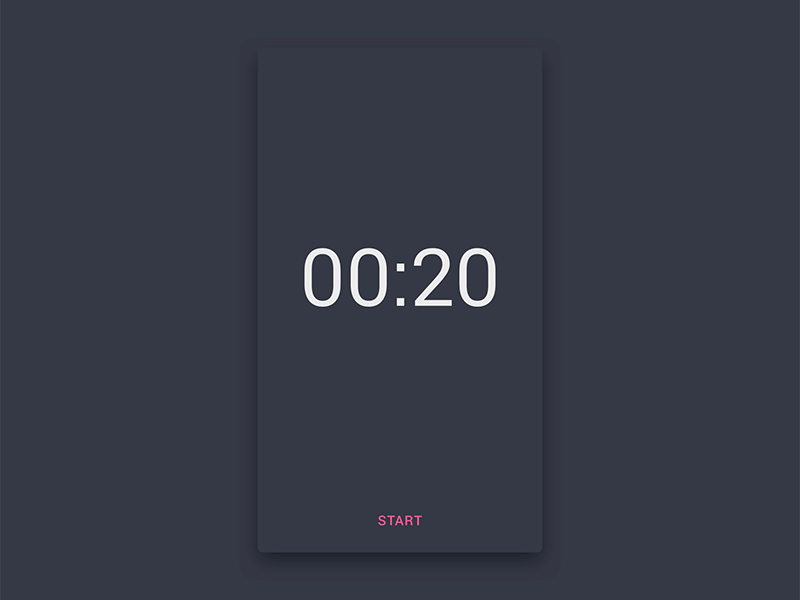
 Image source: Igor Izhik
At the same time, micro interactions allow users to experiment with animations, in particular when it comes to uploading data and downloading content.
A very popular animation is the ‘pull down/up to refresh’ one, which updates the available content on mobile devices, and the more cheerful it is, the more likely will your site be to keep users on board.
In order to make your user interface as successful as possible, design the controls and buttons in a ‘tangible’ way. In fact, try to make them look as real as possible so that users will like them despite of being hidden under the glass.
Thanks to motion and visual clues, the user will understand the meaning of his input right away, and will feel in control of the app. In fact, manipulating UI elements will resemble physical interaction, and the visual response to it will be more than obvious.
Another important function of animations is that they lead users through several navigation contexts, explaining them the different settings and changes in arrangement, and are of particular use where modification is likely to alter the elements’ hierarchy. As a matter of fact, we wouldn’t even understand there is hierarchy if it weren’t for micro interactions.
A very specific interaction to consider is morphing icons’ shape to allow them to perform several functions at the same time. This is the so-called concept of motion design which leads user in a way which is both informative and visually delighting, and is applied on smaller screen and mobile devices to surpass the lack of screen estate.
INTERACTION RULES IN DESIGN ARE ALWAYS THE SAME
The fact that you’re supposed to design for smaller screens doesn’t justify depriving the app from its functionality, and you’re not supposed to skip some of the main good design rules just because you think the space doesn’t allow that.
Purposeful Design: You know your audience, and you know what they need. You’ve spent hours on interviews and surveys, and you’ve created the personas most likely to fall for your designs. What we’re trying to say here is that you’ve worked hard to round up your goals, and you mustn’t let a small screen take that away from you. Rules will still apply; you just have to adjust them.
Usability: You already know that, don’t you? There is no need to repeat how important it is to make a usable app, because otherwise no one would download it. The important thing to remember here, however, is that usability comes before desirability, and there is no exception to it.
Affordance and Signifiers: Affordance refers to the functions. Signifiers, on the other hand, indicate there is an affordance. Let us explain this in plain English: When a sentence is blue and underlined (the signifier), it indicates that by clicking on it, you will be redirected to another page (the affordance). You need to handle signifiers in a way in which users won’t even think what they are for, but will follow them intuitively instead.
Smooth learning curves: Once again – users need to follow your navigation patterns instinctively, not to think of them. Therefore, use patterns that are both easy to acclimate, and familiar to your users.
Feedback and Response times: Feedback matters because it helps users understand whether their action is finished or not, be it a simple beep or a large modal window. Make feedback human and friendly, and deliver it with timing similar to the one recommended in the Nielsen Norman Group guidelines.
Have in mind that limited screen estate won’t be your only constraint. As Maier explains, it is users that will impose most of your obstacles, so make sure you know your audiences before you’ve even started designing.
For the perfect user experience, map out the content, and build the user flows according to it.
Research before you design, and after you’ve drafted your project. The two things have to be performed in parallel, so that you can make modifications quickly upon any change in user expectations. Don’t commit blindly to a single path, but create simple, easy-to-alter prototypes. You can even sketch it on paper, and change it whenever users change their reactions to your content.
Make a detailed outline too, since it will help you evaluate each page flow separately. Unlike what most designers think, simple sketches bring flows to life much easier than digital technology does, and let you handle the structure’s details clearly and on time. Thanks to the prototype, you will share these ideas with users in advance, and you will be able to evaluate the potential success of your app before it even appears on the web.
Use mobile patterns your users are familiar with
At the end of the day, there isn’t that much philosophy about mobile design, as everything revolves around tiny nuances, technical and device specifications, and placement. While this is a good thing because it doesn’t require you to reinvent the wheel, it can be a two-blade knife that will mess up your design.
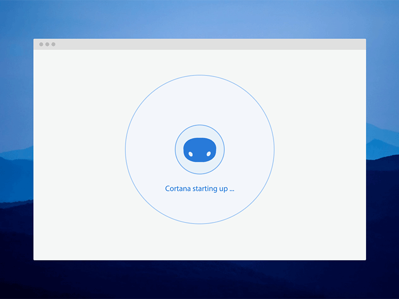 Image source: Fu
The safest course of action is to use a common and popular mobile pattern, as for instance the slide-out navigation. Do the same thing with phrases, and make them sound friendly and controllable. In the meantime, make sure important words are the first one to appear (for example, put ‘Full Name’ instead of ‘Name’). Make sure the wording and the style are uniformed on every page.
The ‘Fat Finger’ design concept: your key for accessibility
Mobile design’s mouse cursors don’t go as pixel-perfect as we would like them to be, so it is up to us to make the screen finger-friendly. The safest option, as you assume, is to add space instead of removing it, so that every user is able to tap on it without triggering an action he didn’t have in mind.
Ideally, keep elements a bit further from each other, and their size reasonable. Unfortunately, unfriendly and bunched buttons are the most common reason why users get frustrated and abandon mobile optimized sites without exploring their content.


