Showing posts with label User Experience. Show all posts

Wednesday, May 23, 2018

Design Better Forms

Common mistakes designers make and how to fix them


Whether it is a signup flow, a multi-view stepper, or a monotonous data entry interface, forms are one of the most important components of digital product design. This article focuses on the common dos and don’ts of form design. Keep in mind that these are general guideline and there are exceptions to every rule.

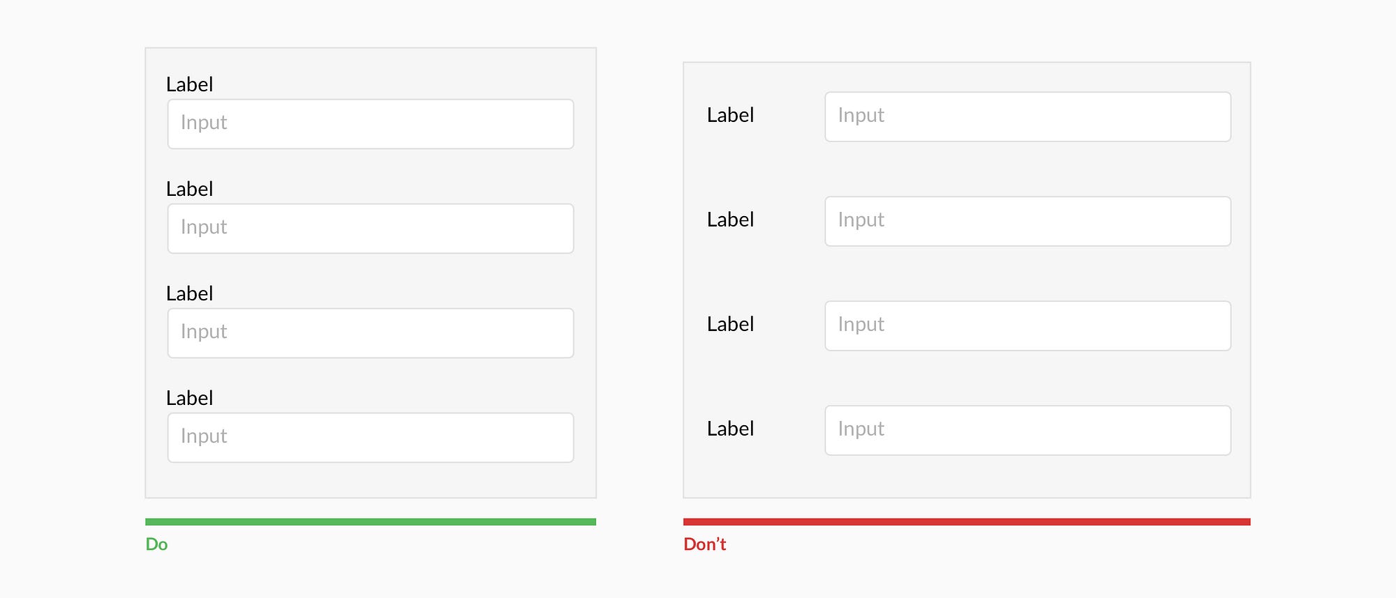
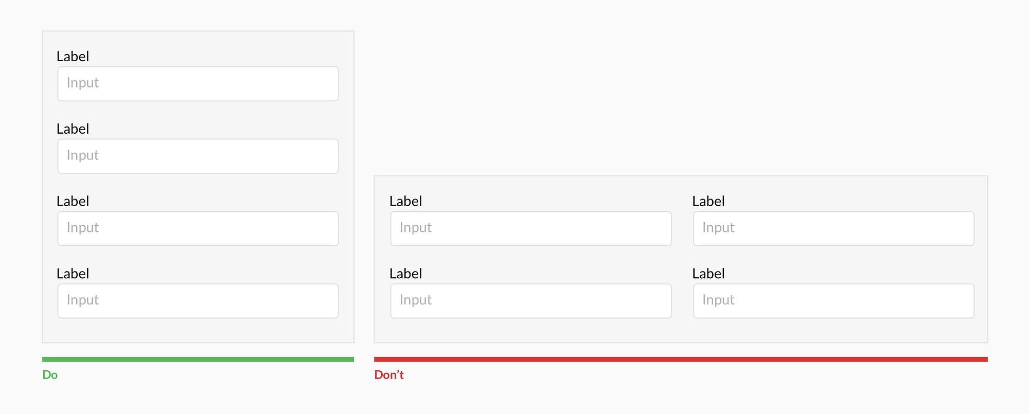
Forms should be one column


Multiple columns disrupt a users vertical momentum.


Top align labels


Users complete top aligned labeled forms at a much higher rate than left aligned labels. Top aligned labels also translate well on mobile. However, consider using left aligned labels for large data-set entry with variable optionality because they are easier to scan together, they reduce height, and prompt more consideration than top aligned labels.


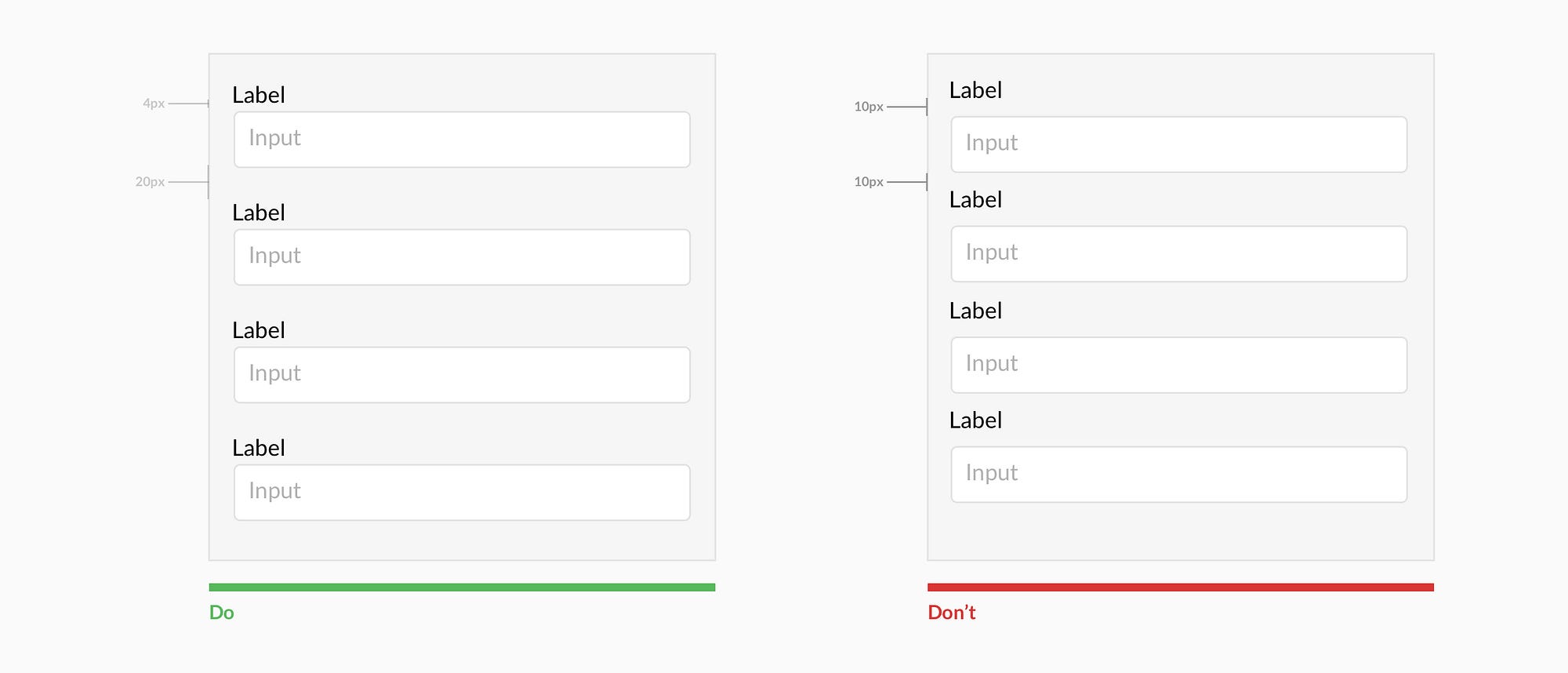
Group labels with their inputs


Present the label and input close together, and make sure there is enough height between the fields so users don’t get confused.

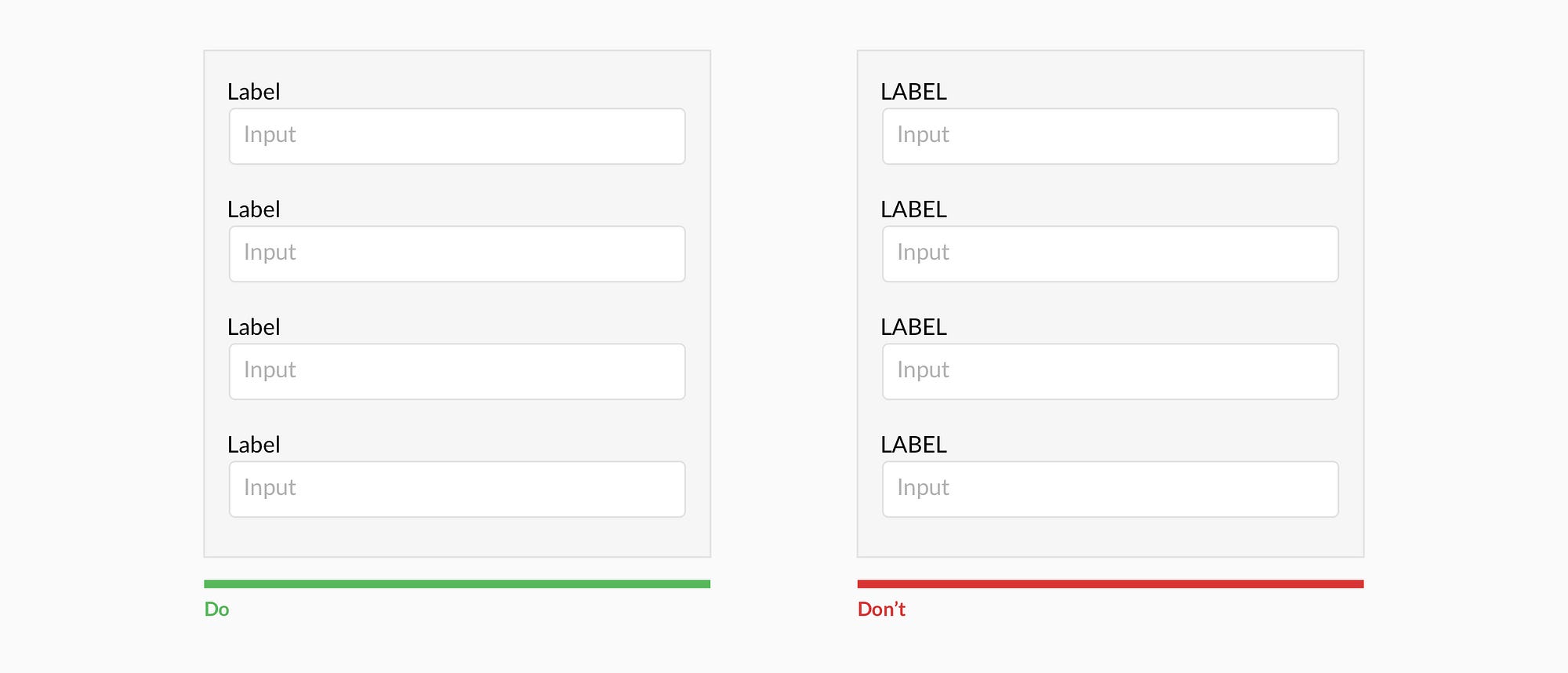
Avoid all caps


All caps is more difficult to read and scan.


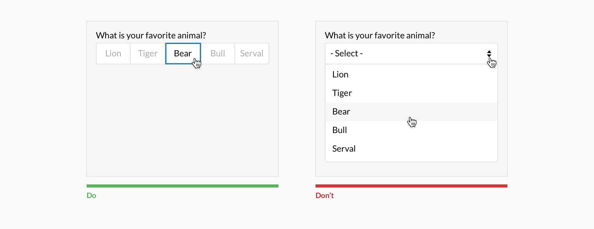
Show all selection options if under 6


Placing options in a selector drop-down requires two clicks, and hides the options. Use an input selector if there are over 5 options. Incorporate contextual search within the drop-down if there are over 25 options.


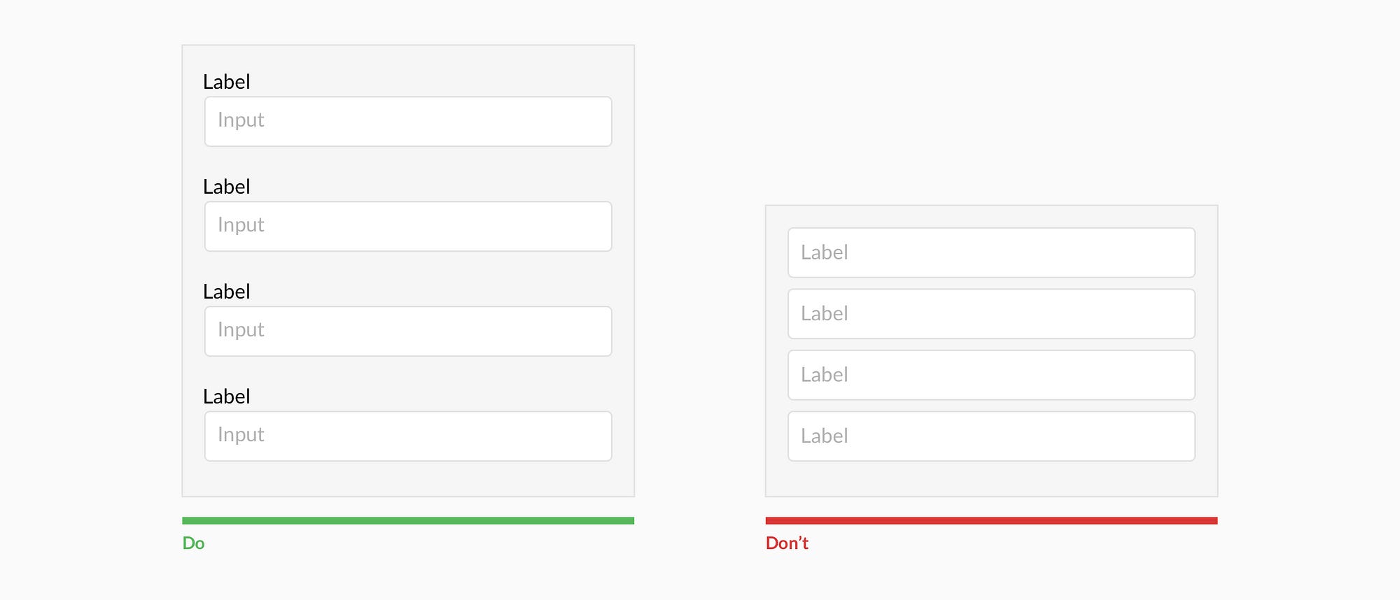
Resist using placeholder text as labels

It is tempting to optimize space by using placeholder text as labels. This causes many usability issues that have been summarized by Katie Sherwin of Nielsen Norman Group.


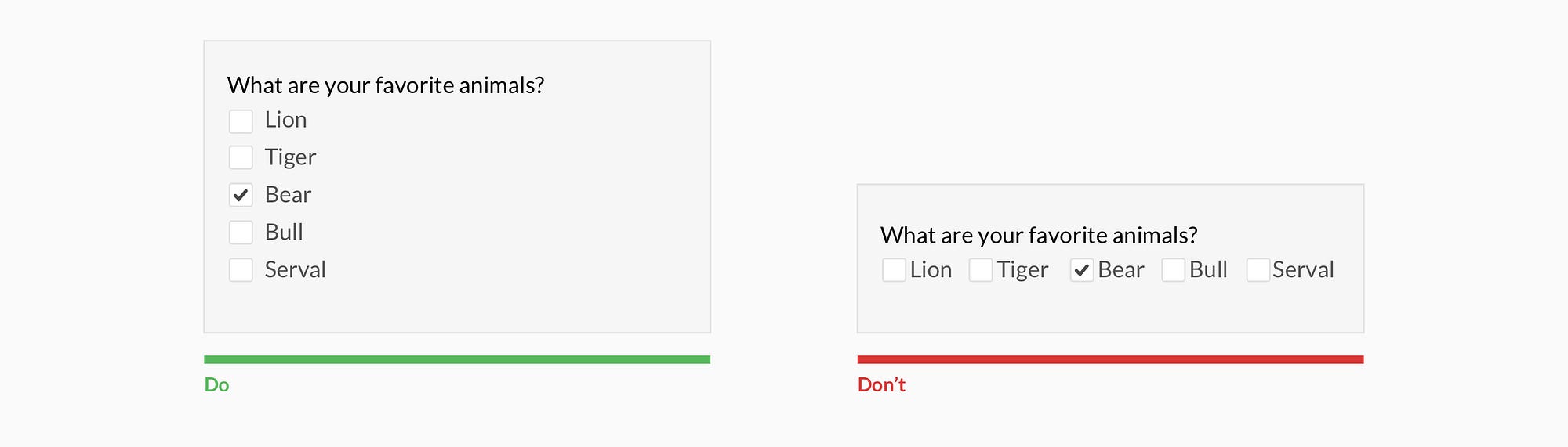
Place checkboxes (and radios) underneath each other for scannability


Placing checkboxes underneath each other allows easy scanning.


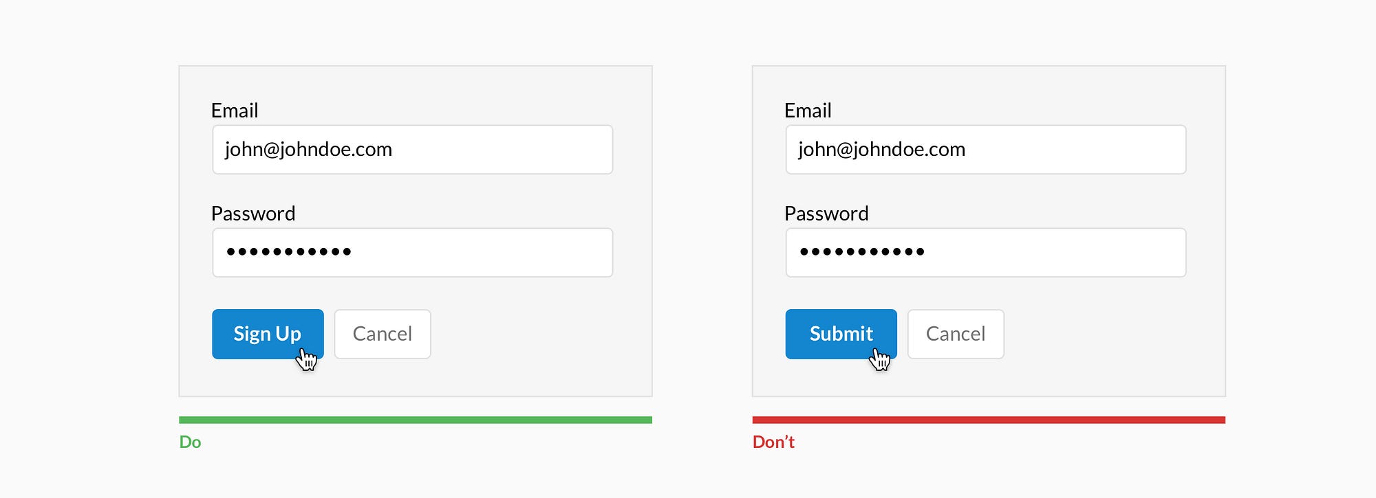
Make CTAs descriptive


A call to action should state the intent.


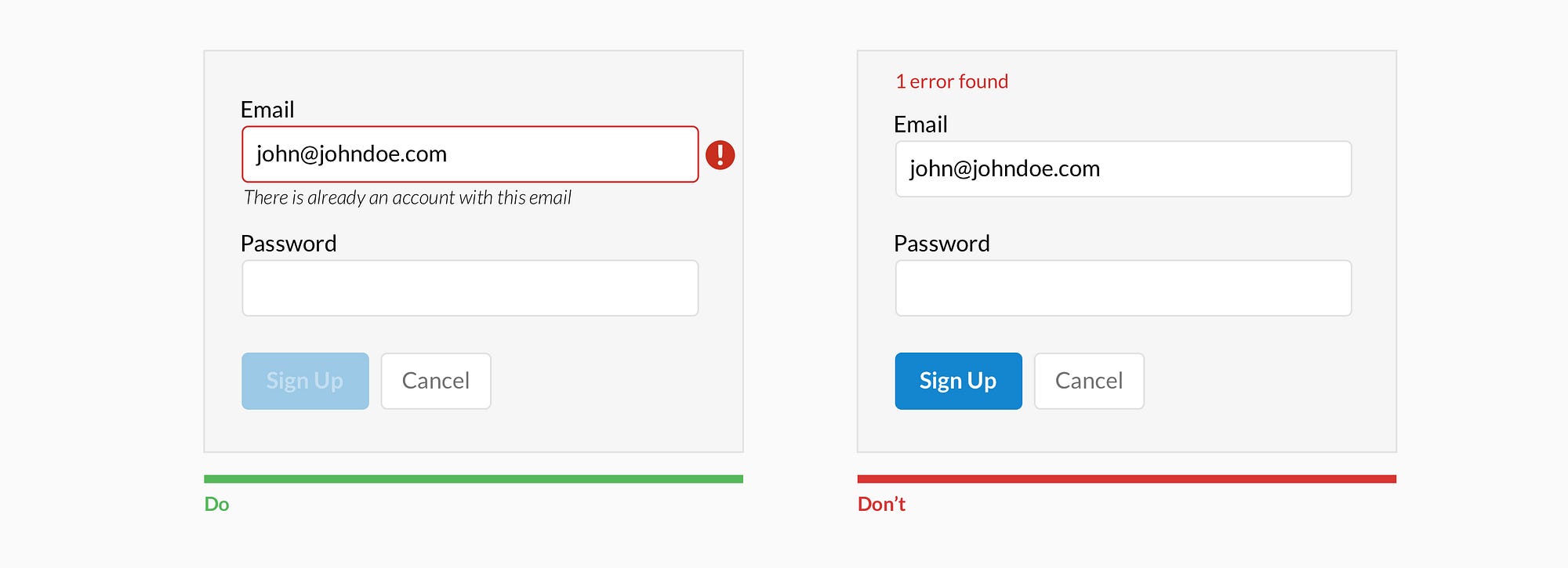
Specify errors inline


Show the user where the error occurred and provide a reason.


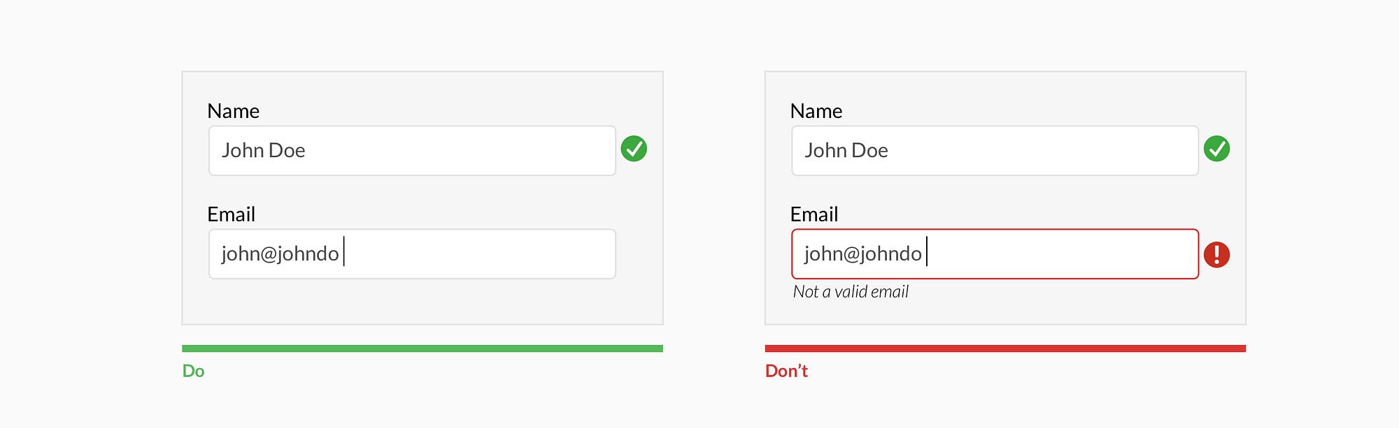
Use inline validation after the user fills out the field (unless it helps them while in the process)


Don’t use inline validation while the user is typing — unless it helps them — like in the case of creating a password, username, or message with a character count.


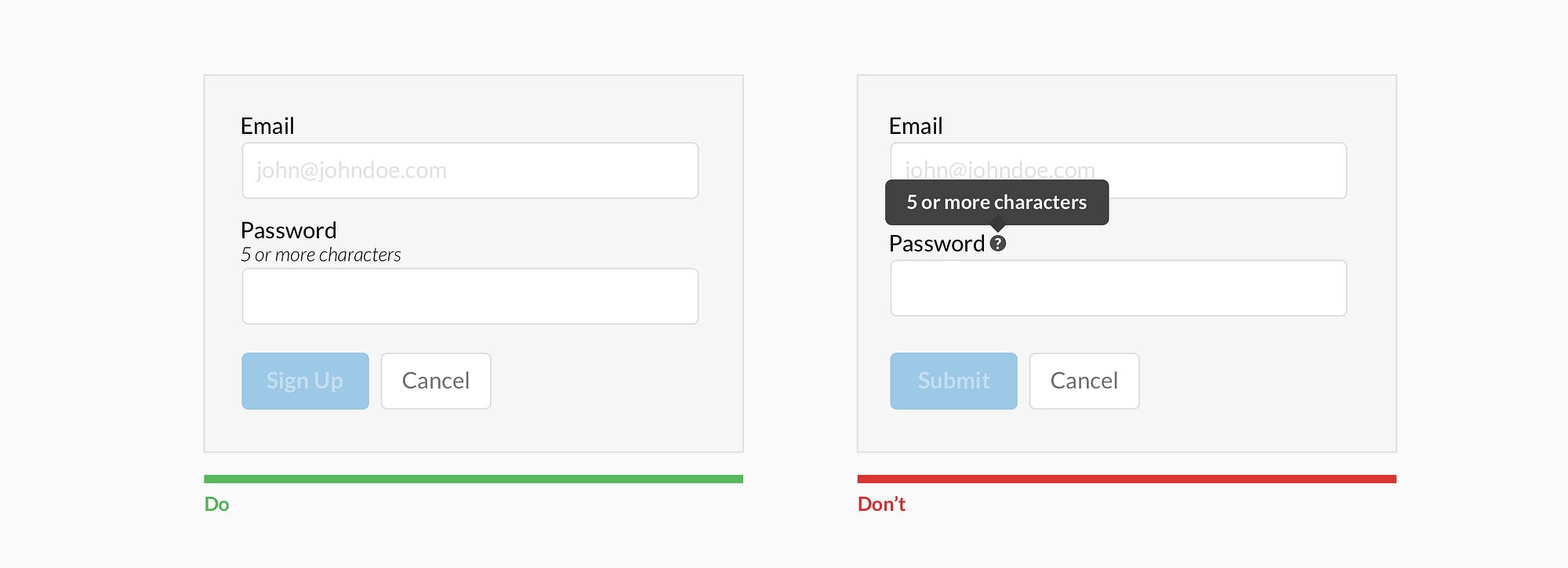
Don’t hide basic helper text


Expose basic helper text wherever possible. For complex helper text, consider placing it next to the input during its focused state.

Differentiate primary from secondary actions


There is a bigger philosophical debate regarding whether a secondary option should even be included.


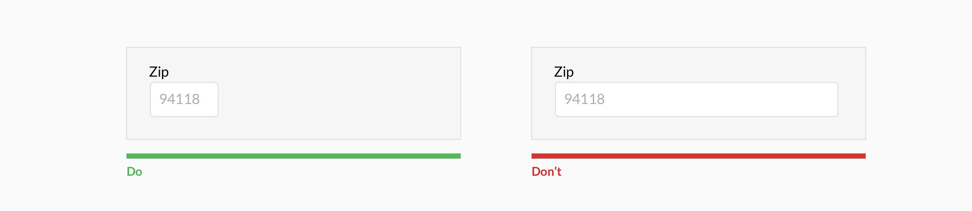
Use field length as an affordance


The length of the field affords the length the answer. Employ this for fields that have a defined character count like phone numbers, zip codes, etc.


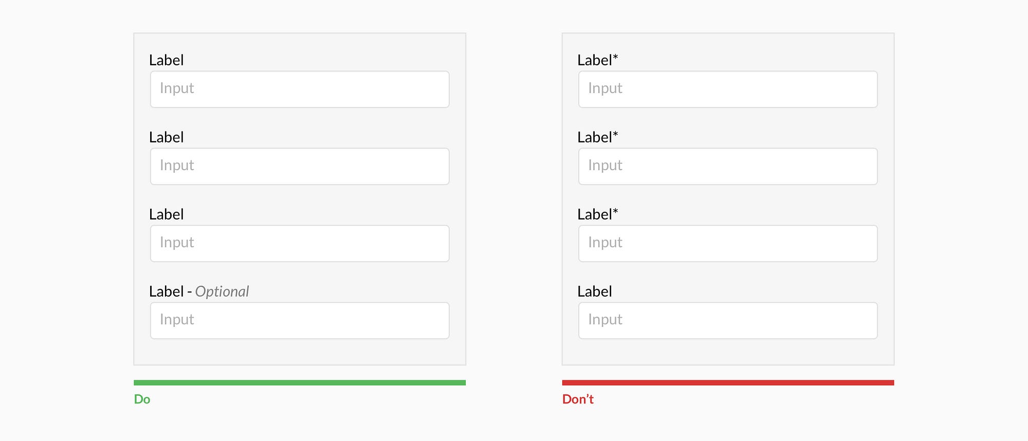
Ditch the * and denote optional fields


Users don’t always know what is implied by the required field marker (*). Instead, it is better to denote optional fields.


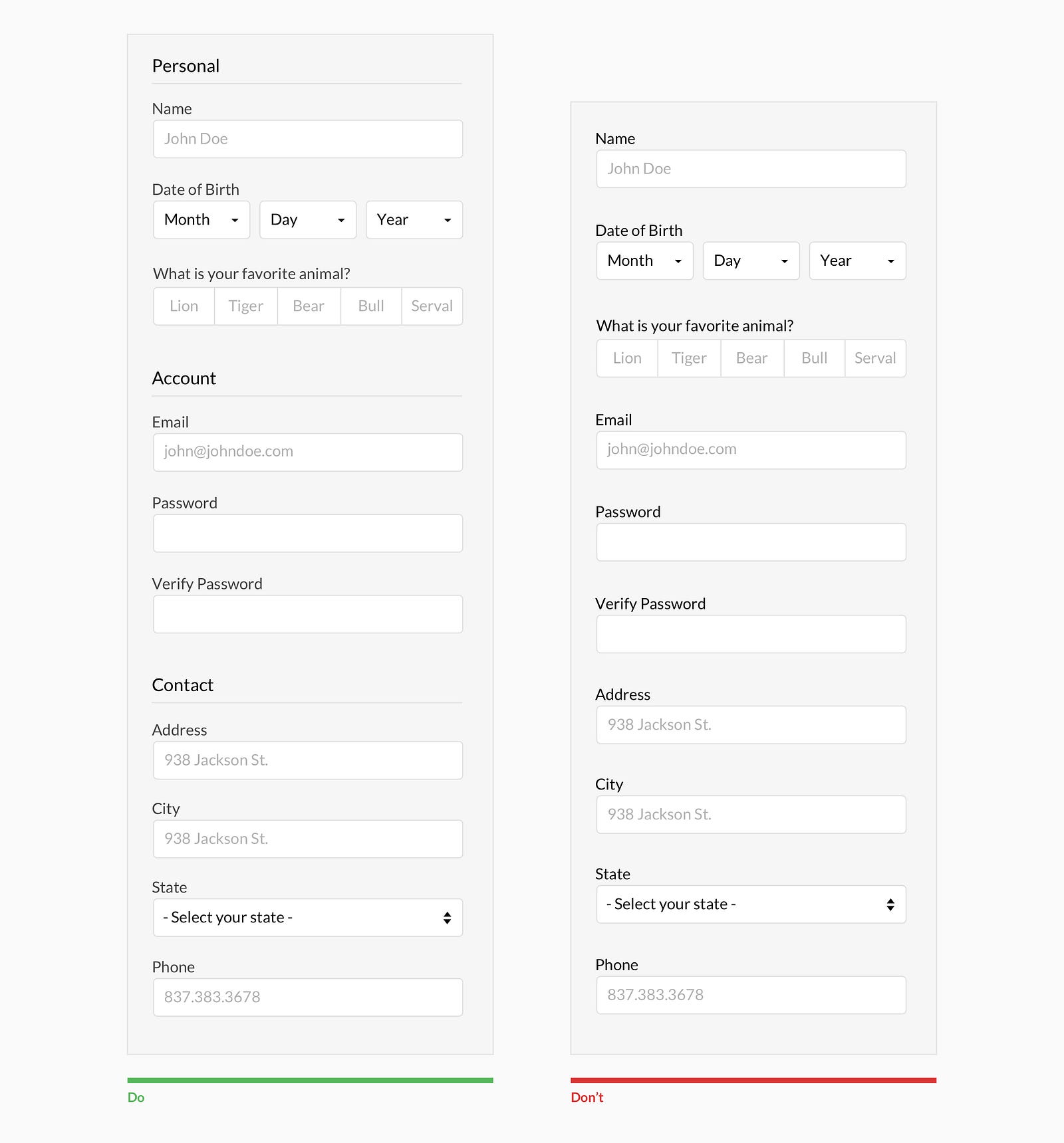
Group related information


Users think in batches, and long forms can feel overwhelming. By creating logical groups the user will make sense of the form much faster.


Why ask?

Omit optional fields and think of other ways to collect data. Always ask yourself if the question can be inferred, postponed, or completely excluded.
Data entry is increasingly automated. For example, mobile and wearable devices collect large amounts of data without the user’s conscious awareness. Think of ways you can leverage social, conversational UI, SMS, email, voice, OCR, location, fingerprint, biometric, etc.

Make it fun

Life is short. No one wants to fill out a form. Be conversational. Be funny. Gradually engage. Do the unexpected. It is the role of the designer to express their company’s brand to elicit an emotional reaction. If done correctly, it will increase completion rates. Just make sure you don’t violate the rules listed above.

Wednesday, May 31, 2017

7 UI Choices That Damage UX

User experience is one of the most important aspects of modern web design. The Google Trends graph for ux design shows how much this field has grown in recent years.
Yet there are still so many websites that push certain design trends which seem like the antithesis of usability. Some are done by accident or negligence, others are done on purpose. The latter are called dark patterns and they’re typically used by marketers to meet some end goal.
But as designers it’s our job to push back and fight for a great user experience. The best way to do that is by shedding light on bad practices and encouraging better ones. So let’s dive into a few of these bad UX practices to see why they exist and how they might be solved.

1. UNWANTED MODALS

The general concept of a modal window is actually very clever. It lets developers add content over the page without using JavaScript to pop open a new tab.
But modal windows are not the problem. Unwanted modals are the problem and they always drag down the user experience.
I’d say there are three different types of “unwanted” modal popups:
  • Exit intents which open when the user’s mouse leaves the page body, usually hovering the browser tab;
  • Timed modals that open after a set amount of seconds;
  • Scroll modals that open after the user scrolls a certain distance down the page.
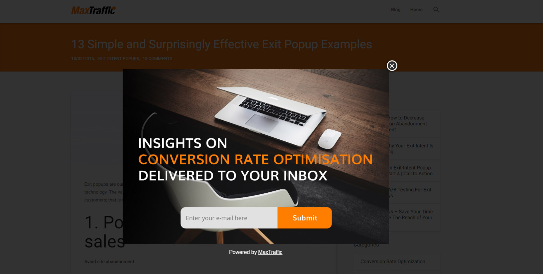
You can see an example of an exit intent modal on this MaxTraffic post using their own exit intent script.
01-modal-window-optins
As much as I’d like to chastise this practice I do understand this from a marketer’s standpoint: it works.
The question isn’t why exit intent/opt-in modals exist. The question is whether you think it’s worth adding an unwanted modal popup to your website.
Is it worth potentially annoying most of your users just for a higher conversion rate?
If you’re more interested in a great user experience then the answer is obvious. Especially with Google now penalizing sites that use annoying interstitials/modals without user interaction.
But these unwanted messages also give modals a bad name, which is tough because they serve a real purpose in UI design. These can be used wisely, like with modal signup fields or information-based modals triggered from a user’s mouse click.
Or they can be annoying marketing messages that just appear seemingly out of nowhere. And don’t get me started on modals that won’t close even when clicking the background.
I really can’t fault marketers for using these modals because they convert well. But they’re also ruining the user experience for everyone else on the web.

2. GUILT IN COPYWRITING

I recognized this trend years ago but I couldn’t put it into words until I read this article by Katie Notopoulos. She uses plenty of great examples to show how guilt-based copy-writing annoys users and increase signups.
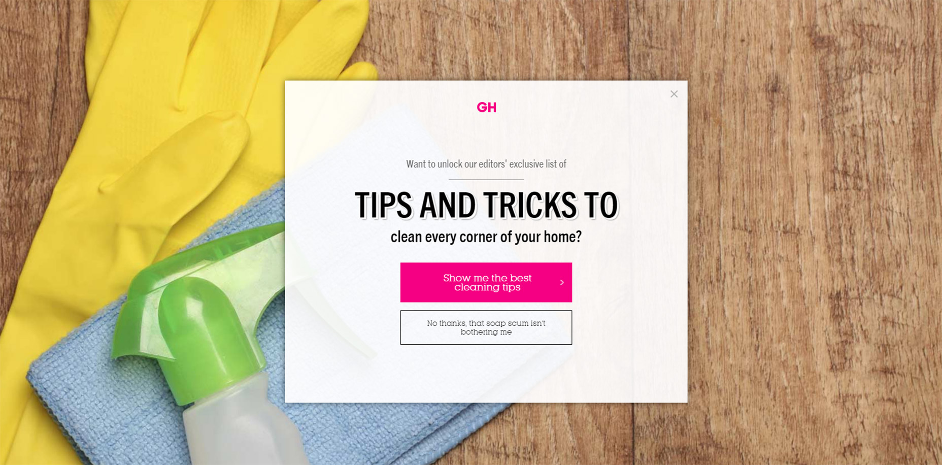
This writing style appears in those annoying modals I just covered. But this writing can also appear in sidebar fields or in-content opt-in forms. One example from Good Housekeeping is just terrible (hover the browser tab to trigger).
02-good-housekeeping-modal-guilt
The goal with this guilt-ridden copy writing is to make the user feel so bad that they second guess their choice to close the window. It usually follows a formula that forces the user to click a nonsensical statement that’s unrelated to closing the window.
For example, a modal might offer you a free eBook on web design. The subscribe button might be simple but the cancel button might read “No thanks, I like sucking at design”. There’s actually a whole Tumblr site devoted to this shaming copy-writing.
This is another example of a technique that works from a marketer’s standpoint, but certainly holds little value from a UX standpoint.

3. FULL SCREEN INTERSTITIALS

It should go without saying that completely taking over the screen with an opt-in or squeeze offer is just plain obnoxious.
This trend is like the unwanted modal window on steroids. These interstitials take over the entire screen and block the page unless you close the window. And sometimes it’s almost impossible to close these windows!
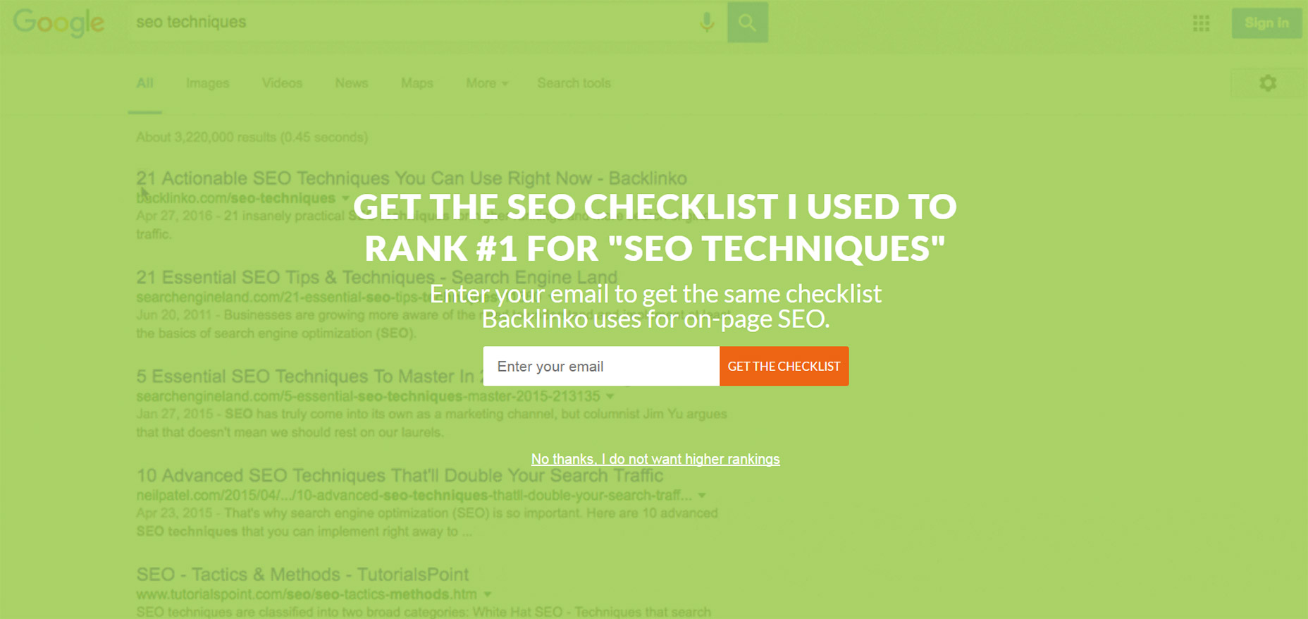
03-backlinko-modal-takeover-window
Backlinko is a fantastic site for SEO tips, but horrible with the pushy marketing.
First time visitors are always greeted with the same fullscreen modal that takes over the entire page. The background uses a video of Google SERPS which is both confusing and ugly.
It places a very tiny X icon in the top right corner and the “no thanks” link is much smaller than the other text, not to mention harder to read. This thing is a usability nightmare on mobile and it’s just one example of a trend that really needs to go.

4. SLIDE-IN ADS/OFFERS

Sometimes you’ll be scrolling down a homepage and see a small box slide into view from the side. This might be a feedback box for user testing, or it might be social sharing links or even a discount/promotion.
I can deal with these every so often. If they stay out of the way and aren’t too obnoxious then, whatever.
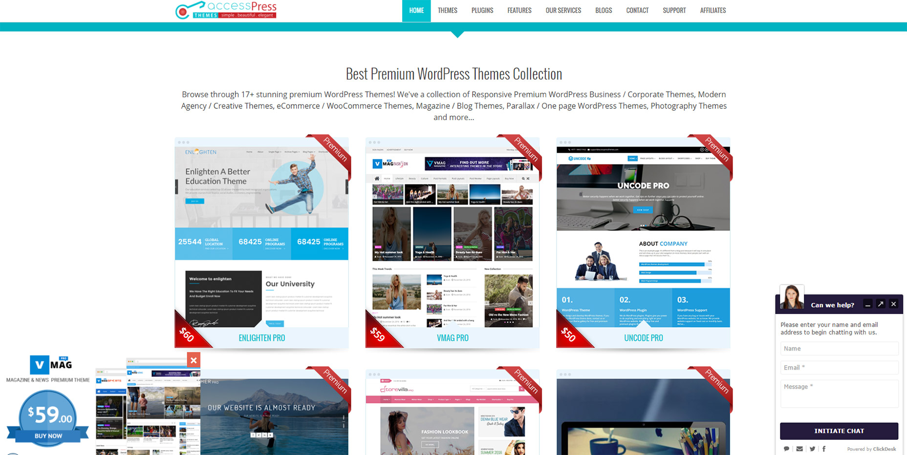
But on sites like AccessPress you can find at least 2 different slide-in boxes on either side of the page, and sometimes even a 3rd!
04-side-sliding-windows
This isn’t meant to shame AccessPress or any other sites in this list. I’m just using this as an example to show how poor UX trends can go too far.
If you have a client who wants this slide-in feature try to make it subtle. No ding noises, no flashing graphics, and preferably no wacky animations. If a user wants to learn more they’ll take the time to read it.

5. CUSTOM SCROLLING

Most trends in this post have been marketing-oriented because, as Gary V says, marketers ruin everything.
But custom scrolling can’t be blamed on anyone. It’s just a trend that’s been around for far too long and feels like a remnant of an older web. Nowadays browsers like Chrome have their own custom scroll features that users can enable/disable on a whim.
But websites like Click and Grow still have these annoying JS-based scroll features that turn navigating the site into a chore.
Usually these custom scroll animations have one of two effects. Either the scroll goes too fast beyond where you wanted to rest the page, or it goes too slow and you have to whip your mouse wheel just to move. Why would any designer think these two options are better than the default?
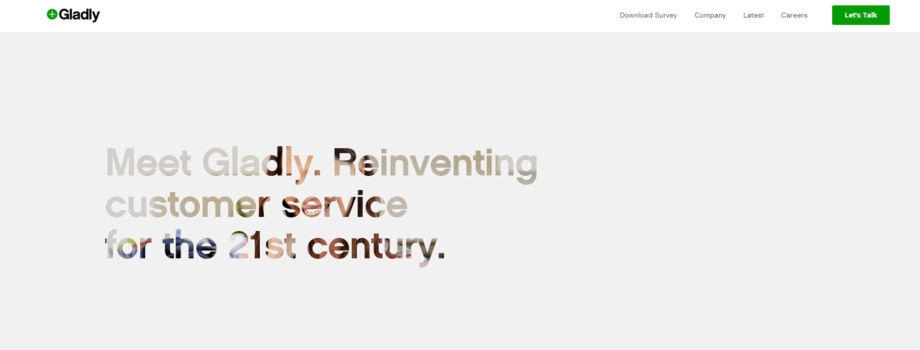
Tied into custom scrolling is a newer trend I’ve seen on single page layouts. They have fullscreen page “sections” where your scroll wheel only moves down one section at a time. Gladly has this trend on their homepage.
05-gladly-homepage
My problem here is the same with fixed scrolling. It takes power away from the user.
The Gladly section animations take way too long to complete. The Internet moves fast and Internet users always want it a little faster. So any type of custom scrolling that ultimately slows down the experience is just bad UX.

6. NAV MENUS WITHOUT PADDING

This is a tough trend to explain but you know it when you see it.
Every site has a navigation menu and most links have padding around them. But sometimes the padding isn’t clickable, so to navigate you need to click on the exact block area of the text itself. This drives me crazy!
It takes maybe 30 seconds to move CSS padding from a link’s container element to the link itself. The navigation menu looks the same, but now users can click the link and the space around the link. So much easier!
Take a look at Tilde’s navigation for a live example.
The craziest thing about their site is that their mobile responsive navigation actually does have clickable padding. Only their desktop nav is plagued by the text-only click area.
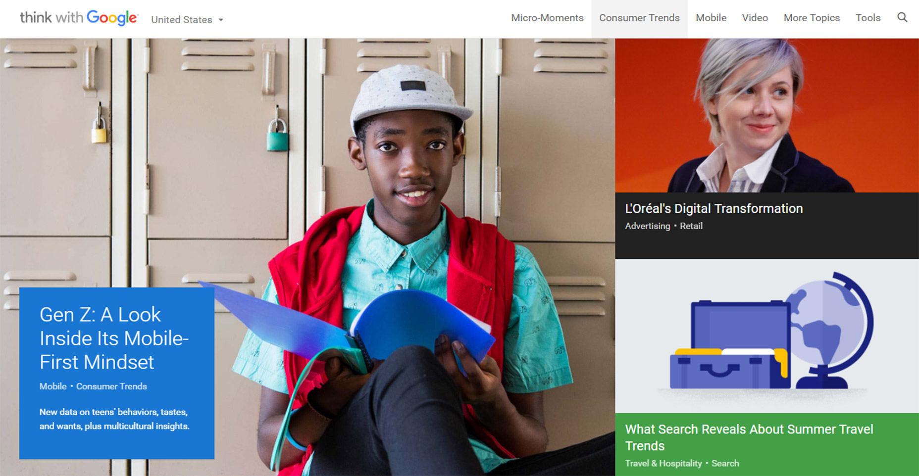
On the flip side you’ll find many sites that understand the importance of this very subtle yet crucial detail. One example is Think With Google where you can actually see the full link size while hovering:
06-think-with-google-nav
Just keep this in mind going forward because it’s a very simple alteration that can have a huge impact on usability.

7. PAGINATED LISTICLES

Last but not least I’m poking a bit of fun at blogs that design their content into one-item-per-page listicles.
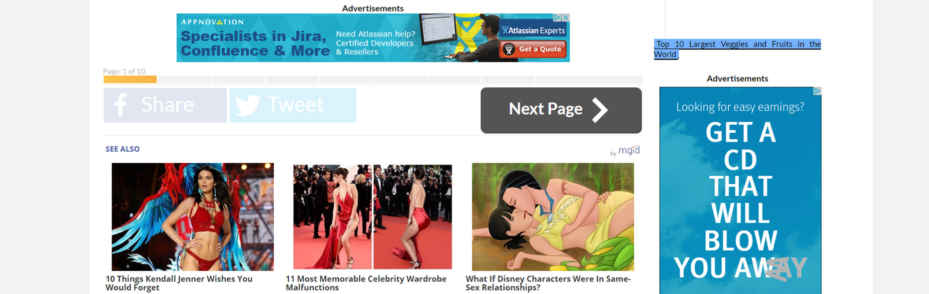
I cannot imagine that any person enjoys constantly clicking the “next” button to read through a clickbait post. You’ll find tons of these on many different websites and none of them consider the user’s experience.
08-next-page-browsing-listicles
This trend is mostly about page views and ad revenue more than anything else. And while it’s not really in the designer’s control to fix this, it does relate to the user experience and webmasters/designers should do all they can to avoid these multi-paged articles.
I can only imagine how many other trends are out there annoying users on a daily basis. But I hope by sharing these ideas more designers will work towards eliminating these dark trends and reducing their presence on the web.
Tuesday, April 5, 2016

Things To Know Before Designing A Great App

User interface design (known also as user interface engineering) encompasses the designing of computing devices, machines, communication devices, software apps, and websites.
The main focus of UI design is to create memorable experience and to guarantee excellent interaction with users. The experience ought to be simplified and efficient, meaning that users will be able to accomplish their tasks without problems or unnecessary delays. This is why UI design is known as the most user-centered design.
Great interface design will enable users to accomplish their tasks with a feeling of ease and comfort. Designers have the essential task of balancing between visual appearance and functionality, in order to provide technically acceptable, but also beautiful design.
Things To Know Before Designing An App
Image source: Julien Renvoye
When reading about things to know before designing an app, you should also have in mind that the system you are designing ought to be modifiable and adaptable to users’ needs.

Platforms for app development

UI style differs significantly from one operating system to the other (try and compare Android, IOS and Windows). Designers should be experienced in a particular platform, so that they will make a suitable design. Choosing the inappropriate platform for a specific UI design would cause some incompatibility.
When developing a non-native app (HTM/CSS), designers should apply the so-called Flat Design style. Skeuomporphic style on the other hand is not applicable because it is complex and slow, and each object has to be modified in order to use images. The final result would be a ‘heavy’ app which takes time to load an image.

The final user doesn’t like changes

The final user doesn’t like changes
Image source: Daniel Klopper
It is sad, but it’s true. It is because change shortens the time users have on disposal for getting their job done. Most final users are always afraid they’ll click ‘the wrong’ thing and they’ll break their device when working in a modified environment. It means that none of the UI changes you may introduce will be positively accepted at the beginning (unless you work carefully and you make a ‘facilitating’ design).
Changes shouldn’t be constantly applied. Your users need to rely on your app’s consistency and you have to make sure that what they’ve learned can be applied for a long time. The essential elements that need to remain unchanged are: layout, design and language. In such cases, users will understand the app much better and they will become much more efficient when operating with it.

Good content creates UI confidence

Good content creates UI confidence
Image source: Gleb Kuznetsov
UI is a deal between you and your customers: you give your customers excellent-quality content, and they are willing to cope with the complexity of your design in order to obtain it. This explains the existence and excellent performance of lower-quality apps that are poorly designed, but have gathered traffic for years so far. It’s a rule-content will always count more than the design standing behind it.

Mobile platforms are different than desktop platforms

asdasdadsasd
Image source: Megan Fox
This is a fact. Your users distinguish mobile from desktop platforms, so don’t expect them to approach the platforms in the same way. Apple is clearly pushing towards the identification between IOS and OSX, but that won’t be such a big user problem because users are familiar with the IOS interface for quite a while.

Using standardized buttons

The biggest dilemma is to choose between ‘Cancel, OK’ and ‘OK, Cancel’ (or Apple’s ‘Previous, Next’ flow).
Designers usually go for Windows’ well-established ‘Cancel, OK’ flow, since most of the population is right handed and they need a subconscious shortcut into approving an activity. Some designers also use colors (green for OK; red for Cancel) believing that in this way, users are enabled to depict the options clearly.
Using standardized buttons
Image source: Padam Boora
Shadowed buttons are not uncommon for flat and skeuomorphic design. In such case, it is recommendable to take really good care of consistency, as the shadow angles need to remain the same throughout the entire website/app. It is a way of replicating daylight experiences, where sunlight disperses equally on any of the present objects.

Keep users focused

Keep users focused
Image source: Alex Volk
In web design, focused equals entertained. You’ll need both dynamic and static elements, and other exiting aspects of UI interface. Your goal is to attract users and to maintain their attention. We recommend you to use bold colors and interesting images.
Human eyes are not so linear to neglect your motions, edges, and patterns. This is exactly why you should avoid distracting or irritating content if you want them to stay focused on something else. Marketing, however, makes the most of this knowledge.
Moderate employing of visual objects can help users to focus and to understand how to perform operations on your website/app without making an effort for understanding technicalities. Visual information is short and concise, and provides an excellent orientation sense among users. At the end of the day, they came looking for simplicity and an easy UI. They don’t really want to know what is happening behind the curtain.

Give them feedback

Remember that interface is a form of interaction-you need to be there for your users at every moment, and to let them know when they do something wrong/right. They should have instructions, guidelines, and to be informed on every exception. We are not talking about user support (that’s not a designer’s problem) but about small cues or messages which can easily take them to the desired result.

What users think about role-interface actually counts

Why would you design a great user interface, if there weren’t the users to evaluate it? You might think users have no enough knowledge to detect the flaws of your design, but they are the first ones to notice complexity or to tag a design as inefficient. Therefore, final users’ feedback should be considered-without user’s affection, even the loveliest website will be ignored.
Users’ opinion is the essential tool of outstanding designers.