Showing posts with label Website Layouts. Show all posts

Wednesday, May 31, 2017

Ways to Design at Lightning Speed

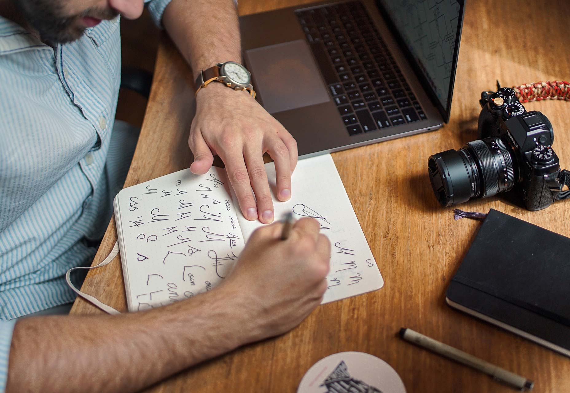
Some of the world’s best designers – and even the best designers where you work – all have something in common: Many of them know how to work at lightning speed. And the work is still good.
While part of this speed work comes with experience, some of it is comes back to solid work habits and great time management. Working quickly and efficiently can be great for helping you make good with the boss, and for freelancers, taking care of tasks quickly can result in the ability to take more jobs (and increase your earning potential).
So how do you get faster without sacrificing quality? Here are seven tips that you can start using today.

1. CREATE SHORTCUTS AND STYLES

No matter what software or tools you prefer, a set of basic libraries, styles and presets will make your life easy. That’s not to say you use the exact specification for every project, but it establishes a starting point so that you can switch fonts, colors or layouts with just a click.
sebastian-mantel-105235
One of the first things you can do is establish a set of universal quick, or shortcut, keys for all programs you commonly use. (I love the “Duplicate” function, but every piece of software uses a different keystroke combination; I always create my own cmd+d, so that the command is universal and not clunky.)
Take this a step further and create basic styles for common text bits – body text, headlines, subheads, captions, quotes – with quick keys. Then when you need to change a font, size or color, styling is universal. (This can make work in Adobe products a breeze and can dramatically speed up the prototyping process before the first line of code is even written.)

2. ORGANIZE CONSISTENTLY

There’s no right or wrong way to organize your design files. (We aren’t getting into that here.) What matters is that you have a consistent system for how you do it.
If you organize files in the same manner every time, using folders, layers or labelling, then you will always know where to find things as you move through iterations of the design. Other members of your team will appreciate this consistency as well, because it will make it easier for them to use your projects as well, while understanding the filing system.
This applies both to how you organize objects and information within files and how you create and use folders outside of the actual project file.

3. HAVE A GO-TO LIST OF TYPEFACES

For the projects that don’t come with a set of typography specifications, it can help to have a short list of go-to typefaces to jumpstart projects. Your arsenal should include a couple of serifs, and few sans serifs and one or two novelty or script options for special use.
marcus-depaula-43304
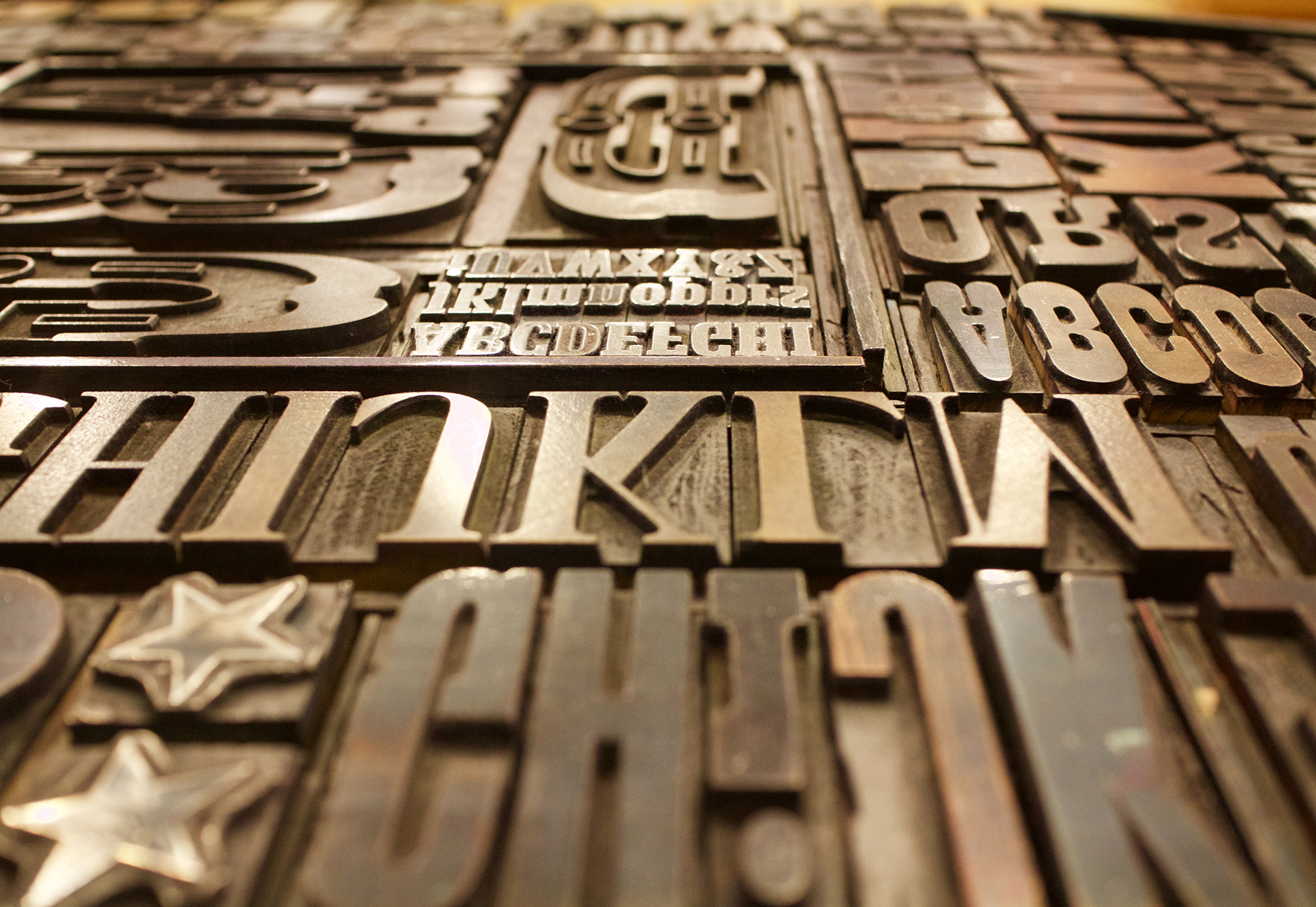
You won’t always end up using typefaces from this “de facto palette,” but it will get you moving quickly on the overall design outline. It will help provide a starting point for font pairing combinations that you can actually show a client almost immediately (and get a feel for how they react to those type styles).
Bonus tip: This concept works great for color palettes, too.

4. HOW TO USE THE RIGHT TOOLS

Using the right tools for the job can make all the difference in the world (and prevent a lot of rework later). Think of how many times you’ve come across a logo in a raster format when the right tool is vector-based software, such as Adobe Illustrator.
This applies to every aspect of design work, both for online projects and printed materials. As a general rule, anything that’s part of a branding scheme or might be needed for multiple uses (logos, characters, iconography) should be designed in a vector format. You can also scale it down or save other files types, but you can’t go from a gif to a scalable image. One time use objects and elements can be designed using small, raster formats or with CSS tools.
Remember, no matter what file format you need for the final version, save everything in a native file for easy access later. Native files are a lot easier to edit and adjust. 

5. USE PREMADE PARTS

Repeat after me – you do not have to create everything from scratch to be a good designer. Particularly when it comes to website projects, use available kits and tools as appropriate to speed up workflows. Most buttons don’t look that dramatically different; it’s ok to start with a kit that includes buttons, icons or other user interface elements. And it will save you a lot of time.
If you plan to use some premade parts of kits, invest in a high-quality option that’s easy for you to edit and adjust. A set of buttons won’t do you any good if the colors or fonts can’t be altered. (While you are looking for user interface kits to help you get moving quickly, grab a couple of nice mockups as well. Clients love seeing their projects displayed in this manner.)
markus-spiske-207946

6. CUT OUT THE CLUTTER

A clean workspace makes for a happy designer. Cutting the clutter comes in two phases when it comes to your digital space:
  1. Keep files and folder clean and free of old versions or materials that aren’t going to be used. Project files and folders should only contain usable materials. If you want to store older versions, set aside a specific location for those elements.
  2. Clean your computer of distractions so that you can work without checking email or Facebook or getting lost in shopping online. (Admit it; this has happened to everyone.) When a project is pressing or even if you are just “feeling it,” turn everything else on your computer off (especially those pesky notifications) so you can focus on the work at hand. You’ll finish sooner and then have time for all that extracurricular activity.

7. START IN BLACK AND WHITE

Every good website starts with a solid wireframe. That mantra can apply to the design of any element. Whether you start with a sketch on paper or screen, a black and white outline can be the first step to creating something with plenty of practical application.
brad-neathery-248309

Used as a tenet of logo design, a black and white concept is something most projects will need to include at some point anyway. (You might need to use the design in single color printing or all white over a hero header image.)
You’ll end up doing a lot of backtracking if your design won’t work in these ways. An efficient process starts with black and white and then color and details are added once the black and white concept is finalized. 

CONCLUSION

Ready to get faster? Start at the top of this list and work through the tips until you are starting to shave time off design projects. The key to working at lightning speed (and staying good) is focus. There are so many distractions that take us away from good processes and work practices, go back to the basics to get reacquainted with good workflows.
And good luck. Becoming a quicker designer takes time and patience. Give yourself room to grow.
Creative Commons photos in this article are from Unsplash.

Friday, July 18, 2014

The secret to designing website layouts without CSS floats

If you have been designing for the Web at all over the past decade you are undoubtedly familiar with the CSS float property. Since the industry (thankfully) adopted the principle of tableless layouts, floats have been the weapon of choice most of us use to lay out our web pages, but is it the best choice?
Despite the popularity of this method it is regularly the cause of frustration and confusion for new designers and becomes a problem when floated elements are left “uncleared”. These uncleared floats can cause multiple issues ranging from sloppy aesthetics to complete inaccessibility. With a small project it’s pretty simple to trouble shoot a float issue but when working on a large web app with dynamic content it can be a tad bit trickier, eating up precious time and costing you money.

A better alternative

Even when used correctly, floats change the normal flow of a document which can cause unexpected behavior and limit styling options. Since a float is not in the ‘normal flow’, non-positioned block boxes created before and after the float box flow vertically as if the float did not exist. With responsive design, where sizes are dynamic and flowing to fill up available space, this is far from ideal. What if there was a better way?
Flexbox is the exciting future of web layouts but, for those of us that must support legacy browsers, this is still a far-off dream. The display property, on the other hand, has full support and can provide almost all the layout functionality of a float without the drawbacks.

inline-block to the rescue

The display property, in combination with float and position, determines the type of box or boxes that are generated for an element. In a very simple nutshell, block level elements span the entire width of their container forcing all subsequent elements to the next line while inline level elements only span the width of their contents, allowing any inline level element to flow up next to it on the same line.
Applying display: inline-block to an element generates an inline-level block container. Think of the text inside a tag. They are all ‘inline’ with one another while the tag itself is a block-level container. By understanding this behavior we can use the display property to inline our content next to each other. Since all of our elements remain in the normal flow, we have no issues with a collapsed parent element. In my opinion this is a much cleaner solution which still achieves the desired result.
See the Pen Inline-block over floats by davidicus on CodePen.

The technique

This method works just about anywhere you would normally apply the float. Let’s take a look at the classic main/sidebar layout. For the HTML we have a wrapper element with two child elements inside like so:
<div class="wrapper">  
        <div class="mainContent">
            <!-- Main content goes here -->
        </div><!-- No Spaces   
     --><div class="sideBar">
            <!-- Sidebar content goes here -->
        </div>  
    </div>
Our CSS:
        .wrapper,
        .mainContent,
        .sideBar { 
            //change the box model for simplicity
            -webkit-box-sizing: border-box;
               -moz-box-sizing: border-box;
                    box-sizing: border-box;
        }
        
        .wrapper {
            font-size: 1em;
            padding: 1.5em;
            width: 100%;
        }
        
        .mainContent,
        .sideBar {
            display: inline-block;
            vertical-align: top;
            width: 100%;
        }
        
        @media (min-width: 700px) {
        
            .mainContent {
                margin-right: 5%;
                width: 60%;
            }
        
            .sideBar { width: 35%; }
        }
Just like that we have the main content and side bar laid out.
The direction of the “float” is determined by the text alignment of the wrapper div. Since default alignment is left we didn’t have to do anything. However, you could easily set it to center or right to achieve some layouts that are not even possible with floats (more on that later). Notice the “no spaces” comment placed in between the two child divs of the .wrapper container. This is important to note, and the reason for doing it is the one “con” about this method.

White space

Let’s go back to the tag example. When writing text in html all white space is wrapped into one single white space character regardless of the amount of spaces you have in your HTML document. So, any gaps you have between your “floated” elements in the markup will actually register as a space between them in the browser, just like our paragraph text. This will naturally cause your size calculations to be off knocking the last element down to the next level of the page. No bueno! Luckily for us there are several solutions to fix this little issue. Such as:
  • Set font-size: 0;. The space that we are dealing with is a character space so setting the font-size to zero makes the size of the space zero as well. The issue with this is that you must bump the font sizes of the child elements back up and any ‘em’ sizing goes completely out the window. This could get a bit cumbersome to keep on top of, so this way is not ideal.
  • Remove the space between your elements in your HTML, thereby removing the space from the equation. I did this for a while but it just looked sloppy and made it more difficult to read.
  • Adding an HTML comment between your elements will also remove the space character as it did in our example. This is my preferred solution. The text highlighting in most text editors is such that the contrast between the note and the elements are enough to significantly improve the readability of your mark up. This will also allow you to keep the proper indentation of the actual element itself. 

Floats work for me, why change?

You may be thinking, “This is good and all but why would I change a method that works just fine for me?” Well, even if you are a float master there are certain things that they just can’t do. For instance:
  • The elusive “centered float”, which is oft-times desirable, requires additional markup and multiple CSS properties to achieve. With the display method this is simply done by applyingtext-align: center to the wrapper.
  • The biggest advantage of choosing the display method is the ability to vertically align your content. How often have you wanted to center an element to its sibling? You could use positioning with the negative margin/translate trick but, again, with a responsive, dynamic environment this is not preferable. Instead applying vertical-align: middle; will perfectly center your elements every time with no extra work on your part. (See the Pen Inline-block over floats by davidicus on CodePen.)

To wrap it up

In reality there is no “one size fits all” when it comes to web design and it really boils down to personal preference. I still use floats in certain situations and sometimes it really is the best tool for the job. I do, however feel there is a definite advantage to using the display method. From my experience, I have found it to be the best, least error prone method for dealing with layouts. For those of you that would like to explore this method more, I have created a “Just Say No To Floats” grid: Inline-block Grid with SASS on CodePen.