Showing posts with label Designing. Show all posts

Wednesday, May 31, 2017

Ways to Design at Lightning Speed

Some of the world’s best designers – and even the best designers where you work – all have something in common: Many of them know how to work at lightning speed. And the work is still good.
While part of this speed work comes with experience, some of it is comes back to solid work habits and great time management. Working quickly and efficiently can be great for helping you make good with the boss, and for freelancers, taking care of tasks quickly can result in the ability to take more jobs (and increase your earning potential).
So how do you get faster without sacrificing quality? Here are seven tips that you can start using today.

1. CREATE SHORTCUTS AND STYLES

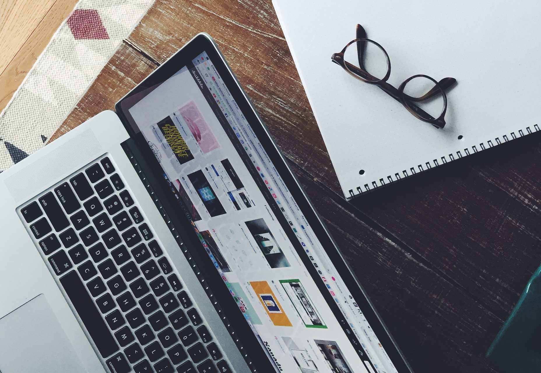
No matter what software or tools you prefer, a set of basic libraries, styles and presets will make your life easy. That’s not to say you use the exact specification for every project, but it establishes a starting point so that you can switch fonts, colors or layouts with just a click.
sebastian-mantel-105235
One of the first things you can do is establish a set of universal quick, or shortcut, keys for all programs you commonly use. (I love the “Duplicate” function, but every piece of software uses a different keystroke combination; I always create my own cmd+d, so that the command is universal and not clunky.)
Take this a step further and create basic styles for common text bits – body text, headlines, subheads, captions, quotes – with quick keys. Then when you need to change a font, size or color, styling is universal. (This can make work in Adobe products a breeze and can dramatically speed up the prototyping process before the first line of code is even written.)

2. ORGANIZE CONSISTENTLY

There’s no right or wrong way to organize your design files. (We aren’t getting into that here.) What matters is that you have a consistent system for how you do it.
If you organize files in the same manner every time, using folders, layers or labelling, then you will always know where to find things as you move through iterations of the design. Other members of your team will appreciate this consistency as well, because it will make it easier for them to use your projects as well, while understanding the filing system.
This applies both to how you organize objects and information within files and how you create and use folders outside of the actual project file.

3. HAVE A GO-TO LIST OF TYPEFACES

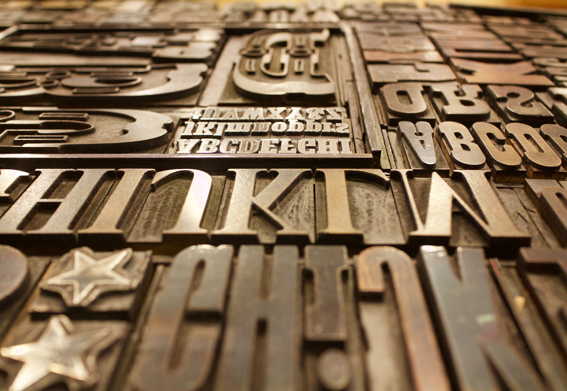
For the projects that don’t come with a set of typography specifications, it can help to have a short list of go-to typefaces to jumpstart projects. Your arsenal should include a couple of serifs, and few sans serifs and one or two novelty or script options for special use.
marcus-depaula-43304
You won’t always end up using typefaces from this “de facto palette,” but it will get you moving quickly on the overall design outline. It will help provide a starting point for font pairing combinations that you can actually show a client almost immediately (and get a feel for how they react to those type styles).
Bonus tip: This concept works great for color palettes, too.

4. HOW TO USE THE RIGHT TOOLS

Using the right tools for the job can make all the difference in the world (and prevent a lot of rework later). Think of how many times you’ve come across a logo in a raster format when the right tool is vector-based software, such as Adobe Illustrator.
This applies to every aspect of design work, both for online projects and printed materials. As a general rule, anything that’s part of a branding scheme or might be needed for multiple uses (logos, characters, iconography) should be designed in a vector format. You can also scale it down or save other files types, but you can’t go from a gif to a scalable image. One time use objects and elements can be designed using small, raster formats or with CSS tools.
Remember, no matter what file format you need for the final version, save everything in a native file for easy access later. Native files are a lot easier to edit and adjust. 

5. USE PREMADE PARTS

Repeat after me – you do not have to create everything from scratch to be a good designer. Particularly when it comes to website projects, use available kits and tools as appropriate to speed up workflows. Most buttons don’t look that dramatically different; it’s ok to start with a kit that includes buttons, icons or other user interface elements. And it will save you a lot of time.
If you plan to use some premade parts of kits, invest in a high-quality option that’s easy for you to edit and adjust. A set of buttons won’t do you any good if the colors or fonts can’t be altered. (While you are looking for user interface kits to help you get moving quickly, grab a couple of nice mockups as well. Clients love seeing their projects displayed in this manner.)
markus-spiske-207946

6. CUT OUT THE CLUTTER

A clean workspace makes for a happy designer. Cutting the clutter comes in two phases when it comes to your digital space:
  1. Keep files and folder clean and free of old versions or materials that aren’t going to be used. Project files and folders should only contain usable materials. If you want to store older versions, set aside a specific location for those elements.
  2. Clean your computer of distractions so that you can work without checking email or Facebook or getting lost in shopping online. (Admit it; this has happened to everyone.) When a project is pressing or even if you are just “feeling it,” turn everything else on your computer off (especially those pesky notifications) so you can focus on the work at hand. You’ll finish sooner and then have time for all that extracurricular activity.

7. START IN BLACK AND WHITE

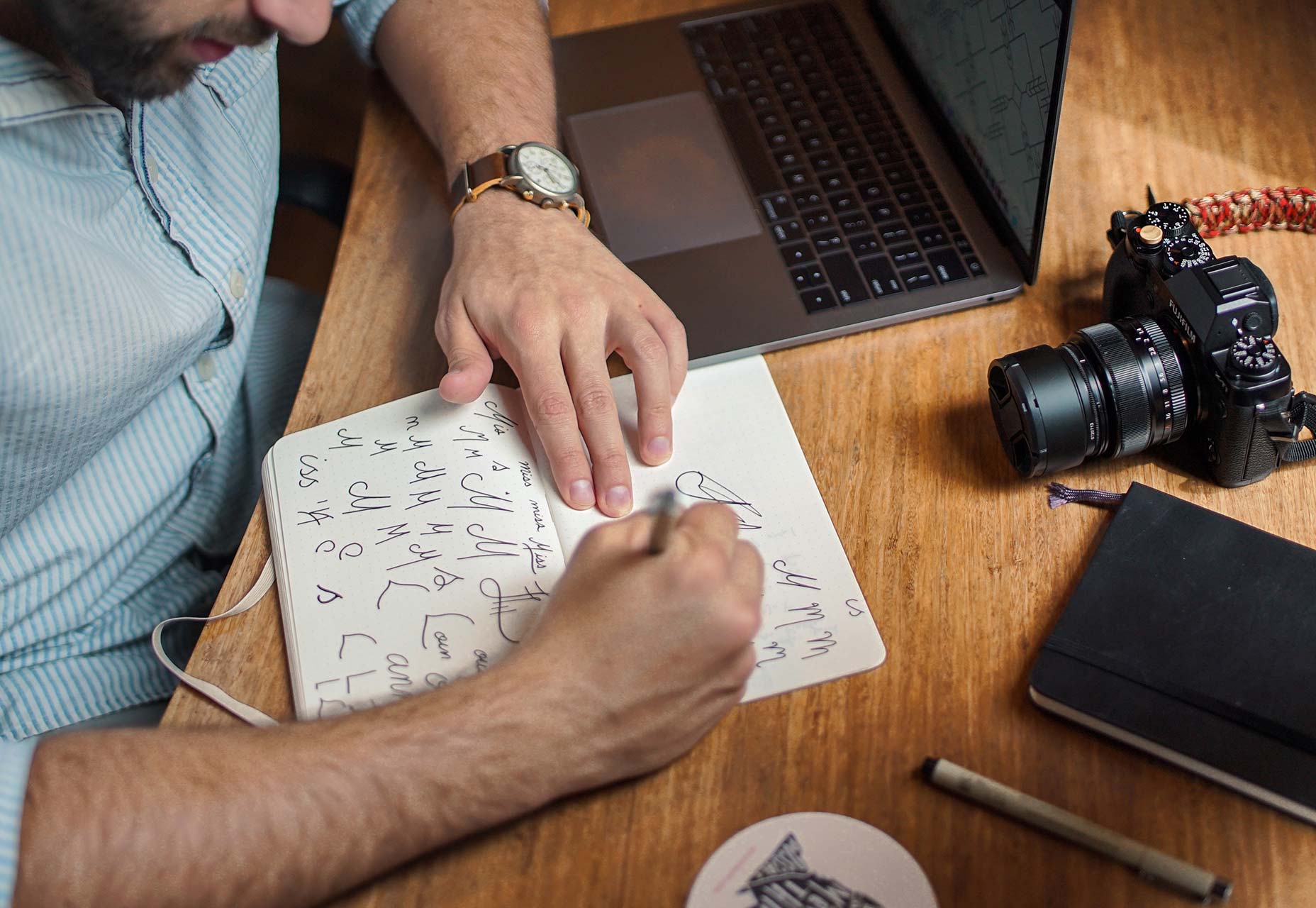
Every good website starts with a solid wireframe. That mantra can apply to the design of any element. Whether you start with a sketch on paper or screen, a black and white outline can be the first step to creating something with plenty of practical application.
brad-neathery-248309

Used as a tenet of logo design, a black and white concept is something most projects will need to include at some point anyway. (You might need to use the design in single color printing or all white over a hero header image.)
You’ll end up doing a lot of backtracking if your design won’t work in these ways. An efficient process starts with black and white and then color and details are added once the black and white concept is finalized. 

CONCLUSION

Ready to get faster? Start at the top of this list and work through the tips until you are starting to shave time off design projects. The key to working at lightning speed (and staying good) is focus. There are so many distractions that take us away from good processes and work practices, go back to the basics to get reacquainted with good workflows.
And good luck. Becoming a quicker designer takes time and patience. Give yourself room to grow.
Creative Commons photos in this article are from Unsplash.

Thursday, October 13, 2016

Essential Skills To Become A Great UI/UX Designer

It’s frustrating to find job offers looking for a UI/UX designer. While these two skillsets are closely related, their skills don’t always overlap. A quality UI designer may not understand user experience psychology. Just like a top-tier UX designer might not be a master of Photoshop or Sketch.
But there is a good amount of overlap, and to be a great UI/UX designer you’ll need to dip a toe into both worlds.
In this guide I want to comb over the fundamental skills that you should learn to promote yourself as a quality UI and/or UX designer. Job security is much easier when you can alternate between both roles. And it’ll be easier for you to see the big picture in any creative project.
If you want a quick overview of specific features I highly recommend browsing this UX checklist.

User Advocation

Remember that a UI/UX designer speaks for the user. But you are not the user. This is an important distinction because most people using your product will not have the same expertise.
This is why usability testing can be so important. Ask users directly what they like and don’t like. Gather feedback. Try to find the root cause of their issues and make only the necessary changes.
Every great UX designer will be a true advocate for the user. The user experience goes beyond a glossy interface to encompass how the UI feels, behaves, and responds to user interaction. Pay careful attention to the details and be willing to scrap ideas even if you think they’re great.
In a situation where you like something that most users don’t it’s generally wise to drop the idea and rework it a little.
User Advocation
Listen to the user’s complaints and try to understand what they’re really saying. This is true of both UX and UI designers, although most user testing involves the UX side of things.
A pretty interface means jack if it can’t operate properly.
Advocate for the user through your words and actions. This is ultimately the #1 requirement of a UX designer. It’s a tough skill to nail down because it’s not exactly a specific skill. But I’d say having an open mind and being willing to rethink ideas will help you understand the user’s perspective much easier.
Here are some related links to read more on this.

Visual Communication

Perhaps the most valuable skill of any designer is visual communication. Most designers get ideas in their head and need to explain these ideas to project managers, developers, or other designers.
Being able to sketch is a great skill to have for this very reason. But you can also communicate ideas digitally by creating digital wireframes, mockups, or interactive prototypes.
Visual Communication
The tool or medium you use to create visual assets really doesn’t matter. Naturally it’s great to have many tools in your toolbox. But if you don’t know Photoshop and only use wireframing tools this can work fine.
It’s very important to communicate your ideas visually to the design team & the development team. It’s possible to do this with words but you’ll have a much easier time showing rather than telling.
Be able to communicate with business and marketing guys too. This means using layman’s terms to explain more complicated features.
Explain what the UX plan is to everyone using whatever visuals or words necessary. One part of this is to master a visual medium(whether sketching or software). The other part of this is communication.
Just because an idea makes sense to you doesn’t mean it’s being explained properly to make sense to others.
Ask your team and clients if they need clarification on anything. Don’t let anyone sit there nodding too afraid to speak up and ask questions. Soft skills are vital to UX work.
Learn to love communication and your job will be that much easier!

Digital Design Software

Not all UX designers know how to use Photoshop, Sketch, or Illustrator. But every UI designer should know at least one of these programs.
The differences between these two jobs are small but noticeable. UI designers must create visuals whether icons, logos, or interface mockups. UX designers are more concerned with how these interfaces behave and how users complete their objectives.
But if you’re going the UX design route it’s still wise to study Photoshop or Sketch(or both).
Just mastering one of these programs will help you express your visual ideas much clearer. You’ll also be much more lucrative to employers.
And with so many online tools it’s important to branch out when needed.
Desktop software like the Adobe suite is crucial to the design process. But UI/UX platforms like InVision and UXPin can both prove vital to your portfolio of skills. These are tools for rapid prototyping and creating interactive demos from scratch.
Digital Design Software
You can accomplish this same task with a frontend library like Bootstrap, but not all UX designers want to learn coding.
Truthfully it doesn’t matter how you create prototypes. But if you have a broad range of skills using various design programs your resume will be much more lucrative.
One last tool I’d recommend learning is a digital UX animation program. The two most popular choices are Principle and Adobe After Effects. These programs let you import digital mockups and manipulate the layers to create custom animations.
Adobe AE
Check out this TutsPlus tutorial if you want to learn more. It’s not easy picking up all these programs but you’ll be thanking yourself later.
A great UI/UX designer should be thinking about every step of the design process. It starts with wireframing and prototyping, then moves through digital graphic/UI design into full interactivity.
These animation programs allow you to simulate interactivity without actually building a demo interface with code. Project leaders like to see these kinds of assets and your skills will prove invaluable to the process.

Empathy & Critical Thinking

Being empathetic seems very abstract but it’s quite powerful. If you can empathize with users you’ll be able to understand their concerns, their struggles, and their complaints with an interface.
The best UX designers consider the target audience for any given project. The user experience design for a dating website will be very different than the UX for an RPG video game. Think critically about your target audience to contemplate and understand what they need.
Interpret the individual problems of each project and consider the target audience by understanding how they think & act.
This is a difficult skill to teach because it requires awareness and understanding. When you watch a user interact with a website you should catch all the little details and nuances about their behavior.
If something was difficult for the user they’ll definitely complain during user testing. But a complaint is a problem, not a solution. As a UX designer your job is to gather user feedback and interpret what it means to come up with real solutions.
Practice by surfing the web and browsing other websites. Write down your complaints. Don’t be afraid to ask “why” every step of the way.
Think about why something behaves the way it does and how it could be improved.
With all the advancements in web technology UI designers can do anything. So technically there’s no limit to the question “what can we do?”.
But not every choice will be a good one. Ask yourself “why are we doing this?”. If you can’t come up with a valuable reason then it might not be a great choice. Critical thinking is vital and should be applied to the entire creative process.
Empathy & Critical Thinking
If you’re struggling to understand empathy in design check out this post to learn more. It’s all about practice and application to get a better idea of how interfaces work. Answers aren’t always binary yes or no. They’re usually fluid in the sense of “yes this kind of works, but could be improved by X”.
To delve deeper into the psychological aspects of UX design read through some of these posts.

Moving Forward

Not all of these skills are mandatory to get your first UI/UX job. But if you ever want to become a great UI/UX designer then you’ll really want to branch into all of these areas and develop your skills as much as possible.
UI designers are concerned more with visuals while UX designers care more about the experience. However both jobs overlap quite a bit. If you can technically fill both roles you’ll be an incredible asset to whatever team you join.

Monday, July 18, 2016

Designing the perfect notification UX

Notifications are all around us on the web and on mobile. Originally intended to help our user experience and usability in general, that’s not always been the case in practice since notifications can quickly become an annoyance if they’re designed poorly or not managed properly.
From desktop-based notifications to the notifications you can toggle on and off on your mobile apps, these alerts are all around us today. Thanks to their prevalence, it’s easy to take their design for granted, which usually leads to unsatisfactory UX.
What makes a notification design good? When and where should a specific notification appear?

UNOBTRUSIVENESS

There’s a fine line between notifications that serve their purpose and help users with timely alerts and reminders, and notifications that are nothing more than distractions because of how they make their way onto a user’s screen. Designers need to know what this fine line is so they can always stay on the UX-friendly side of it.
Notifications should always be as unobtrusive as possible. They shouldn’t interfere with what task the user needs to accomplish at any time, yet they should obviously still achieve their intended purpose of letting users know of something important that’s coming up.
OS X Calendar Notifications 2

On my Mac, for example, OS X is the OS that decides how my calendar app will notify me of important events. I never have my calendar open as with other, more heavily used applications and programs, so the calendar has to find a way to get my attention while still promoting great usability.
When your event gets nearer, my calendar sends me small notifications that slide in at the top right of my screen. Although they’re small, I’ll always see them because the movement catches my eye, and their small size means that they’ll never obstruct what I’m doing. In short, these unobtrusive notifications from my calendar are wonderful because they fulfill their purpose without being a hassle to my UX.

LOCATION-BASED RELEVANCE

One of the hallmarks of excellent usability is pushing relevant notifications to users, particularly when they’re out and about. Smartphones today are so under siege by a plethora of notifications, but not all of them are designed with the user in mind, unfortunately.
Location-based notifications provide a very helpful benefit because of their relevance to where users are in the moment. If an app has properly gathered information from its users, it should already know the user’s likes and dislikes and can therefore push relevant notifications. For instance, when it comes to retail apps, one of the most favorite activities people do on those apps is create shopping and wish lists. This info is a goldmine for the app’s administrators because they can see exactly what’s relevant to a user and what’s not.
If an app has properly gathered information from its users, it should already know the user’s likes and dislikes
Location-based relevance means sending your users notifications when they’re able to take action on a specific purchase because they’re geographically near the actual store.
In the case of, let’s say the Target app, it’s indescribably helpful to design notifications to ping the user when they’re close to a Target store and using info culled from their in-app shopping lists. If there’s a sale on detergent, and the app knows that detergent just happens to be on the user’s shopping list for the week, a notification should be pushed to user when they’re near an actual Target.

LAST-CHANCE CONFIRMATION MESSAGES

There’s nothing more annoying than accidentally deleting an app, which usually destroys all of the information and data inside of it that you’ve worked hard to accumulate over time. Whether it’s your social-media or cloud-storage apps, not having vital data around anymore all because of an accidental tap on your smartphone is frustrating and hard to take.
That’s exactly why notifications that act as confirmation messages should make completely clear what’s being deleted before it’s actually deleted. These popup boxes should have the following characteristics:
  • be big enough to fill the screen width wise so that users can’t easily overlook them;
  • ask a short question of the user that forces them to make a decision;
  • use simple and to-the-point language to communicate what action is being considered;
  • use a bolded headline to catch the user’s attention;
  • feature call to action buttons that are clearly marked and have a distinct color.
Confirmation Message Notification

NUMERICAL VALUES

When we quantify something, it usually gets easier for us to process and handle the task because it allows us to analyze how much personal investment of time we have to put into it. Numbers also help us to prioritize whether or not we want to take on a certain task at the moment. Measurable things are therefore helpful to usability because they allow us to make better decisions.
Notifications that contain numbers allow us to manage our workflows more efficiently
Notifications that contain numbers allow us to manage our workflows more efficiently. When we see a badge, an alert or just an icon that updates us that we have one notification to deal with, we’re likelier to deal with it right at that moment because it implies little work. Looking at one update will take us a conceivably shorter period of time than five updates.
At the same time, an alert that communicates that we have several notifications will be something that we’re likelier to put off until we think we can free up more time to adequately handle that load of work.

Google’s notifications system routinely uses numbers to update you on how many alerts you have to deal with at a given time, thereby quantifying how much work you’ll likely have to do if you check said alerts. This gives users more control over their time management.

USABILITY SHOULD BE JOB ONE

It’s too easy for designers to get caught up in designing notifications for the sake of designing notifications. It seems like almost every single app out there is replete with alerts and notification features.
The biggest job for designers is deciding what notification should ultimately find its way to the end user since not all info is obviously going to be essential to the user. When the notification has a direct impact on the user’s UX, then it has to be pushed to the user, otherwise it probably doesn’t need to be shown.

Thursday, May 5, 2016

Essential Design Trends, May 2016

Website design sure does look happy these days. Maybe because Spring is in the air or maybe there’s just a good vibe going around. Either way, the trends in website design this month are reflective of that upward feeling, with cool icon-style illustrations, big photography and bright color choices.
Here’s what’s trending in design this month:

1) Icon-style illustrations

It’s hard not to love a great illustration. Some of the best illustrations we are seeing right now have more of an icon-style feel to them. The comes with a few key characteristics:
  • Flat and simple illustrated elements (note how all of the tiny illustrations are combined in the Confederation Studio site)
  • Bright color or simple coloring featuring primary hues
  • Geometric shapes with an interactive purpose
  • Elements with the look and feel of the icon, minus the container, so visually you see it as a drawing and not a button
  • Hand-drawn illustrative effects
  • Elements that looks like icons, but take up considerably more space on the canvas than an icon
  • Simple line-style drawings (such as the style from Draw a Better 2016)
What’s cool about this trend is that it works to incorporate an element of whimsy into a design project without feeling overwhelmingly whimsical. It creates a nice balance of handmade and professional. It also takes on a somewhat more masculine feel than many of the other trends that focus on whimsy, such as watercolor or hand-drawn script lettering.
Even if you aren’t an illustrator, this is a trend you can take advantage of. There are plenty of vendors—paid and free—that create vector-based icon kits. Look for a kit that includes all of the actual shape files so you can pull apart pieces, change colors and mix-and-match parts to create oversized illustrated iconography for your projects.
confederation
mod
draw

2. Larger than life photography

A big, bold photograph or image makes a stunning first impression. That’s why so many designers are selecting larger-then life images to draw users into their website designs. This design element can be surprising, interesting and be a great alternative if you have one or two great images, but not a large library to work with.
But you have to willing to get a little uncomfortable to get there.
To make the most of the larger-than-life photography trend you need to be willing to do one of three things with the design:
  1. Crop a photo so tightly that it takes up a significant portion of the screen, so that the image is scaled to a proportion that’s larger than reality
  2. Zoom in to an almost uncomfortable level with images of people and faces to show every detail
  3. Stage a standard photo but add an element that’s different or interesting in a way that’s a little unexpected
All three of these techniques might be quite uncomfortable at first. Intense crops, super-close faces and oddities can all make you a little uneasy at first. Approach the visual for this type of design a little differently. Start with the biggest or oddest option possible. Then back off in small increments and evaluate how you feel about the image. Chances are you might end up going back to one of the earlier options.
By taking this approach you allow yourself to see the design and imagery in a different way. That’s what makes this trend so striking—the images are different. They draw users in because the shapes, crops and overall styles are so unlike most of the websites a user lands on every day.
curaterz
epic
grisly

3. Bright color choices

Bright, bold color is in. The trend has influences rooted in Material Design. Even though Material is an interaction-based design style, some of the visual components are gaining traction on their own. This applies to color in particular.
Why use a Material-style color palette if the rest of the design is not Material? It’s a simple way to add a trendy element to a project without a full-scale redesign. You can almost add a bright color and leave the rest of the design alone with just a few tweaks to the CSS or imagery.
What is Material color? There’s no perfect definition, but here’s how Google describes it: “Color in material design is inspired by bold hues juxtaposed with muted environments, deep shadows, and bright highlights. Material takes cues from contemporary architecture, road signs, pavement marking tape, and athletic courts. Color should be unexpected and vibrant.” –https://www.google.com/design/spec/style/color.html
If you are interested in creating a Material-based color palette and need a starting place, try Material Palette. http://www.materialpalette.com/
The bold color options are beautiful and stand out against many of the more subdued minimal-style projects that have been popular. Bright blues, greens and yellows are especially popular as accents in the color palette. The trend seems to be focused on touches of Material color, not full-scale color palettes.
For a project that really wows, it takes a more than just a bright color. The mood of the project should be equally bright.
  • Note how Lefty pairs bright green with images of happy, smiling people to create an overwhelming positive mood.
  • BNP Paribas uses a bright green to bring users into a game-style interface that is set against a darker backdrop.
  • Big Drop uses a bold yellow (and blue, red and green on the scroll) with light images and a fun typeface to draw users in, making the business site seem less formal.
The trick to adding in hints of Material Design-inspired colors is not to lose your branding. Don’t redo your entire color palette based on a trend; rather find a way to incorporate bright color without overwhelming the design. The example uses are great ways to think about it—use a simple colored shape as a visual element, try a boldly colored headline or use bright color panels to create a more immersive interactive experience for users as they scroll down the page.
lefty
bnp
bigdrop

Conclusion

It’s great when a few trends can just make you happy. That’s what this group does with color and with type choices and with imagery. Maybe it’s not just the influence of spring and we’ll continue to see these elements in even more designs in the months to come.
What trends are you loving (or hating) right now? I’d love to see some of the websites that you are fascinated with. Drop me a link on Facebook; I’d love to hear from you.