Showing posts with label UX. Show all posts

Wednesday, May 31, 2017

7 UI Choices That Damage UX

User experience is one of the most important aspects of modern web design. The Google Trends graph for ux design shows how much this field has grown in recent years.
Yet there are still so many websites that push certain design trends which seem like the antithesis of usability. Some are done by accident or negligence, others are done on purpose. The latter are called dark patterns and they’re typically used by marketers to meet some end goal.
But as designers it’s our job to push back and fight for a great user experience. The best way to do that is by shedding light on bad practices and encouraging better ones. So let’s dive into a few of these bad UX practices to see why they exist and how they might be solved.

1. UNWANTED MODALS

The general concept of a modal window is actually very clever. It lets developers add content over the page without using JavaScript to pop open a new tab.
But modal windows are not the problem. Unwanted modals are the problem and they always drag down the user experience.
I’d say there are three different types of “unwanted” modal popups:
  • Exit intents which open when the user’s mouse leaves the page body, usually hovering the browser tab;
  • Timed modals that open after a set amount of seconds;
  • Scroll modals that open after the user scrolls a certain distance down the page.
You can see an example of an exit intent modal on this MaxTraffic post using their own exit intent script.
01-modal-window-optins
As much as I’d like to chastise this practice I do understand this from a marketer’s standpoint: it works.
The question isn’t why exit intent/opt-in modals exist. The question is whether you think it’s worth adding an unwanted modal popup to your website.
Is it worth potentially annoying most of your users just for a higher conversion rate?
If you’re more interested in a great user experience then the answer is obvious. Especially with Google now penalizing sites that use annoying interstitials/modals without user interaction.
But these unwanted messages also give modals a bad name, which is tough because they serve a real purpose in UI design. These can be used wisely, like with modal signup fields or information-based modals triggered from a user’s mouse click.
Or they can be annoying marketing messages that just appear seemingly out of nowhere. And don’t get me started on modals that won’t close even when clicking the background.
I really can’t fault marketers for using these modals because they convert well. But they’re also ruining the user experience for everyone else on the web.

2. GUILT IN COPYWRITING

I recognized this trend years ago but I couldn’t put it into words until I read this article by Katie Notopoulos. She uses plenty of great examples to show how guilt-based copy-writing annoys users and increase signups.
This writing style appears in those annoying modals I just covered. But this writing can also appear in sidebar fields or in-content opt-in forms. One example from Good Housekeeping is just terrible (hover the browser tab to trigger).
02-good-housekeeping-modal-guilt
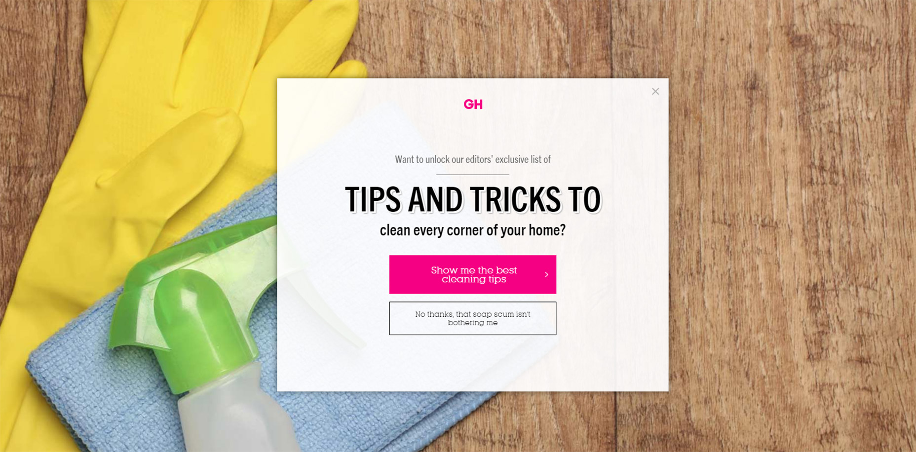
The goal with this guilt-ridden copy writing is to make the user feel so bad that they second guess their choice to close the window. It usually follows a formula that forces the user to click a nonsensical statement that’s unrelated to closing the window.
For example, a modal might offer you a free eBook on web design. The subscribe button might be simple but the cancel button might read “No thanks, I like sucking at design”. There’s actually a whole Tumblr site devoted to this shaming copy-writing.
This is another example of a technique that works from a marketer’s standpoint, but certainly holds little value from a UX standpoint.

3. FULL SCREEN INTERSTITIALS

It should go without saying that completely taking over the screen with an opt-in or squeeze offer is just plain obnoxious.
This trend is like the unwanted modal window on steroids. These interstitials take over the entire screen and block the page unless you close the window. And sometimes it’s almost impossible to close these windows!
03-backlinko-modal-takeover-window
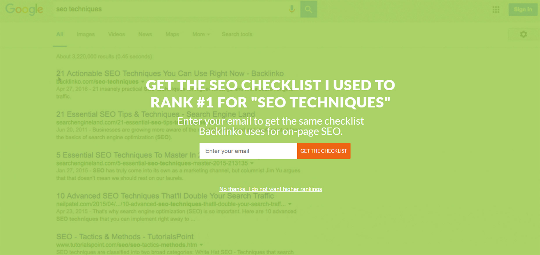
Backlinko is a fantastic site for SEO tips, but horrible with the pushy marketing.
First time visitors are always greeted with the same fullscreen modal that takes over the entire page. The background uses a video of Google SERPS which is both confusing and ugly.
It places a very tiny X icon in the top right corner and the “no thanks” link is much smaller than the other text, not to mention harder to read. This thing is a usability nightmare on mobile and it’s just one example of a trend that really needs to go.

4. SLIDE-IN ADS/OFFERS

Sometimes you’ll be scrolling down a homepage and see a small box slide into view from the side. This might be a feedback box for user testing, or it might be social sharing links or even a discount/promotion.
I can deal with these every so often. If they stay out of the way and aren’t too obnoxious then, whatever.
But on sites like AccessPress you can find at least 2 different slide-in boxes on either side of the page, and sometimes even a 3rd!
04-side-sliding-windows
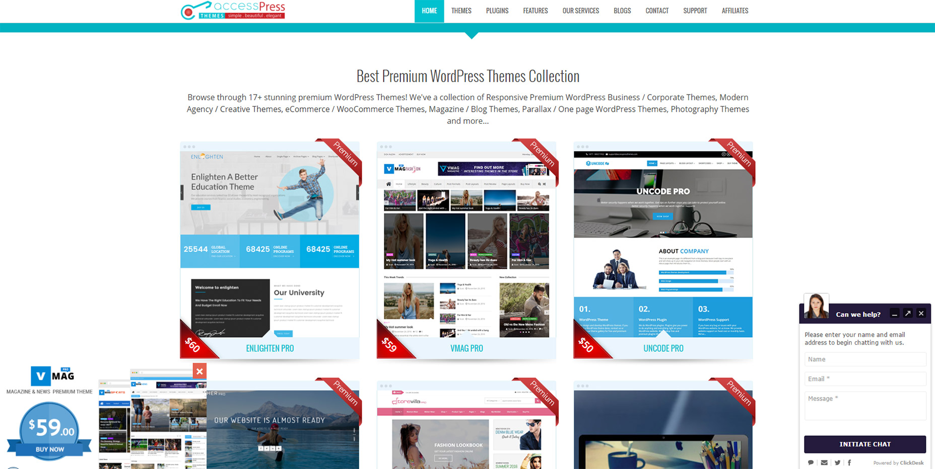
This isn’t meant to shame AccessPress or any other sites in this list. I’m just using this as an example to show how poor UX trends can go too far.
If you have a client who wants this slide-in feature try to make it subtle. No ding noises, no flashing graphics, and preferably no wacky animations. If a user wants to learn more they’ll take the time to read it.

5. CUSTOM SCROLLING

Most trends in this post have been marketing-oriented because, as Gary V says, marketers ruin everything.
But custom scrolling can’t be blamed on anyone. It’s just a trend that’s been around for far too long and feels like a remnant of an older web. Nowadays browsers like Chrome have their own custom scroll features that users can enable/disable on a whim.
But websites like Click and Grow still have these annoying JS-based scroll features that turn navigating the site into a chore.
Usually these custom scroll animations have one of two effects. Either the scroll goes too fast beyond where you wanted to rest the page, or it goes too slow and you have to whip your mouse wheel just to move. Why would any designer think these two options are better than the default?
Tied into custom scrolling is a newer trend I’ve seen on single page layouts. They have fullscreen page “sections” where your scroll wheel only moves down one section at a time. Gladly has this trend on their homepage.
05-gladly-homepage
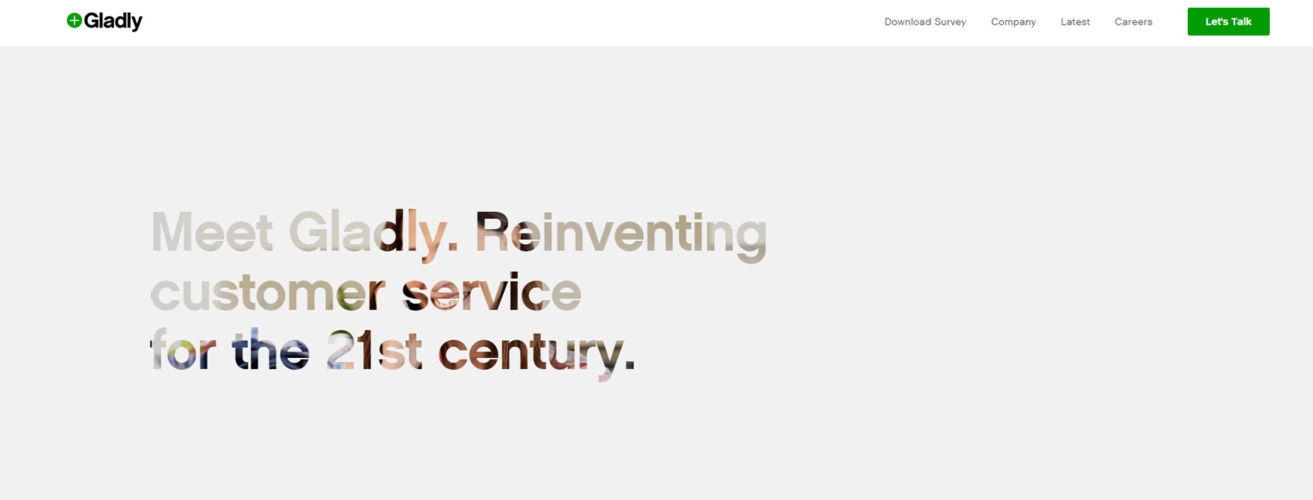
My problem here is the same with fixed scrolling. It takes power away from the user.
The Gladly section animations take way too long to complete. The Internet moves fast and Internet users always want it a little faster. So any type of custom scrolling that ultimately slows down the experience is just bad UX.

6. NAV MENUS WITHOUT PADDING

This is a tough trend to explain but you know it when you see it.
Every site has a navigation menu and most links have padding around them. But sometimes the padding isn’t clickable, so to navigate you need to click on the exact block area of the text itself. This drives me crazy!
It takes maybe 30 seconds to move CSS padding from a link’s container element to the link itself. The navigation menu looks the same, but now users can click the link and the space around the link. So much easier!
Take a look at Tilde’s navigation for a live example.
The craziest thing about their site is that their mobile responsive navigation actually does have clickable padding. Only their desktop nav is plagued by the text-only click area.
On the flip side you’ll find many sites that understand the importance of this very subtle yet crucial detail. One example is Think With Google where you can actually see the full link size while hovering:
06-think-with-google-nav
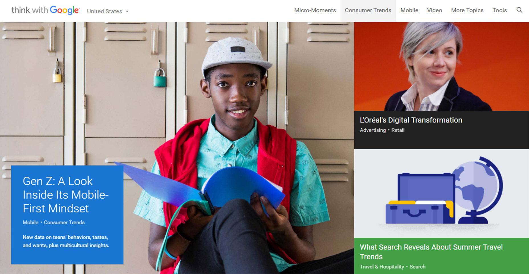
Just keep this in mind going forward because it’s a very simple alteration that can have a huge impact on usability.

7. PAGINATED LISTICLES

Last but not least I’m poking a bit of fun at blogs that design their content into one-item-per-page listicles.
I cannot imagine that any person enjoys constantly clicking the “next” button to read through a clickbait post. You’ll find tons of these on many different websites and none of them consider the user’s experience.
08-next-page-browsing-listicles
This trend is mostly about page views and ad revenue more than anything else. And while it’s not really in the designer’s control to fix this, it does relate to the user experience and webmasters/designers should do all they can to avoid these multi-paged articles.
I can only imagine how many other trends are out there annoying users on a daily basis. But I hope by sharing these ideas more designers will work towards eliminating these dark trends and reducing their presence on the web.

Thursday, October 13, 2016

Essential Skills To Become A Great UI/UX Designer

It’s frustrating to find job offers looking for a UI/UX designer. While these two skillsets are closely related, their skills don’t always overlap. A quality UI designer may not understand user experience psychology. Just like a top-tier UX designer might not be a master of Photoshop or Sketch.
But there is a good amount of overlap, and to be a great UI/UX designer you’ll need to dip a toe into both worlds.
In this guide I want to comb over the fundamental skills that you should learn to promote yourself as a quality UI and/or UX designer. Job security is much easier when you can alternate between both roles. And it’ll be easier for you to see the big picture in any creative project.
If you want a quick overview of specific features I highly recommend browsing this UX checklist.

User Advocation

Remember that a UI/UX designer speaks for the user. But you are not the user. This is an important distinction because most people using your product will not have the same expertise.
This is why usability testing can be so important. Ask users directly what they like and don’t like. Gather feedback. Try to find the root cause of their issues and make only the necessary changes.
Every great UX designer will be a true advocate for the user. The user experience goes beyond a glossy interface to encompass how the UI feels, behaves, and responds to user interaction. Pay careful attention to the details and be willing to scrap ideas even if you think they’re great.
In a situation where you like something that most users don’t it’s generally wise to drop the idea and rework it a little.
User Advocation
Listen to the user’s complaints and try to understand what they’re really saying. This is true of both UX and UI designers, although most user testing involves the UX side of things.
A pretty interface means jack if it can’t operate properly.
Advocate for the user through your words and actions. This is ultimately the #1 requirement of a UX designer. It’s a tough skill to nail down because it’s not exactly a specific skill. But I’d say having an open mind and being willing to rethink ideas will help you understand the user’s perspective much easier.
Here are some related links to read more on this.

Visual Communication

Perhaps the most valuable skill of any designer is visual communication. Most designers get ideas in their head and need to explain these ideas to project managers, developers, or other designers.
Being able to sketch is a great skill to have for this very reason. But you can also communicate ideas digitally by creating digital wireframes, mockups, or interactive prototypes.
Visual Communication
The tool or medium you use to create visual assets really doesn’t matter. Naturally it’s great to have many tools in your toolbox. But if you don’t know Photoshop and only use wireframing tools this can work fine.
It’s very important to communicate your ideas visually to the design team & the development team. It’s possible to do this with words but you’ll have a much easier time showing rather than telling.
Be able to communicate with business and marketing guys too. This means using layman’s terms to explain more complicated features.
Explain what the UX plan is to everyone using whatever visuals or words necessary. One part of this is to master a visual medium(whether sketching or software). The other part of this is communication.
Just because an idea makes sense to you doesn’t mean it’s being explained properly to make sense to others.
Ask your team and clients if they need clarification on anything. Don’t let anyone sit there nodding too afraid to speak up and ask questions. Soft skills are vital to UX work.
Learn to love communication and your job will be that much easier!

Digital Design Software

Not all UX designers know how to use Photoshop, Sketch, or Illustrator. But every UI designer should know at least one of these programs.
The differences between these two jobs are small but noticeable. UI designers must create visuals whether icons, logos, or interface mockups. UX designers are more concerned with how these interfaces behave and how users complete their objectives.
But if you’re going the UX design route it’s still wise to study Photoshop or Sketch(or both).
Just mastering one of these programs will help you express your visual ideas much clearer. You’ll also be much more lucrative to employers.
And with so many online tools it’s important to branch out when needed.
Desktop software like the Adobe suite is crucial to the design process. But UI/UX platforms like InVision and UXPin can both prove vital to your portfolio of skills. These are tools for rapid prototyping and creating interactive demos from scratch.
Digital Design Software
You can accomplish this same task with a frontend library like Bootstrap, but not all UX designers want to learn coding.
Truthfully it doesn’t matter how you create prototypes. But if you have a broad range of skills using various design programs your resume will be much more lucrative.
One last tool I’d recommend learning is a digital UX animation program. The two most popular choices are Principle and Adobe After Effects. These programs let you import digital mockups and manipulate the layers to create custom animations.
Adobe AE
Check out this TutsPlus tutorial if you want to learn more. It’s not easy picking up all these programs but you’ll be thanking yourself later.
A great UI/UX designer should be thinking about every step of the design process. It starts with wireframing and prototyping, then moves through digital graphic/UI design into full interactivity.
These animation programs allow you to simulate interactivity without actually building a demo interface with code. Project leaders like to see these kinds of assets and your skills will prove invaluable to the process.

Empathy & Critical Thinking

Being empathetic seems very abstract but it’s quite powerful. If you can empathize with users you’ll be able to understand their concerns, their struggles, and their complaints with an interface.
The best UX designers consider the target audience for any given project. The user experience design for a dating website will be very different than the UX for an RPG video game. Think critically about your target audience to contemplate and understand what they need.
Interpret the individual problems of each project and consider the target audience by understanding how they think & act.
This is a difficult skill to teach because it requires awareness and understanding. When you watch a user interact with a website you should catch all the little details and nuances about their behavior.
If something was difficult for the user they’ll definitely complain during user testing. But a complaint is a problem, not a solution. As a UX designer your job is to gather user feedback and interpret what it means to come up with real solutions.
Practice by surfing the web and browsing other websites. Write down your complaints. Don’t be afraid to ask “why” every step of the way.
Think about why something behaves the way it does and how it could be improved.
With all the advancements in web technology UI designers can do anything. So technically there’s no limit to the question “what can we do?”.
But not every choice will be a good one. Ask yourself “why are we doing this?”. If you can’t come up with a valuable reason then it might not be a great choice. Critical thinking is vital and should be applied to the entire creative process.
Empathy & Critical Thinking
If you’re struggling to understand empathy in design check out this post to learn more. It’s all about practice and application to get a better idea of how interfaces work. Answers aren’t always binary yes or no. They’re usually fluid in the sense of “yes this kind of works, but could be improved by X”.
To delve deeper into the psychological aspects of UX design read through some of these posts.

Moving Forward

Not all of these skills are mandatory to get your first UI/UX job. But if you ever want to become a great UI/UX designer then you’ll really want to branch into all of these areas and develop your skills as much as possible.
UI designers are concerned more with visuals while UX designers care more about the experience. However both jobs overlap quite a bit. If you can technically fill both roles you’ll be an incredible asset to whatever team you join.

Monday, July 18, 2016

Designing the perfect notification UX

Notifications are all around us on the web and on mobile. Originally intended to help our user experience and usability in general, that’s not always been the case in practice since notifications can quickly become an annoyance if they’re designed poorly or not managed properly.
From desktop-based notifications to the notifications you can toggle on and off on your mobile apps, these alerts are all around us today. Thanks to their prevalence, it’s easy to take their design for granted, which usually leads to unsatisfactory UX.
What makes a notification design good? When and where should a specific notification appear?

UNOBTRUSIVENESS

There’s a fine line between notifications that serve their purpose and help users with timely alerts and reminders, and notifications that are nothing more than distractions because of how they make their way onto a user’s screen. Designers need to know what this fine line is so they can always stay on the UX-friendly side of it.
Notifications should always be as unobtrusive as possible. They shouldn’t interfere with what task the user needs to accomplish at any time, yet they should obviously still achieve their intended purpose of letting users know of something important that’s coming up.
OS X Calendar Notifications 2

On my Mac, for example, OS X is the OS that decides how my calendar app will notify me of important events. I never have my calendar open as with other, more heavily used applications and programs, so the calendar has to find a way to get my attention while still promoting great usability.
When your event gets nearer, my calendar sends me small notifications that slide in at the top right of my screen. Although they’re small, I’ll always see them because the movement catches my eye, and their small size means that they’ll never obstruct what I’m doing. In short, these unobtrusive notifications from my calendar are wonderful because they fulfill their purpose without being a hassle to my UX.

LOCATION-BASED RELEVANCE

One of the hallmarks of excellent usability is pushing relevant notifications to users, particularly when they’re out and about. Smartphones today are so under siege by a plethora of notifications, but not all of them are designed with the user in mind, unfortunately.
Location-based notifications provide a very helpful benefit because of their relevance to where users are in the moment. If an app has properly gathered information from its users, it should already know the user’s likes and dislikes and can therefore push relevant notifications. For instance, when it comes to retail apps, one of the most favorite activities people do on those apps is create shopping and wish lists. This info is a goldmine for the app’s administrators because they can see exactly what’s relevant to a user and what’s not.
If an app has properly gathered information from its users, it should already know the user’s likes and dislikes
Location-based relevance means sending your users notifications when they’re able to take action on a specific purchase because they’re geographically near the actual store.
In the case of, let’s say the Target app, it’s indescribably helpful to design notifications to ping the user when they’re close to a Target store and using info culled from their in-app shopping lists. If there’s a sale on detergent, and the app knows that detergent just happens to be on the user’s shopping list for the week, a notification should be pushed to user when they’re near an actual Target.

LAST-CHANCE CONFIRMATION MESSAGES

There’s nothing more annoying than accidentally deleting an app, which usually destroys all of the information and data inside of it that you’ve worked hard to accumulate over time. Whether it’s your social-media or cloud-storage apps, not having vital data around anymore all because of an accidental tap on your smartphone is frustrating and hard to take.
That’s exactly why notifications that act as confirmation messages should make completely clear what’s being deleted before it’s actually deleted. These popup boxes should have the following characteristics:
  • be big enough to fill the screen width wise so that users can’t easily overlook them;
  • ask a short question of the user that forces them to make a decision;
  • use simple and to-the-point language to communicate what action is being considered;
  • use a bolded headline to catch the user’s attention;
  • feature call to action buttons that are clearly marked and have a distinct color.
Confirmation Message Notification

NUMERICAL VALUES

When we quantify something, it usually gets easier for us to process and handle the task because it allows us to analyze how much personal investment of time we have to put into it. Numbers also help us to prioritize whether or not we want to take on a certain task at the moment. Measurable things are therefore helpful to usability because they allow us to make better decisions.
Notifications that contain numbers allow us to manage our workflows more efficiently
Notifications that contain numbers allow us to manage our workflows more efficiently. When we see a badge, an alert or just an icon that updates us that we have one notification to deal with, we’re likelier to deal with it right at that moment because it implies little work. Looking at one update will take us a conceivably shorter period of time than five updates.
At the same time, an alert that communicates that we have several notifications will be something that we’re likelier to put off until we think we can free up more time to adequately handle that load of work.

Google’s notifications system routinely uses numbers to update you on how many alerts you have to deal with at a given time, thereby quantifying how much work you’ll likely have to do if you check said alerts. This gives users more control over their time management.

USABILITY SHOULD BE JOB ONE

It’s too easy for designers to get caught up in designing notifications for the sake of designing notifications. It seems like almost every single app out there is replete with alerts and notification features.
The biggest job for designers is deciding what notification should ultimately find its way to the end user since not all info is obviously going to be essential to the user. When the notification has a direct impact on the user’s UX, then it has to be pushed to the user, otherwise it probably doesn’t need to be shown.

Thursday, May 5, 2016

UI/UX Designing

If you have a passion for art, and a good head for technicalities, chances are that UI/UX designing is your jam.
This is one of the few jobs that provide an outlet for skill, imagination, creativity and technological know-how, which also makes it so demanding.
If you’re looking for ways to improve on your skills, though, this is the roadmap to a pro designer mode.

Spend Time in Drawing and Sketching

The job of a UI/UX designer is to combine the role of a visual artist with that of a techie, but in paying attention to codes and digital designs, but over time I found myself more and more distant my first true passion for art.
This caused difficulties in designing, until the day I picked up a sketchpad and just started conceptualizing…on paper. Just think of what many art classes focus on: positive and negative space, colors, perspective, depth, layout and framing. Each of these elements counts amongst essential skills for an UI designer, and can help you get closer to your dreams of success.

Make Use of User Testing with Prototyping Tools

Make Use of User Testing with Prototyping Tools
Image source: Tsuriel
This is an important secret for UI and UX designers: user testing. The basic idea behind it is the thinking out loud approach, which works so well in a variety of fields and situations.
Methods vary from discount testing to lab tests, and there are some really good books if you want to go into details e.g. the Handbook of Usability Testing by Jeffrey Rubin and Dana Chisnel. One of my favorite tools is Invision, which lets me transform my own designs into interactive and totally-clickable mockups.

Optimizing UI and UX for Mobile Devices

Optimizing UI and UX for Mobile Devices
Image source: Lukas Horak
One mistake I’ve seen very often is that designers leave just one design framework for both mobile and desktop devices. Realizing this, I mobilized my own design team to work on separate versions.
Together, we created a mobile optimized design module that had bigger text, less number of elements, automatic input zoning, and more such features. One UX design principle we utilized was breaking each task into smaller portions, so that we could focus each task towards one particular process.
We also use particular mobile-oriented designs that factor-in hand/finger positions for hand-held devices.

Utilizing UI Recurring Pattern Libraries

Utilizing UI Recurring Pattern Libraries
Image source: Gleb Kuznetsov
Design patterns are big on abilities, make no mistake. If you want to up your designing skills, you’ll have to take advantage of these to a great extent. A popular design pattern to use is the Card: you identify a key component, represent it in the form of a card, make sure the user associates the shape/style with something, and then use instant recognition to reduce load.

Unearth the Ways in which Process Works to become Better

Unearth the Ways in which Process Works to become Better
Image source: Stano Bagin
If you want to be a great – and not just a good – UX designer, you should turn your attention towards how Processes work. It is a fundamental aspect of designing, so all you need is to choose the right method depending on the context of use.
You can choose Agile development methods for incremental and interactive designing, you can use the Capability Maturity Model (CMM) and Improved CMM (CMMI) for quality control and analysis, and you can use the Lean Startup as a framework for understanding user needs and requirements through the MVP (Minimum Viable Product) hypothesis.

If you Want to Improve, Research Your Potential Users Well

cannot emphasize on this enough, really! Imagine that you’re trying to sell steak to an 80 year old with no teeth, or a drug to a policeman, and you’ll see exactly how risky it is to go in blind.
Without knowing the age, context, needs and requirements of your prospective audience, you really can’t figure out a good design. A hip and cool nightclub’s web page would be totally different from that of MIT, now, won’t it?
So do a bit of research and find out what kind of things you’ll be offering on the page: then run a mockup to see if it lives up to what you’d imagined inside your head initially. Works like a charm, every time!

Use tools like GoogleDrive

Google Drive is the collaborative cloud storage tool which saved me so many times that I’ve lost count! There’s a reason why it’s so awesome for UI and UX designers, and that’s mostly related to its amazing sharing abilities.
For instance, you can use Sheets to break down tasks, you can use Presentations to represent wireframes and UX flows, and you can use Google Drawing to share simple state diagrams. Plus, you and your team can use it to share notes and feedback: which is very useful especially if you want to make edits later on.

Learn the Technical tricks of the Trade for Great Success

Learn the Technical tricks of the Trade for Great Success
Image source: Prakhar Neel Sharma
Okay, now it’s time to look into some technical aspects like spacing and buttons. Now, web-designing requires typographers, but as an UI/UX specialist, you should have some idea of letter spacing (via CSS letter spacing property).
Next, pay attention to how you use typesetting buttons: misplaces labels are the worst thing imaginable, so be careful! Also, make sure to link with the help of padded block links which highlight clickable areas so as to give users a better experience (it can be frustrating clicking beyond the text are, and finding out you’d been hitting up on blank space all along).
Be careful to add enough padding to the links, because simply converting it to a block format won’t really help much except to increase the width and height.

Improve on Color Skills for Overall Development

Improve on Color Skills for Overall Development
Image source: Natalie Berowska
This is another skill development point that should take you back to Art class, but it’s absolutely critical if you want to be a good UI and UX designer. By using correct colors, you can highlight a particular element on a page, provide some good contrast, and direct the flow of attention.
Used properly with the help of block grid elements on a particular page, effective coloration can give a huge impetus to how your design is perceived. Better visuals, more money: at least in my experience of the past years! Besides, color and contrast are great but little known tricks for managing your visitors’ attention and focus.

Use design elements like Lines, Animation, White Space

Use design elements like Lines, Animation, White Spaces
Image source: Ramotion
The reason why I’m paying so much attention to white spaces, line and animation, is that I learnt its importance the hard way. When I first designed a website for a client, I hardly knew about these factors. Speaking to him after about a month or so,
I learnt of the less-than expected success of the site. I was young, naïve, and optimistic, so everything was personal: which is why I went back to some guidelines and tried to analyze what went wrong.
Using white space more often, a couple of animated elements, and some lines to draw between components, I offered another version of my initial design. Surprisingly enough, this actually worked and led to some great feedback.