Showing posts with label UX Rules. Show all posts

Wednesday, May 23, 2018

Design Better Forms

Common mistakes designers make and how to fix them


Whether it is a signup flow, a multi-view stepper, or a monotonous data entry interface, forms are one of the most important components of digital product design. This article focuses on the common dos and don’ts of form design. Keep in mind that these are general guideline and there are exceptions to every rule.

Forms should be one column


Multiple columns disrupt a users vertical momentum.


Top align labels


Users complete top aligned labeled forms at a much higher rate than left aligned labels. Top aligned labels also translate well on mobile. However, consider using left aligned labels for large data-set entry with variable optionality because they are easier to scan together, they reduce height, and prompt more consideration than top aligned labels.


Group labels with their inputs


Present the label and input close together, and make sure there is enough height between the fields so users don’t get confused.

Avoid all caps


All caps is more difficult to read and scan.


Show all selection options if under 6


Placing options in a selector drop-down requires two clicks, and hides the options. Use an input selector if there are over 5 options. Incorporate contextual search within the drop-down if there are over 25 options.


Resist using placeholder text as labels

It is tempting to optimize space by using placeholder text as labels. This causes many usability issues that have been summarized by Katie Sherwin of Nielsen Norman Group.


Place checkboxes (and radios) underneath each other for scannability


Placing checkboxes underneath each other allows easy scanning.


Make CTAs descriptive


A call to action should state the intent.


Specify errors inline


Show the user where the error occurred and provide a reason.


Use inline validation after the user fills out the field (unless it helps them while in the process)


Don’t use inline validation while the user is typing — unless it helps them — like in the case of creating a password, username, or message with a character count.


Don’t hide basic helper text


Expose basic helper text wherever possible. For complex helper text, consider placing it next to the input during its focused state.

Differentiate primary from secondary actions


There is a bigger philosophical debate regarding whether a secondary option should even be included.


Use field length as an affordance


The length of the field affords the length the answer. Employ this for fields that have a defined character count like phone numbers, zip codes, etc.


Ditch the * and denote optional fields


Users don’t always know what is implied by the required field marker (*). Instead, it is better to denote optional fields.


Group related information


Users think in batches, and long forms can feel overwhelming. By creating logical groups the user will make sense of the form much faster.


Why ask?

Omit optional fields and think of other ways to collect data. Always ask yourself if the question can be inferred, postponed, or completely excluded.
Data entry is increasingly automated. For example, mobile and wearable devices collect large amounts of data without the user’s conscious awareness. Think of ways you can leverage social, conversational UI, SMS, email, voice, OCR, location, fingerprint, biometric, etc.

Make it fun

Life is short. No one wants to fill out a form. Be conversational. Be funny. Gradually engage. Do the unexpected. It is the role of the designer to express their company’s brand to elicit an emotional reaction. If done correctly, it will increase completion rates. Just make sure you don’t violate the rules listed above.

Wednesday, May 31, 2017

7 UI Choices That Damage UX

User experience is one of the most important aspects of modern web design. The Google Trends graph for ux design shows how much this field has grown in recent years.
Yet there are still so many websites that push certain design trends which seem like the antithesis of usability. Some are done by accident or negligence, others are done on purpose. The latter are called dark patterns and they’re typically used by marketers to meet some end goal.
But as designers it’s our job to push back and fight for a great user experience. The best way to do that is by shedding light on bad practices and encouraging better ones. So let’s dive into a few of these bad UX practices to see why they exist and how they might be solved.

1. UNWANTED MODALS

The general concept of a modal window is actually very clever. It lets developers add content over the page without using JavaScript to pop open a new tab.
But modal windows are not the problem. Unwanted modals are the problem and they always drag down the user experience.
I’d say there are three different types of “unwanted” modal popups:
  • Exit intents which open when the user’s mouse leaves the page body, usually hovering the browser tab;
  • Timed modals that open after a set amount of seconds;
  • Scroll modals that open after the user scrolls a certain distance down the page.
You can see an example of an exit intent modal on this MaxTraffic post using their own exit intent script.
01-modal-window-optins
As much as I’d like to chastise this practice I do understand this from a marketer’s standpoint: it works.
The question isn’t why exit intent/opt-in modals exist. The question is whether you think it’s worth adding an unwanted modal popup to your website.
Is it worth potentially annoying most of your users just for a higher conversion rate?
If you’re more interested in a great user experience then the answer is obvious. Especially with Google now penalizing sites that use annoying interstitials/modals without user interaction.
But these unwanted messages also give modals a bad name, which is tough because they serve a real purpose in UI design. These can be used wisely, like with modal signup fields or information-based modals triggered from a user’s mouse click.
Or they can be annoying marketing messages that just appear seemingly out of nowhere. And don’t get me started on modals that won’t close even when clicking the background.
I really can’t fault marketers for using these modals because they convert well. But they’re also ruining the user experience for everyone else on the web.

2. GUILT IN COPYWRITING

I recognized this trend years ago but I couldn’t put it into words until I read this article by Katie Notopoulos. She uses plenty of great examples to show how guilt-based copy-writing annoys users and increase signups.
This writing style appears in those annoying modals I just covered. But this writing can also appear in sidebar fields or in-content opt-in forms. One example from Good Housekeeping is just terrible (hover the browser tab to trigger).
02-good-housekeeping-modal-guilt
The goal with this guilt-ridden copy writing is to make the user feel so bad that they second guess their choice to close the window. It usually follows a formula that forces the user to click a nonsensical statement that’s unrelated to closing the window.
For example, a modal might offer you a free eBook on web design. The subscribe button might be simple but the cancel button might read “No thanks, I like sucking at design”. There’s actually a whole Tumblr site devoted to this shaming copy-writing.
This is another example of a technique that works from a marketer’s standpoint, but certainly holds little value from a UX standpoint.

3. FULL SCREEN INTERSTITIALS

It should go without saying that completely taking over the screen with an opt-in or squeeze offer is just plain obnoxious.
This trend is like the unwanted modal window on steroids. These interstitials take over the entire screen and block the page unless you close the window. And sometimes it’s almost impossible to close these windows!
03-backlinko-modal-takeover-window
Backlinko is a fantastic site for SEO tips, but horrible with the pushy marketing.
First time visitors are always greeted with the same fullscreen modal that takes over the entire page. The background uses a video of Google SERPS which is both confusing and ugly.
It places a very tiny X icon in the top right corner and the “no thanks” link is much smaller than the other text, not to mention harder to read. This thing is a usability nightmare on mobile and it’s just one example of a trend that really needs to go.

4. SLIDE-IN ADS/OFFERS

Sometimes you’ll be scrolling down a homepage and see a small box slide into view from the side. This might be a feedback box for user testing, or it might be social sharing links or even a discount/promotion.
I can deal with these every so often. If they stay out of the way and aren’t too obnoxious then, whatever.
But on sites like AccessPress you can find at least 2 different slide-in boxes on either side of the page, and sometimes even a 3rd!
04-side-sliding-windows
This isn’t meant to shame AccessPress or any other sites in this list. I’m just using this as an example to show how poor UX trends can go too far.
If you have a client who wants this slide-in feature try to make it subtle. No ding noises, no flashing graphics, and preferably no wacky animations. If a user wants to learn more they’ll take the time to read it.

5. CUSTOM SCROLLING

Most trends in this post have been marketing-oriented because, as Gary V says, marketers ruin everything.
But custom scrolling can’t be blamed on anyone. It’s just a trend that’s been around for far too long and feels like a remnant of an older web. Nowadays browsers like Chrome have their own custom scroll features that users can enable/disable on a whim.
But websites like Click and Grow still have these annoying JS-based scroll features that turn navigating the site into a chore.
Usually these custom scroll animations have one of two effects. Either the scroll goes too fast beyond where you wanted to rest the page, or it goes too slow and you have to whip your mouse wheel just to move. Why would any designer think these two options are better than the default?
Tied into custom scrolling is a newer trend I’ve seen on single page layouts. They have fullscreen page “sections” where your scroll wheel only moves down one section at a time. Gladly has this trend on their homepage.
05-gladly-homepage
My problem here is the same with fixed scrolling. It takes power away from the user.
The Gladly section animations take way too long to complete. The Internet moves fast and Internet users always want it a little faster. So any type of custom scrolling that ultimately slows down the experience is just bad UX.

6. NAV MENUS WITHOUT PADDING

This is a tough trend to explain but you know it when you see it.
Every site has a navigation menu and most links have padding around them. But sometimes the padding isn’t clickable, so to navigate you need to click on the exact block area of the text itself. This drives me crazy!
It takes maybe 30 seconds to move CSS padding from a link’s container element to the link itself. The navigation menu looks the same, but now users can click the link and the space around the link. So much easier!
Take a look at Tilde’s navigation for a live example.
The craziest thing about their site is that their mobile responsive navigation actually does have clickable padding. Only their desktop nav is plagued by the text-only click area.
On the flip side you’ll find many sites that understand the importance of this very subtle yet crucial detail. One example is Think With Google where you can actually see the full link size while hovering:
06-think-with-google-nav
Just keep this in mind going forward because it’s a very simple alteration that can have a huge impact on usability.

7. PAGINATED LISTICLES

Last but not least I’m poking a bit of fun at blogs that design their content into one-item-per-page listicles.
I cannot imagine that any person enjoys constantly clicking the “next” button to read through a clickbait post. You’ll find tons of these on many different websites and none of them consider the user’s experience.
08-next-page-browsing-listicles
This trend is mostly about page views and ad revenue more than anything else. And while it’s not really in the designer’s control to fix this, it does relate to the user experience and webmasters/designers should do all they can to avoid these multi-paged articles.
I can only imagine how many other trends are out there annoying users on a daily basis. But I hope by sharing these ideas more designers will work towards eliminating these dark trends and reducing their presence on the web.

Monday, January 2, 2017

12 UX rules every designer should know


“User experience” is a broad term that gets bandied around at meetings and swapped with “user interface” as if the two are the same—they’re not. This confusion has probably affected your career as UX and web design roles have slowly started to overlap. Even your clients may be confused as to what exactly your job is.
Like it or not, UX has a huge impact on what web designers do. You can create the best design in the world, but it won’t succeed if it’s not usable. And it won’t be usable unless you know a little UX strategy. These UX lessons will teach you how to improve projects’ usability and make you indispensable to your clients.

1) UX IS NOT UI

Even if you don’t interchange the terms “UX” and “UI”, you’ll likely hear your clients say it at some point. You’ll have to be able to explain the difference between UX and UI so they can understand what is, and isn’t, your job.
User interface refers to the actual system… User experience is about the emotions…
User interface refers to the actual system the client interacts with. The layout of an iPhone’s settings menu is a user interface. User experience is about the emotions the interface evokes during that interaction; the user’s satisfaction with an easy-to-use settings menu is user experience.
Essentially, UX is the totality of the emotions resulting from the UI. Good UX designers understand human emotion and user behavior patterns, because those things affect how users respond to an interface.

2) UX IS NOT JUST A “WEB THING”

Web design is only a small portion of UX. Every print design you see, product you use, and even place you go, also has UX. Eating at a terrible restaurant is a bad experience; easily opening a package is a good one.
Offline UX design may seem like a different ball game—after all, creating a navigable website isn’t the same as designing a sports car for people to drive on real roads—but in reality, the two types of UX affect each other.
Nav bars are a great example of how the web and physical worlds overlap. Website navigation used to be on the left side of the page, but somebody realized we prioritize information from left to right—meaning content should be on the left. By the early 2000s, nav bars moved to the right side of the viewport.
If you’re a web designer, it never hurts to brush up on print, packaging, or other types of physical UX design. This cross-training expands your knowledge and helps you see projects from a fresh perspective.

3) UX IS ART AND SCIENCE COMBINED

Art and science make an odd couple, but that’s essentially what UX is. Understanding how UX combines art and science lets you refine your design process to reach solutions more easily.
UX is scientific in that it poses a problem-solution scenario in which the designer poses a theory about how to fix the problem. So let’s say the problem is an outdated site hurting sales. The designer suggests a way to update the site; through testing and adaptation, that suggestion evolves into a solution.
The solution is where the art comes in. Colors, typefaces, layout, and so forth all combine to create an aesthetically pleasing whole. As with viewing art in a gallery, the design evokes an emotional response, which in turn produces an outward behavior.

4) UX CREATES GOAL-DRIVEN DESIGN

Every designer has dealt with clients who insisted on having things their own way. This creates a conundrum, because the client’s way may not be the only or best way to solve that specific problem. Similarly, some designers think their way is the only way and won’t listen to any other ideas—even if those ideas might work better.
Rather than taking this single-minded approach, UX stems from using goal-driven design to look for the most effective solution.
Let’s say your client wants to move their customer testimonials link to the top of the page so it gets more traffic. But the problem isn’t necessarily the link’s location; it’s that the link needs more traffic. You could also fix the issue by making the link more visible where it’s at. Either solution will solve the problem; being open to those options is goal-driven design.

5) UX SHOWCASES YOUR BRAND

Good UX design reflects brand identity, so it requires you to stay true to the client’s goals.
Once in a while, you may find yourself in a design trance. Colors come easily, type fits together, images are imaginative—and none of it matches your client’s brand identity.
It’s imperative that you don’t get caught up in creating a look that doesn’t meet the client’s needs. And while that sounds almost laughable, it happens much more easily (and often) than you might expect.
Good UX design reflects brand identity, so it requires you to stay true to the client’s goals. Make sure you ask questions about the brand upfront and schedule regular input from stakeholders, who will be able to tell you if you’re sticking with the brand or straying away.

6) UX DESIGNS FOR THE USER

It sounds silly to say “design for the user,” because that’s what UX is. Yet many web designers are often the victims of their own creativity. Their designs have all the bells and whistles — and even meet the client’s expectations — but they may still not meet the user’s needs.
Designing for the user requires you to do something that’s often difficult for creatives: let go of your opinion. While you may view something as best, it may not be best for that situation.
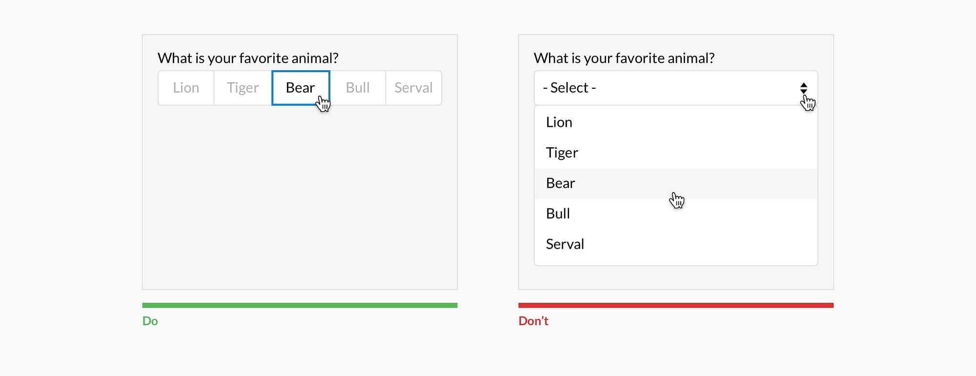
To make sure you’re on the right track, you’ll want to learn some guidelines to user-driven design. A good rule of thumb is to start by researching different types of users and mapping out how they use the site you’re working on. Before you release the finished design, use A/B testing to verify that you’ve reached the best solution.

7) IDENTIFY BEHAVIORAL TRIGGERS

Good UX design relies heavily on psychology. The cool part is, UX designers not only learn users’ tendencies – they can trigger new behaviors that lead to conversions. But there’s a right and wrong way to do it.
Take notifications, for instance. They’re meant to spark a behavior, but it’s easy to forget actually doing the behavior takes time and effort for the user. Some designers bombard users with notifications at the worst times, then wonder why there’s no response.
The trick is to research how users’ motivation changes throughout the day, so you can time notifications accordingly. For instance, receiving a notification on the way to work won’t do any good, because the user has a competing, and more urgent, goal of getting to work. But the same notification received on the way home gets more attention, because now the user actually has time to engage in the behavior.
Your goal is to empower users with a beneficial solution; to help their day go smoother in some way. The more you play to their desires and habits, the more successful your design will be.

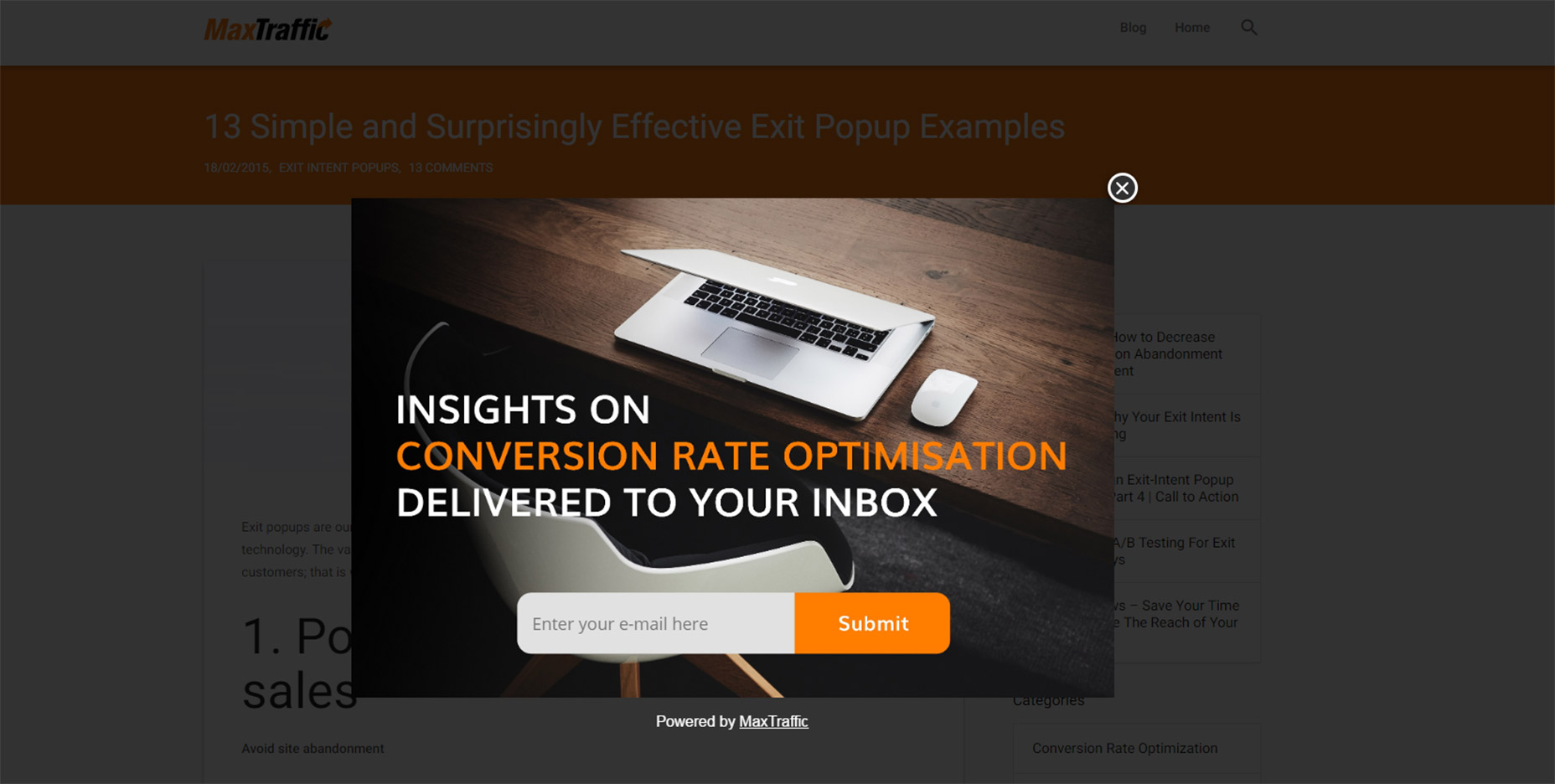
8) ENCOURAGE SCROLLING

Scrolling sends users deeper into the site and asks them to invest more time – making them more likely to convert. That’s why some designers place their calls to action at the bottom of the page, where users have to scroll to get to them.
Even above-the-fold sites — which place the call to action at the top of the page to optimize the “love at first sight” principle — can promote scrolling. You can encourage users to spend more time on the site with “scroll cues,” such as an arrow that points down to the next section or partially visible text that requires users to scroll to keep reading.

9) ASK YOURSELF, “WHAT HAS THE USER DONE?”

Before you can start solving a problem, you have to understand what exactly the problem is. You’ll want to analyze the user’s experience on your current site. Ask the right questions to find out how they’re interacting with the site now, what’s working, and what’s going wrong.
If possible, get a little help from the customer service department. Collect their notes on issues clients have complained about, or listen to recordings of frustrated customers. Often, you’ll learn about design issues while customers are ranting about what went wrong the last time they tried to use the site.

10) LET CONTENT DEFINE THE INTERACTION

UX isn’t just about the icons users click or the colors on the page. Almost everything visitors see is content – whether that’s writing, images, or videos. Yet many designers completely skip talking to the content team or developing any sort of content strategy.
A great-looking site is essentially useless unless you back it up with strong content. So on your next design, start asking questions. Are you redesigning a site that already has a voice – and if so, how should you incorporate it? Or are helping set the tone for a completely new site?
The goal is to create content that’s easy to absorb and process. You ultimately want your users to feel as if a friend is guiding them through the site, because a friend would know exactly what they want and show them where it is.

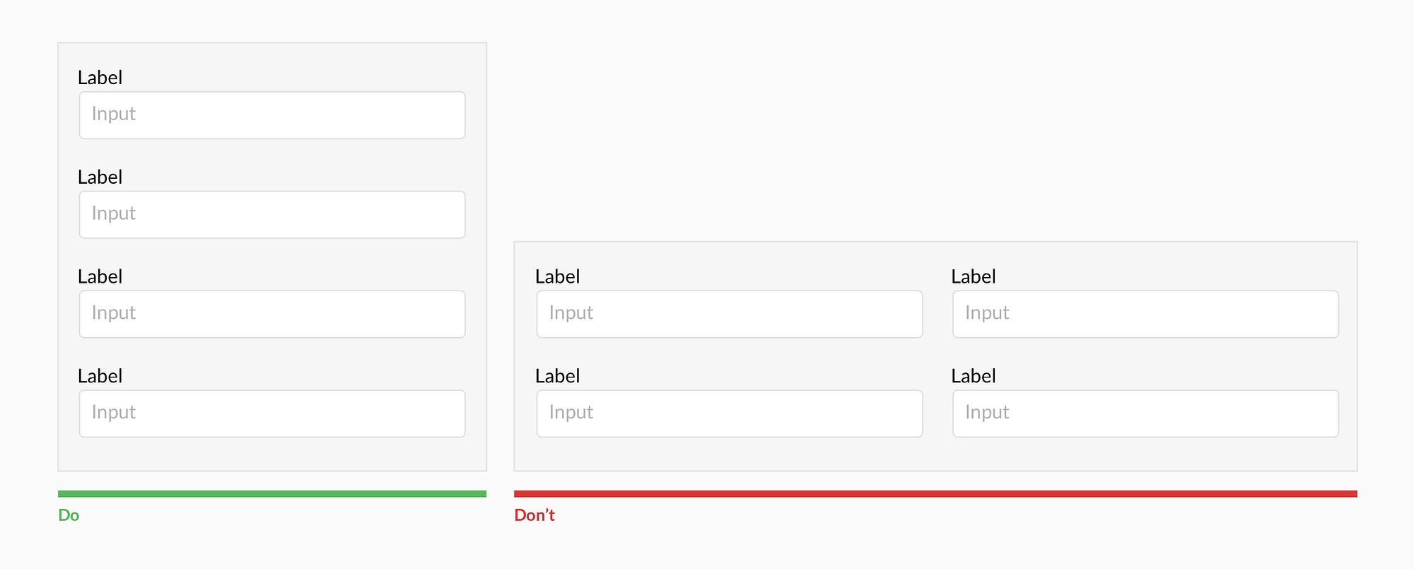
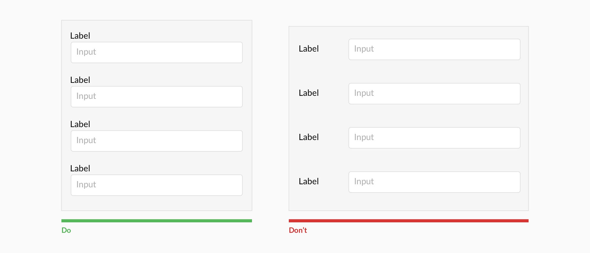
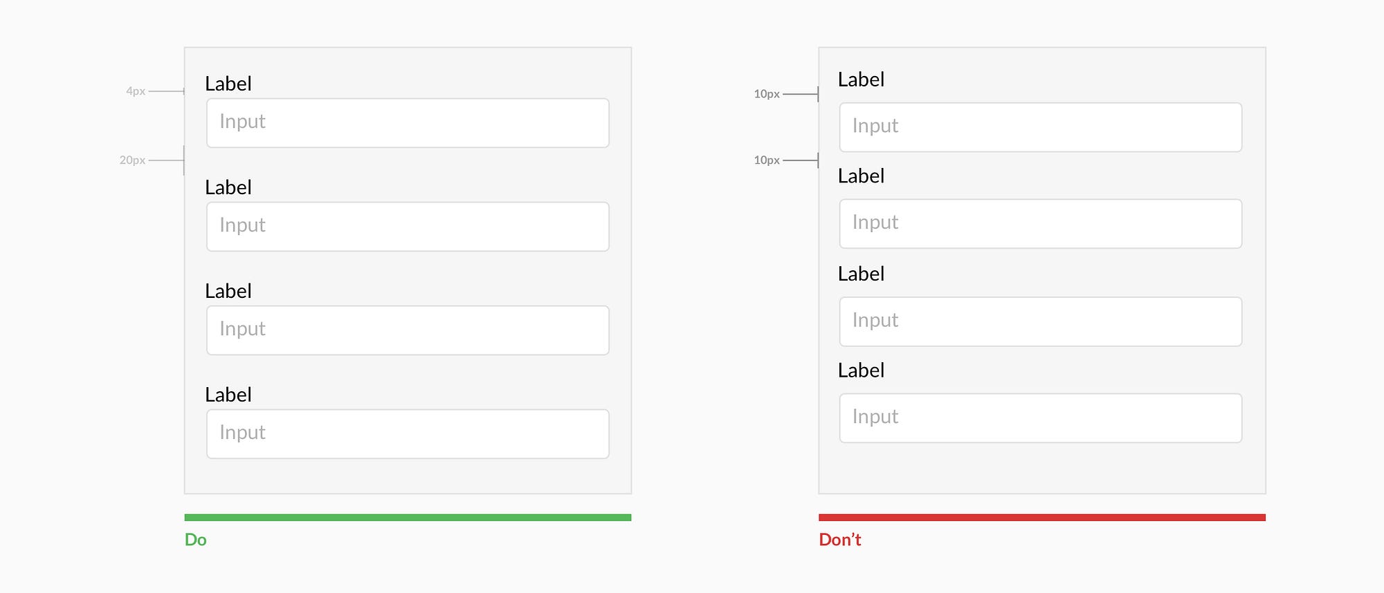
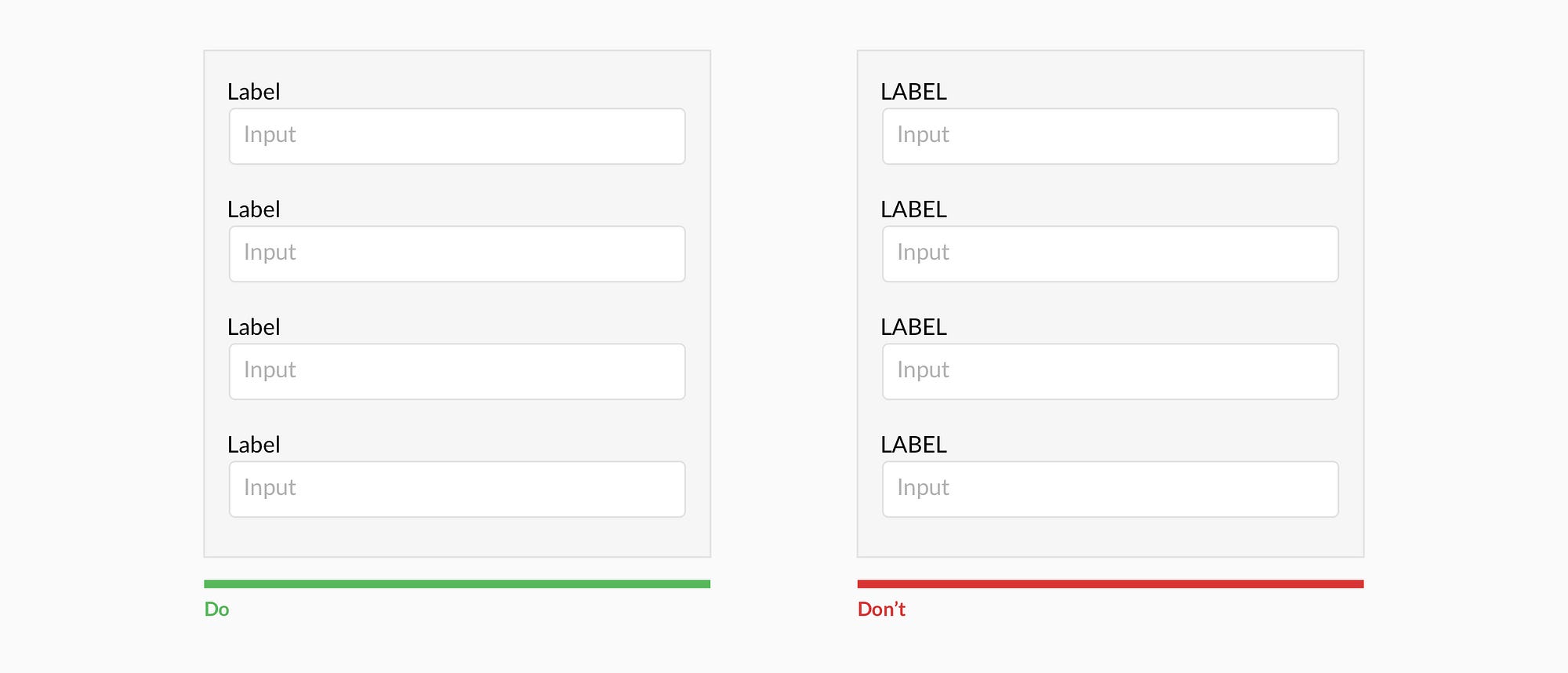
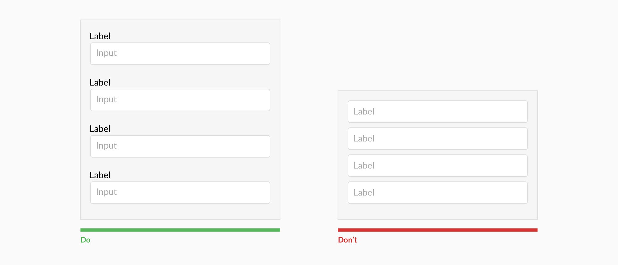
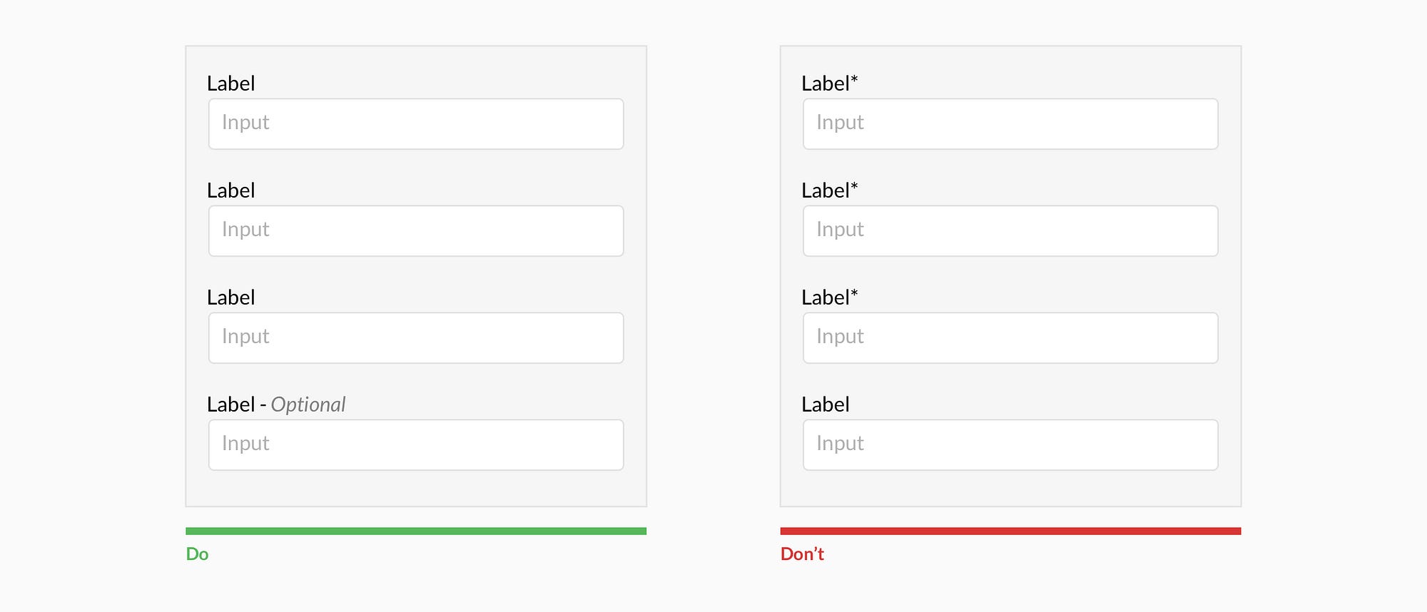
11) DON’T CREATE INCONSISTENCY

Users who feel confused are more likely to get frustrated — even if they don’t have the vocabulary to say why…
Inconsistency is one of the biggest problems users deal with. Yet many designers actually try to make their designs appear more creative or memorable with intentional inconsistencies in color or style.
Let’s say you used a nav burger on your homepage, while another landing page features a dropdown arrow. Both icons technically do the same job, and the homepage has its own unique look. However, users developed an impression of your site while they were on the homepage. Seeing another type of navigation on other pages conflicts with their initial impression, creating confusion.
Users who feel confused are more likely to get frustrated—even if they don’t have the vocabulary to say why—and they won’t come back. A consistent site, on the other hand, lets them take care of their business without pondering your stylistic choices.

12) ELIMINATE POINTLESS PAGE ELEMENTS

UX design has evolved a lot over the last decade, as the internet shed its gawky teenage phase and morphed into a sophisticated adult. Gone are the days of too-bright colors and nav links scattered across the page. Today’s site is streamlined for good UX.
So why mention eliminating pointless page elements? Because “pointless” has gotten a lot more subtle. People aren’t making the same gaudy mistakes – well, in most cases. Today, a pointless page element might be a call to action with two commands instead of one, or an image that draws the eye away from where it should go.
To get rid of these things, you’ll have to learn how to gauge an element’s value. A good way to check for useless elements is to get into the user’s mindset – ask yourself how each element makes you feel and whether it helped you reach your goal.