Monday, November 30, 2015

Google+ Undergoes Huge ReDesign


The ugly duckling of the social media world, Google+, has just undergone a significant redesign. Far more than a simple facelift, the social network has been entirely refocused on interests, and in the process dropped several of its most used features.

Google leads the pack in almost every field it has entered, but notably struggles with social media; partly because it was late to the game; partly because it over-extended Google+’s feature set.

The real value of social media isn't features, but being on the network that your ‘friends’ are on. Google believes that the key to finally cracking the social media marketplace is by focusing on users’ shared interests, rather than familial or work connections.

Facebook was always that family dinner that you were forced to attend, but secretly hated. Google+ was that cool coffee shop down the street…where you could hang out with people…you actually had something in common with. — Vance McAlister

Google+’s new focus is on Collections and Communities: Collections allow you to immerse yourself in a specific subject — long boarding, or sub-Saharan entomology, for example; Communities allows you to meet up with like-minded users.

The service is being primed as a place not to connect with friends, but to discover new ones. Given Google’s long track record of successfully marrying data to search queries, it’s an approach that’s closely aligned with their core business.

The new Google+ is simpler, and more enjoyable to use. And with consistent experiences across desktop, and mobile sites it feels more coherent. As you’d expect, the design embraces Material Design (including the use of the distinctive, but controversial floating call-to-action).

the new Google+…makes it easier to post, search, connect, and keep up with great content…we’ve worked hard to make our new web experience load fast and work beautifully on devices of all sizes. — Luke Wroblewski, Google

One interesting aspect of the redesign, is that Android and iOS apps—which will roll out in the coming days—look remarkably similar. This flies in the face of conventional wisdom, that suggests that users prefer user interfaces that reflect their chosen platform.

Google plans to continue iterating over the design in the coming months, and some features that are conspicuous by their absence (Events for example) may make their way back into the service.
You can try out the new design by logging into your account, or signing up for an account, and clicking “Let’s Go” when promoted. If you don’t see the option yet, try back in a few days; it’s being staggered over the coming week.

Many commentators had expected Google+ to be quietly retired in the next year or two, but this redesign heralds a new focus and a renewed push from Google to embrace the social landscape. Whether it gains traction is yet to be seen but surely this is G+’s last chance before Google throws in the towel and buys Twitter.

Tuesday, November 24, 2015

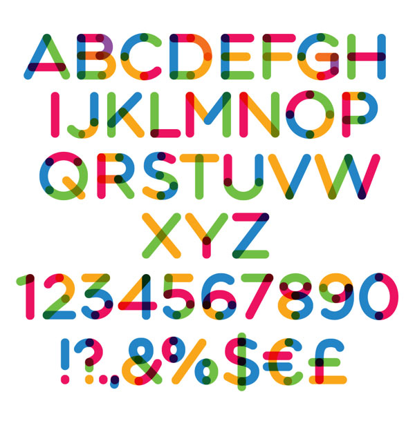
Free Download: MultiColor Font

Technically this is not a font (as the current state of technology doesn't allow multicolored fonts) and you cannot write with it in your favorite program - you will need a vector editing application like Adobe Illustrator to easily create short texts for headlines, posters, logos or anything else. Or you can simply stack few characters to create some random art.
Download this freebie, from designer, Ivan Filipov. To open the included files you need at Adobe Illustrator CS5 or later.
Examples:


See how it works:
To easily change the color of any of the color segments : from Window Menu choose Swatches. Then in the Swatches palette change the color of the main color swatches by double-clicking the desired swatch.
To achieve more interesting effects, from Window Menu choose Layers and then make Dots or Inline layers visible by clicking the eye icon. Or just choose the second color pallette.
The archive also includes a Symbol Library which allows you to add the desired characters to your designs very easy. After you extract the files in the ZIP to your hard drive, just follow these 3 steps:
1. Make sure the SYMBOLS palette is visible, by choosing Window > Symbols
2. In the Symbols palette, click the little triangle in the top right corner and choose Open Symbol Library and then choose Other Library
3. Find multicolore-library.ai and open it. Now you just pick the desired characters from the list of thumbnails and drag & drop it to your art board. That's all!!!

Download: Click Here

Friday, November 13, 2015

Creating a Familiar User Interface for the Users

When someone seeks to create a familiar user interface (UI), the objective should be to construct an interactive process between the user and the product they are using that meets their needs.

Furthermore, if you are looking to add User Assistance content, also known as Instructional Text, within an application, you must ensure that it adequately serves the basic purpose of the user interface.

Here are some rules that when followed, will ensure Instructional Text is implemented effectively.


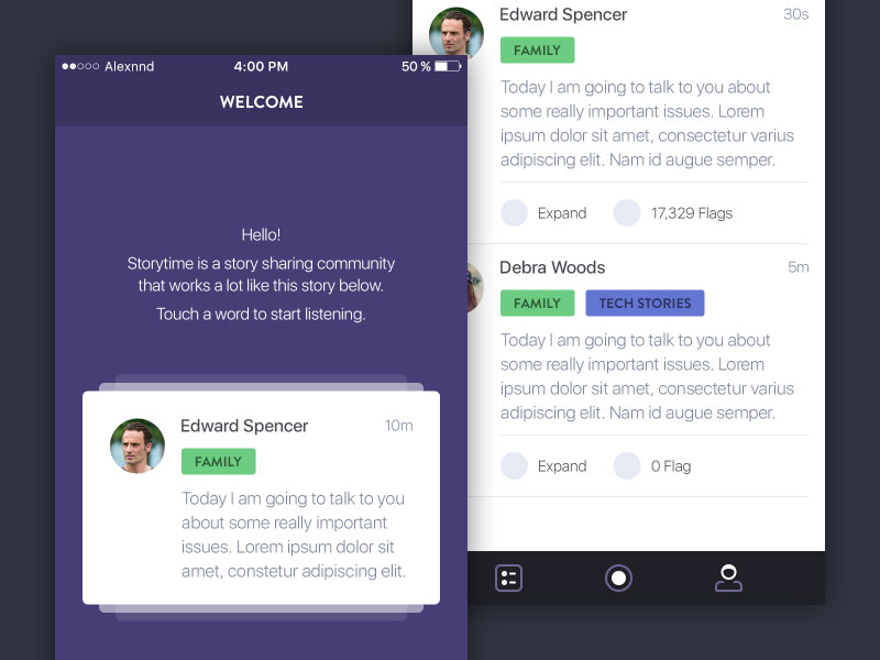
User Interface Assistance2329794

Image source: Dion Pramadhan

User assistance is often necessary in an action context and it is something that needs to focus of the action. When a user performs any action in an application, user assistance should be readily available within the application.

The User assistance is always placed in the user interface, assuming there is sufficient space to do so. This user assistance is typically referred to as Instructional Text. Bear in mind that even the most conventional information design principles must occasionally be modified before certain aspects of an interactive user interface can be accommodated.

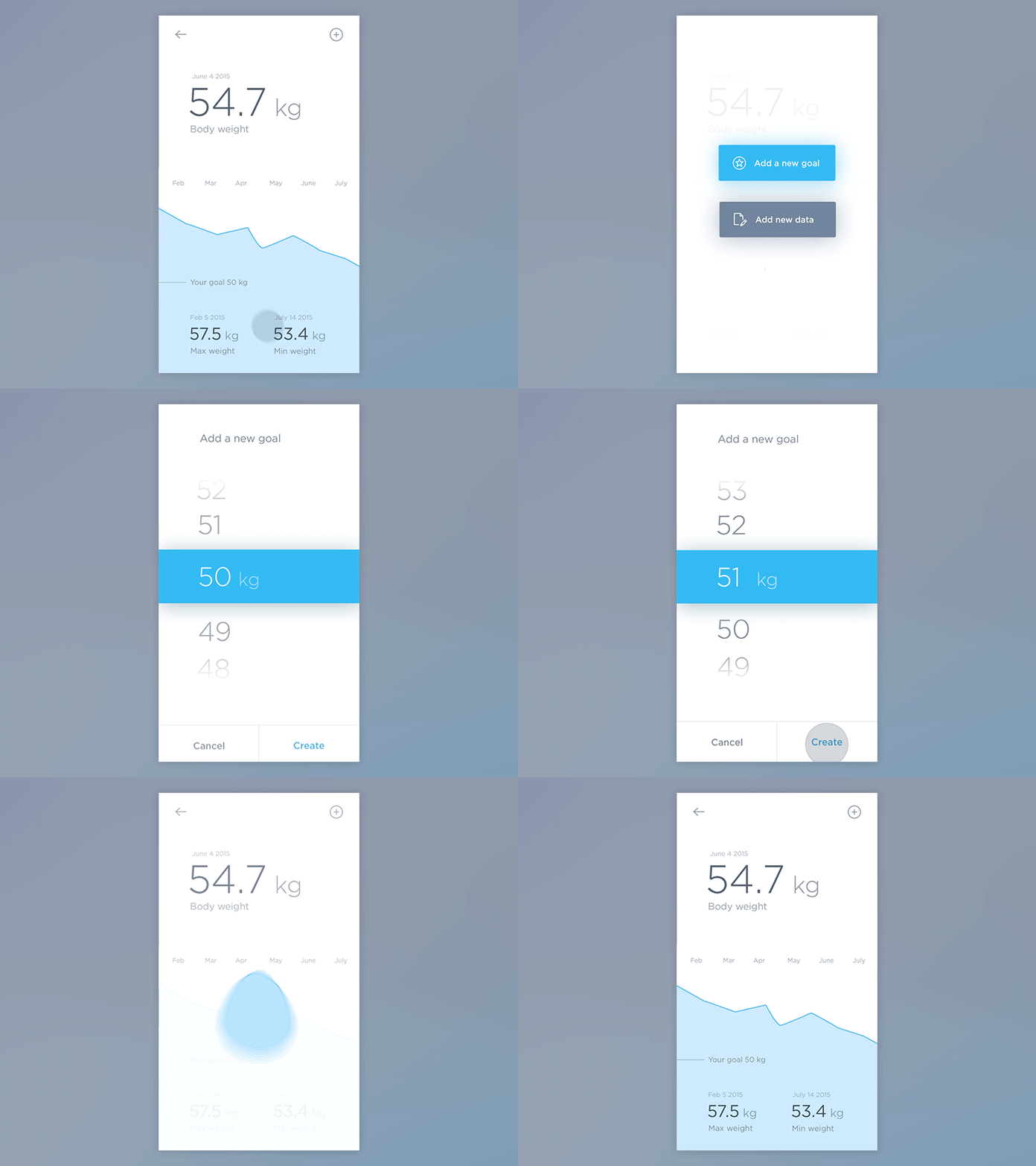
An individual’s behavior on the internet is inherently goal-driven. Therefore, web pages tend to be designed to help users perform the actions necessary to accomplish the goals they wish to achieve. As an example; a button that needs to be clicked in order to enable a user to achieve a certain objective should be shadowed to visually raise the button, making the user aware that it can be clicked on.

Copy Matters
2330658
Image source: Ghani Pradita
In order for a user interface to perform as expected, it’s important to have instructions that are as detailed, yet succinct. The shorter the instructions, the easier it is to take notice of them, since they will be more readable. While lengthy fields of text can explain things more clearly; it takes up more screen space, and most web designers find this approach to be mentally tiring for their users, and lead to user interfaces that are more confusing to work with.

The following guidelines should be followed whenever you decide to place instructional text within a user interface:
  • Divide all dense instructions in accordance with the individual action objects
  • Ensure that the necessary instructions are placed as closely as possible to their respective action objects
  • Always place instructional text next to the corresponding action object.
  • When instructional text is overly lengthy, consider implementing a link that displays a pane or a pop-up when a user clicks on it.
Use Common Language
2332625
Image source: Valentyn Khenkin
One of the major issues regarding user interfaces involves writing instructions that are succinct and meaningful to your audience.

Perhaps the best approach is to avoid using language or terminology that is overly technical, as this may be confusing to many of your users. This is why terms such as “questions” and “responses” are used in place of “inputs,” “fields,” and “labels.” While most people may understand what these terms mean, it’s best to be as simple as possible.

Instructional copy
23217601
Image source: Alexandre Naud
The following behaviors need to be kept in mind whenever you create assistance content for an application:
  • Individuals typically scan and take in information in the same fashion, whether it is left-to-right or top-to-bottom
  • Individuals are normally motivated to take some kind of action when using an application. They tend to focus on action objects such as buttons and menus.
  • When something on a page captures an individual’s attention, it tends to cause them to continue going down the page rather than going back up the page
  • Individuals prefer to actually be doing something rather than just reading about something.
Use Clear Instructions
2278322
Image source: Jakub Antalík
When mental models are incorrect or inaccurate, they can negatively affect an individual’s experience with an interface. This is a major reason why implementing clear user interface instructions is extremely important. Negative experiences can result in the following: Frustration, user error, an inability to accomplish certain goals.

When a user becomes frustrated with a website, they will most likely look for another that will be much easier to both use and understand. The best way to avoid interface issues is to compose instructions that are easy to understand and are aesthetically appealing. Doing so will help guide your visitors to where they need to go. This is especially true if their mental models are incorrect or inaccurate.

Final thoughts
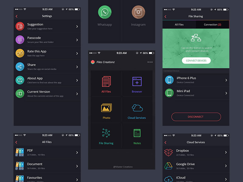
2325787
Image source: Master Creationz
Every dynamic involving how users interact with various interactive user interface elements, can influence how we should address interface instructions. Individuals tend to skip elements that are static, such as Instructional Text.

Instead, their focus tends to shift more towards active objects. Natural workflow can best be accommodated by effective user assistance design, where instructions are provided in proximity with interactive elements that have a need for supportive information.

Friday, November 6, 2015

10 Things You won't ever Believed Regarding the History of Graphic Designs


The world of graphic design is like a vast ocean that’s replete with numerous secrets! During past many decades, graphic design has evolved with a dramatic pace! It seems as if there has been a spate amongst graphic designers to find new and innovative ideas in order to make it easy for businesses to stand out in the market and make a deep impact on their consumers, prospects, affiliates and the entire market.

Graphic designs such as professional logo designs, creative web designs, social media page designs and a host of other such designs are essential for effective branding of businesses. In fact, experts and industry insiders believe that a business goes nowhere without great graphic designs. Here you can find out more about the best graphic designs for your business in your budget.

For graphic designers, it’s important to get acquainted with the history of graphic designs to understand how it has evolved over the years and how its past has helped shape the present and future of the designing arena worldwide.

So if you are curious to explore the history of graphic designs and see how it has evolved over the years, here’s a little smattering on 10 cool facts that is sure to blow your mind away.

  1. Logo designs are believed to have started in the 13th century when ancient Egyptians branded domestic animals with hieroglyphs to mark their ownership.
  2. Graphic design began with the Sumerian pictographs and Egyptian Hieroglyphics during 2500 BC to 1400 BC.
  3. Typography emerged in the mid-1400s using re-usable Meta. Johann Gutenberg was the one who developed the first ever movable type. Claude Garamond opens first type foundry, developing and selling fonts to printers in 1530.
  4. In the 18th century, letters were designed basis the mathematical drafting principles. Ornamental typography also started in the 1800s. First sans-serif font was introduced as one line of a book.
  5. In the late 1800s, Art Nouveau emerged as an international art style and soon took the world of graphic design by storm.
  6. Helvetica font was introduced to the world in the 20th century and soon it became one of the most used fonts.
  7. Pop Art and Psychedelia became popular graphic design styles between 1960's and 1970's.
  8. In the mid-1970s, designers paid more attention to word spacing, distorting type, typewriter type and collage.
  9. From the 1990s forward, street style design became popular. Typefaces were mass produced and marketed for computers.
  10. The world’s first ever website was launched in the year 1992.

These are just some of the many interesting facts about the history of graphic designs. The aim here is make you understand how graphic design and its elements have evolved over the years. If you are a designer, you’ll definitely find a new lease of inspiration with the colourful history of graphic designs.