When someone seeks to create a familiar user interface (UI), the objective should be to construct an interactive process between the user and the product they are using that meets their needs.
Furthermore, if you are looking to add User Assistance content, also known as Instructional Text, within an application, you must ensure that it adequately serves the basic purpose of the user interface.
Here are some rules that when followed, will ensure Instructional Text is implemented effectively.
Image source: Dion Pramadhan
User assistance is often necessary in an action context and it is something that needs to focus of the action. When a user performs any action in an application, user assistance should be readily available within the application.
The User assistance is always placed in the user interface, assuming there is sufficient space to do so. This user assistance is typically referred to as Instructional Text. Bear in mind that even the most conventional information design principles must occasionally be modified before certain aspects of an interactive user interface can be accommodated.
An individual’s behavior on the internet is inherently goal-driven. Therefore, web pages tend to be designed to help users perform the actions necessary to accomplish the goals they wish to achieve. As an example; a button that needs to be clicked in order to enable a user to achieve a certain objective should be shadowed to visually raise the button, making the user aware that it can be clicked on.
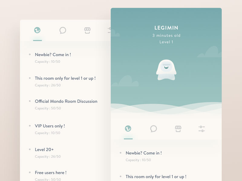
Instructional copy
Image source: Alexandre Naud
The following behaviors need to be kept in mind whenever you create assistance content for an application:
Furthermore, if you are looking to add User Assistance content, also known as Instructional Text, within an application, you must ensure that it adequately serves the basic purpose of the user interface.
Here are some rules that when followed, will ensure Instructional Text is implemented effectively.
User Interface Assistance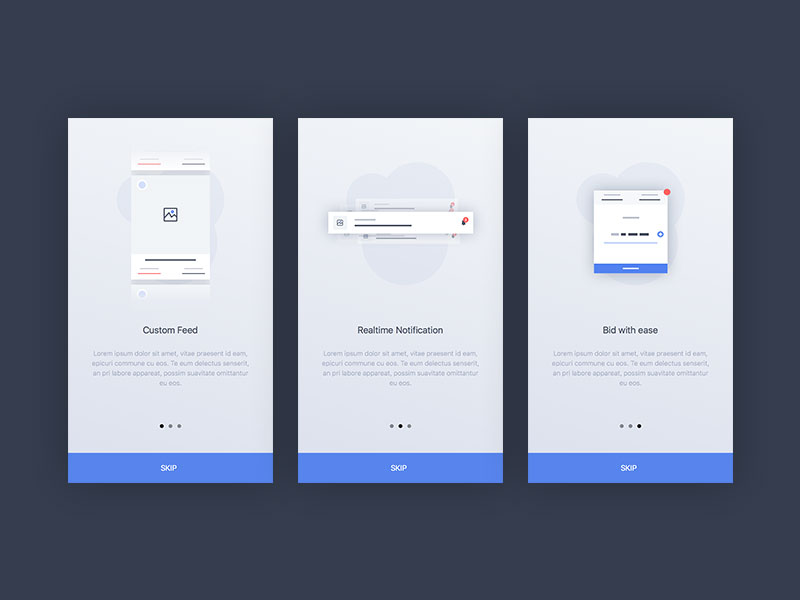
Image source: Dion PramadhanUser assistance is often necessary in an action context and it is something that needs to focus of the action. When a user performs any action in an application, user assistance should be readily available within the application.
The User assistance is always placed in the user interface, assuming there is sufficient space to do so. This user assistance is typically referred to as Instructional Text. Bear in mind that even the most conventional information design principles must occasionally be modified before certain aspects of an interactive user interface can be accommodated.
An individual’s behavior on the internet is inherently goal-driven. Therefore, web pages tend to be designed to help users perform the actions necessary to accomplish the goals they wish to achieve. As an example; a button that needs to be clicked in order to enable a user to achieve a certain objective should be shadowed to visually raise the button, making the user aware that it can be clicked on.
Copy Matters
Image source: Ghani Pradita
In order for a user interface to perform as expected, it’s important to have instructions that are as detailed, yet succinct. The shorter the instructions, the easier it is to take notice of them, since they will be more readable. While lengthy fields of text can explain things more clearly; it takes up more screen space, and most web designers find this approach to be mentally tiring for their users, and lead to user interfaces that are more confusing to work with.
The following guidelines should be followed whenever you decide to place instructional text within a user interface:
Image source: Valentyn Khenkin
One of the major issues regarding user interfaces involves writing instructions that are succinct and meaningful to your audience.
Perhaps the best approach is to avoid using language or terminology that is overly technical, as this may be confusing to many of your users. This is why terms such as “questions” and “responses” are used in place of “inputs,” “fields,” and “labels.” While most people may understand what these terms mean, it’s best to be as simple as possible.
The following guidelines should be followed whenever you decide to place instructional text within a user interface:
- Divide all dense instructions in accordance with the individual action objects
- Ensure that the necessary instructions are placed as closely as possible to their respective action objects
- Always place instructional text next to the corresponding action object.
- When instructional text is overly lengthy, consider implementing a link that displays a pane or a pop-up when a user clicks on it.
Perhaps the best approach is to avoid using language or terminology that is overly technical, as this may be confusing to many of your users. This is why terms such as “questions” and “responses” are used in place of “inputs,” “fields,” and “labels.” While most people may understand what these terms mean, it’s best to be as simple as possible.
Instructional copy
- Individuals typically scan and take in information in the same fashion, whether it is left-to-right or top-to-bottom
- Individuals are normally motivated to take some kind of action when using an application. They tend to focus on action objects such as buttons and menus.
- When something on a page captures an individual’s attention, it tends to cause them to continue going down the page rather than going back up the page
- Individuals prefer to actually be doing something rather than just reading about something.
Use Clear Instructions
Image source: Jakub Antalík
When mental models are incorrect or inaccurate, they can negatively affect an individual’s experience with an interface. This is a major reason why implementing clear user interface instructions is extremely important. Negative experiences can result in the following: Frustration, user error, an inability to accomplish certain goals.
When a user becomes frustrated with a website, they will most likely look for another that will be much easier to both use and understand. The best way to avoid interface issues is to compose instructions that are easy to understand and are aesthetically appealing. Doing so will help guide your visitors to where they need to go. This is especially true if their mental models are incorrect or inaccurate.
When a user becomes frustrated with a website, they will most likely look for another that will be much easier to both use and understand. The best way to avoid interface issues is to compose instructions that are easy to understand and are aesthetically appealing. Doing so will help guide your visitors to where they need to go. This is especially true if their mental models are incorrect or inaccurate.
Final thoughts
Image source: Master Creationz
Every dynamic involving how users interact with various interactive user interface elements, can influence how we should address interface instructions. Individuals tend to skip elements that are static, such as Instructional Text.
Instead, their focus tends to shift more towards active objects. Natural workflow can best be accommodated by effective user assistance design, where instructions are provided in proximity with interactive elements that have a need for supportive information.
Instead, their focus tends to shift more towards active objects. Natural workflow can best be accommodated by effective user assistance design, where instructions are provided in proximity with interactive elements that have a need for supportive information.