Introduction
I’m very happy to welcome you all to the first part of this online course onwireframing and creating design documentation. I hope you’ll all have fun and learn useful, applicable techniques that will make your everyday work life much easier.
Articles are meant to be highly practical so expect just a little bit of design philosophy and a lot of real life stories.
Wireframe, prototype, mockup – what’s the difference?
A couple of years ago I realized that a lot of my IT, non-designer, friends were using the names of my beloved design deliverables synonymously. They assumed that a wireframe, prototype and mock-up are exactly the same thing – a kind of greyish, boxy, sketch representing an ingenious idea.
The problem with their simplified view is that they never know what to expect from the work of User Experience designers and they often get confused. ”Why the hell is this not clickable?”, ”Well, I didn’t know that I was supposed to click here…” – these kind of comments are annoyingly common in UX design projects.
Confusing wireframes with prototypes is like assuming that an architectural blueprint (a detailed plan of a building-to-be) and a display house, are the same thing.
Though you may certainly try to live in a display house (you know – its beauty is supposed to demonstrate how cool other houses in the area are), you can’t count on a comfortable stay in a blueprint – it’s just a sheet of paper.
A display house and a blueprint are different means of communication in architecture:
– a blueprint serves as a building plan and should specify how the building should be built
– a display house provides a test drive for future residents
The same differentiation can be applied to wireframes, prototypes and mockups. They look different, they communicate something different and they serve different purposes.
A display house and blueprint do have something in common though – they both represent the final product – actual house. And again exactly the same common trait can be applied to wireframes, prototypes and mockups – all these documents are forms of representation of the final product.
Believe it or not, the difference between a prototype, wireframe and mockup was always one of the first things I tried to teach members of my User Experience Design team.
Yes, it’s really that important.
Let’s discuss wireframes, prototypes and mockups in detail, so you’ll grasp the idea of what to use in specific situations.
Wireframe
1. What is a wireframe?
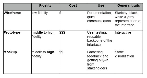
A wireframe is a low fidelity representation of a design. It should clearly show:
– the main groups of content (what?)
– the structure of information (where?)
– a description and basic visualisation of the user – interface interaction (how?)
Wireframes are not just meaningless sets of grey boxes, though they may look exactly like that. Consider them as the backbone of your design and remember that wireframes should contain a representation of every important piece of the final product.

„Representation” is a crucial term here, which will help you find the right fidelity – speed balance. You can’t go into too many details, but on the other hand you need to create a solid representation of the final design that won’t miss out any important piece of it. You’re setting a path for the whole project and for the people that are working with you (developers, visual designers, copy writers, project managers – they all need well-created wireframes). In fact you’re creating a map of a city. Every street is represented on a map, but it’s vastly simplified. You can sense the architecture of the city if you look on a map, but you can’t perceive its beauty.
Wireframes should be created quickly and almost the whole time should be spent communicating with team members and…thinking. The mere activity of wireframe-creation should be really quick.
Visualisation should be aesthetic, but this is vastly simplified. Black-grey-white are the typical colours you’ll use (you may add blue to specify links).
If something takes too much time to prepare (e.g. choice of icons, uploading images), you have to represent it in a simplified way (e.g. using placeholders – crossed rectangles for images, plus an appropriate description). We tend to call wireframes low-fidelity deliverables (lo-fi).
Remember – a well-created wireframe communicates design in a crystal clear way and sets a path for the whole team.
2. When to use wireframes.
Wireframes are typically used as the documentation of the project. Since they are static and fix interaction with an interface at a specific point in time, they should be accompanied by the written word (from short notes explaining interaction to, when needed, complex technical documentation).
However they might be also used in a less formal way. Since they are quick and simple in form, they serve well as clear sketches for inner communication in the team. If developers ask how something should be done – the answer can be provided as a rapidly created wireframe.
Consider this: UXPin is a start-up with really rapid development cycles (releases every couple of days). We use wireframes to quickly visualise tasks (even small ones!). It eliminates misunderstandings and is really cheap.
Wireframes are hardly used as a testing material, although they may help to gather feedback in initial, guerrilla-style, research, in which you don’t care about methodological purity, but rather try to get some quick insights.
Wireframes placed in the context of the whole design story can be surprisingly effective and, though in recent years they’ve received some bad press, are still indispensable as an initial stage of complex projects.
Prototype
1. What is a prototype?
A prototype, often confused with a wireframe, is a middle to high fidelity representation of the final product, which simulates user interface interaction. It should allow the user to:
– experience content and interactions with the interface
– test the main interactions in a way similar to the final product
A prototype is a simulation of the final interaction between the user and the interface. It might not look exactly like the final product, but should be vastly similar (it’s definitely not a greyish, sketchy thing). Interactions should be modelled with care and have a significant resemblance to the final experience. Interdependence between the interface and backend mechanisms is often omitted to reduce costs and speed up development cycles.
2. When to use a prototype.

Prototypes are used to their full potential in user testing. Such a simulation of the final interactions forms great material to check the usability of the interface, before the development actually begins.
Prototypes usually aren’t the best documentation you can imagine, since they force the „reader” to take some effort to understand the interface. On the other hand, a prototype is the most engaging form of design documentation as the interface is tangible and straightforward.
Beware that prototyping is rather an expensive and time-consuming form of design communication. I’d suggest rather creating prototypes that can be reused in development (yep, it means that you need to code some HTML, CSS and probably IS on your own). It’s especially effective in relatively simple projects.
Done right and combined with user testing, prototyping can pay for itself.
Mockup (mock-up)
1. What is a mockup?
A mockup is a middle to high fidelity, static, design representation. Very often a mockup is a visual design draft, or even the actual visual design. A well created mockup:
– represents the structure of information, visualises the content and demonstrates the basic functionalities in a static way
– encourages people to actually review the visual side of the project
Mockups are often confused with wireframes, due to the names of some software companies.
2. When to use a mockup.

Mockups are particularly useful if you want to get early buy-in from a stakeholder. Thanks to their visual nature, mockups don’t have the resistance of the low fidelity deliverables and are much quicker to create than prototypes. They are a good feedback-gatherer and, if placed in the context of the whole design story, can form a great chapter of documentation.
Sum-up

Where to start?
Before you choose a means of communication in the design process you need to:
– specify the problem that you’re trying to solve
– get to know your target group
– have a look at what competitors have done in this area
– set overall product requirements
That’s a minimum. Now think which deliverable will be most appropriate for you. Consider your product and team. What will work best for all of you? Formalised documentation, or informal quick sketches and face-to-face discussions? Do you have time and money for solid user research, or are you just going to visit a local cafe and hand a couple of sketches to your prospects?
What skills do you posses? Can you code?
Having a look at yourself, your team and your project should guide you through the process of choosing the right deliverable.
You can, of course, create all of them and…in many cases you will! Don’t be afraid of taking this step. They all make sense and, done right, can bring you closer to great design.
In this particular course, we’ll focus on the creation of low fidelity deliverables and on creating consistent design documentation based on them.